
In this guide 19 sections
To improve mobile website conversion for a local service business, make the service and coverage area clear, provide easy contact options, simplify forms, improve page responsiveness, and verify that every enquiry reaches the business. Measure qualified calls and requests rather than assuming more taps mean more customers.
This guide focuses on real mobile customer tasks: finding a service, deciding whether the provider is credible, and reaching the right person. It covers design, content, accessibility, performance, tracking, and operational follow-up.
1. Understand the mobile visitor’s immediate goal
Local service customers may be looking for a phone number, a service area, a price explanation, or a quote request. Do not assume every mobile visitor wants the same thing. A person searching for urgent roof repairs needs a different path from someone comparing long-term office cleaning contracts. Review actual search queries, enquiry notes, and customer questions before redesigning the mobile page. Identify the main task and make it easy to complete without unnecessary navigation. A useful mobile experience is about clarity and task completion, not simply fitting a desktop design into a smaller rectangle. Test the page with people who do not already know where everything is. Ask them to find the service, verify availability, and contact the business. Their difficulties reveal more than aesthetic preferences.
2. Make the service clear above the fold
The first screen should tell visitors what the business does and where it operates when location matters. Use a concise headline, a supporting sentence, and a clear next action. Avoid filling the entire screen with an oversized stock image or slow decorative animation. A local cleaning page might state the cleaning type and actual service coverage; a contractor page might identify the repair or installation service. Do not invent city-specific claims to rank for additional places. Keep important content in the natural reading order and ensure the headline does not become awkwardly cropped. A secondary route to service details can help visitors who need more information before contacting you. The goal is to make the offer understandable quickly without forcing a premature enquiry.
3. Prioritize tap-friendly contact options
Phone numbers should be readable and tap-to-call where appropriate. Quote buttons should lead to working forms, and booking links should open a usable calendar. Avoid buttons placed so closely together that visitors tap the wrong action. If you use a sticky mobile contact bar, verify it never covers input fields, navigation, privacy links, or error messages. A call button is only useful if the business can answer or return calls. Offer a monitored alternative for visitors who prefer writing. Different services may need different contact paths: an urgent repair may emphasize phone calls while a complex B2B project may emphasize consultation requests. Keep the main action consistent with the actual service and customer expectations.

4. Simplify mobile forms without losing qualification
Mobile users often type slowly and may be interrupted. Ask only what is needed to route and respond to the enquiry. Use persistent field labels, appropriate keyboard types, and clearly marked required fields. Preserve entered values when validation fails. Avoid asking for a complete project specification before offering a conversation. For a local service, location and service type may be necessary; for website development, a current URL and brief description can be useful. More questions are not always worse, but every field should serve a real purpose. Review the balance between form completion and qualified leads. A shorter form that generates irrelevant submissions may not improve business outcomes. Test the full submission journey on actual phones.
5. Improve loading without stripping away useful design
Large images, unnecessary scripts, complex animation, and third-party widgets can delay important content. Compress and size images appropriately, avoid loading huge desktop media on mobile, and reserve space to prevent layout shifts. Review whether every tracking script and plugin is essential. Google’s Core Web Vitals describe loading, responsiveness, and visual stability through LCP, INP, and CLS. These are useful diagnostics but not a substitute for usability testing. A technically fast page can still be confusing. Keep helpful design elements and remove performance costs that provide little value. Test on realistic mobile connections and devices rather than relying solely on a powerful office computer.
6. Fix navigation that hides important services
A mobile menu should be easy to open, understand, and close. Put the main service categories in a logical order and avoid deeply nested navigation when visitors need a quick answer. Use descriptive labels such as “Roof Cleaning” or “Website Redesign” rather than vague internal terms. Keep the contact route accessible without repeating it in every menu row. Check that the menu does not trap keyboard focus or block scrolling after it closes. If a business serves several locations, organize coverage information clearly rather than filling the menu with dozens of nearly identical city links. Navigation should help people move from their current question to the relevant service and contact option.
7. Show genuine trust signals where decisions happen
Mobile visitors may compare several providers rapidly. Give them relevant evidence without requiring a long search. Authentic reviews, completed project examples, clear company details, credentials where applicable, and an understandable process can all help. Never fabricate testimonials, ratings, or before-and-after results. Do not use unrelated stock photos as evidence of completed work. Place proof near the service claims it supports, and link to deeper case studies for visitors who want more detail. Avoid giant logo strips that push the useful content down the page. The strongest trust signal is often an accurate explanation of what the company will do and how the customer can verify its experience.

8. Make service areas and eligibility explicit
For a local business, visitors need to know whether the company serves their address. Provide a clear coverage description and a sensible way to check uncertain locations. Do not imply a physical office exists in every city served. Avoid publishing thin location pages that differ only by the city name. If service availability depends on job type, distance, minimum order, or scheduling, explain the relevant conditions. A visitor outside the coverage area should not have to complete a lengthy form before discovering the mismatch. Clear eligibility information can reduce low-quality enquiries and improve the experience for suitable customers.
9. Explain pricing and next steps
Many mobile visitors hesitate because they cannot tell whether the service is within reach or what happens after contacting the company. If prices are fixed, show accurate current amounts and inclusions. If work requires a custom estimate, explain the factors that affect cost and the steps in preparing a quote. Avoid invented starting prices or guaranteed turnaround times. Use short sections and expandable detail only when it improves accessibility. A quote request should not secretly become an agreement to purchase. Make the next step specific: the business reviews details, asks clarifying questions if needed, and prepares an estimate or consultation. Clear expectations help attract buyers who are genuinely ready to discuss the service.
10. Design for readable content and accessibility
Use readable body text, sufficient contrast, sensible line lengths, and clear heading hierarchy. Do not place essential text inside an image that becomes illegible on a narrow screen. Provide alternative text for meaningful images and leave decorative imagery out of the accessibility tree when appropriate. Support keyboard navigation, visible focus, and understandable form errors. Respect reduced-motion preferences and avoid flashing or distracting effects. W3C accessibility guidance is a useful foundation for reviewing these decisions. Accessibility is not a decorative compliance badge; it helps real visitors complete tasks. Test the actual page with screen readers and keyboard controls where possible.
11. Verify the entire lead-delivery chain
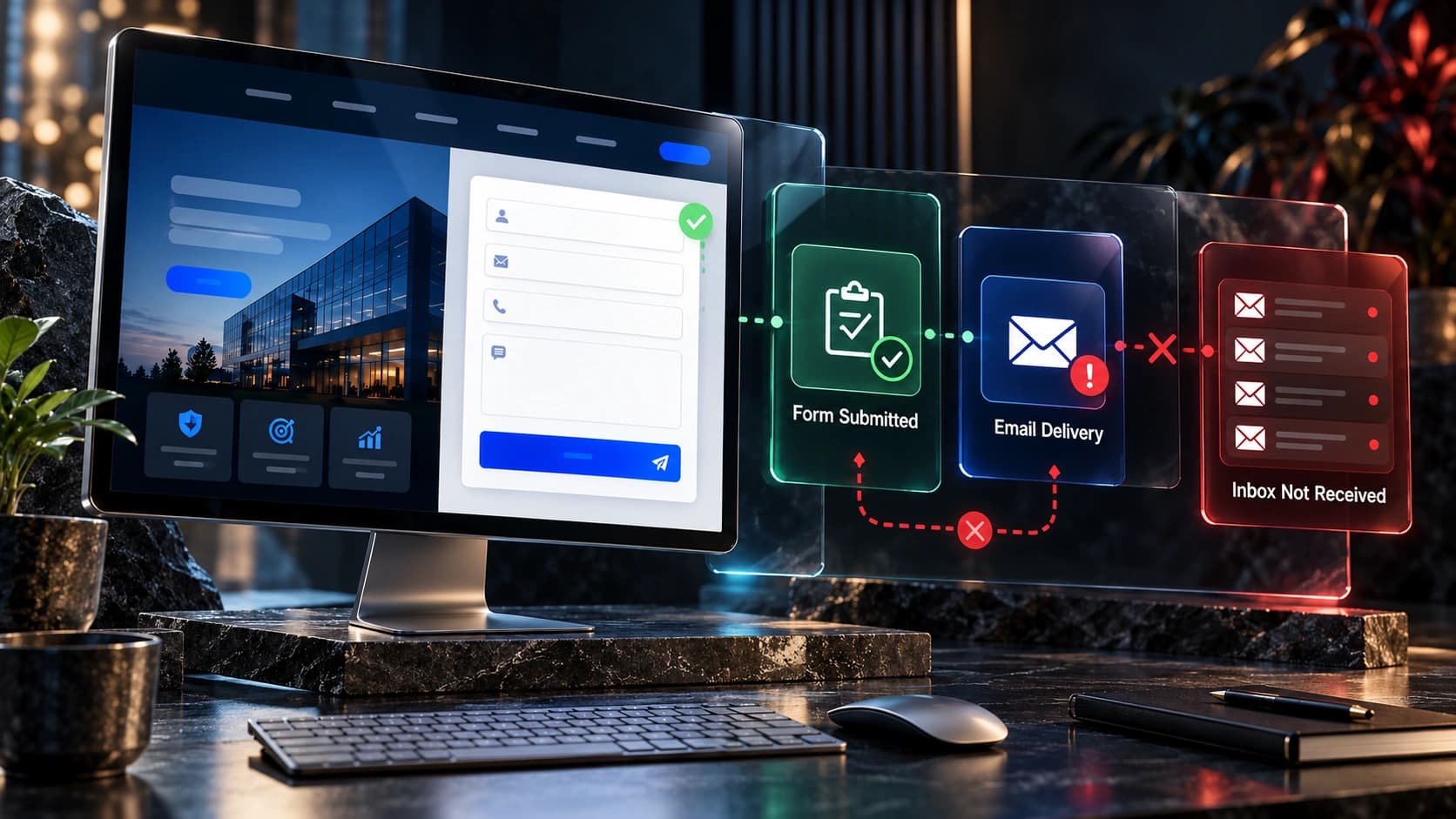
A successful mobile form submission should create a real record and reach the right team. Test the form from a phone, confirm the success message, check the stored enquiry, verify notifications, and inspect CRM assignment. If a form works on desktop but fails on mobile, investigate field validation, scripts, network behavior, and layout interference. Do not count a tap on the submit button as a lead. Make sure the customer receives accurate response expectations and the sales team has enough context to respond. If the business uses automation, test fallback ownership and opt-out handling. A polished mobile interface is not useful if valid enquiries disappear after submission.

12. Measure qualified outcomes by device
Compare successful enquiries, contacted leads, and qualified opportunities across mobile and desktop traffic. Use consistent definitions and consider differences in visitor intent. Google Analytics 4 supports the recommended generate_lead event for completed lead-generation actions. Validate that the event fires only when the enquiry is accepted. Connect outcomes to CRM records where appropriate and privacy-safe. Avoid assuming a lower mobile conversion rate automatically means the design is broken; source mix and customer behavior can differ. Review actual user journeys and errors before making changes. Small samples can be noisy, so avoid declaring a redesign successful based on a few extra form submissions.
13. Use a practical mobile testing checklist
Open each important service page on multiple screen widths. Check the headline, menu, tap targets, images, content order, CTA visibility, and form behavior. Rotate the device if landscape use matters. Test slower connections and verify that important content is available before optional scripts finish loading. Review sticky elements for overlap, ensure modal windows can close, and confirm keyboard input does not obscure fields. Check phone links, maps where relevant, calendar bookings, and the thank-you state. Record issues by severity: broken forms and inaccessible navigation come before minor decorative spacing. Retest after changes because a fix on one template can unintentionally affect another.
14. Prioritize improvements by business impact
Start with problems that prevent contact: broken forms, hidden phone numbers, overlapping buttons, inaccessible menus, and inaccurate service coverage. Next address unclear offers, weak trust evidence, and confusing price expectations. Then improve performance and visual polish where they materially affect the experience. Keep a baseline and document changes. If traffic is limited, combine analytics with qualitative testing rather than running many inconclusive A/B tests. Involve the people who answer enquiries; they know which questions and misunderstandings recur. The best mobile redesign is not necessarily the one with the most visual effects, but the one that helps suitable visitors complete their tasks reliably.

15. Continue improving after launch
Mobile usability is not finished when a page passes one device test. New content, marketing widgets, form plugins, and promotional banners can introduce regressions. Schedule regular checks of the main contact pathways and review real customer feedback. Monitor broken links, form errors, slow pages, and changes in lead quality. Revisit service descriptions when coverage, pricing, or processes change. Keep mobile layouts consistent across homepage, service pages, and contact pages. A well-maintained experience helps visitors trust that the business is active and dependable. Continuous improvement should be based on observed problems and verified outcomes rather than design trends alone.
Mobile conversion troubleshooting table
| Problem | Likely investigation | Useful check |
|---|---|---|
| Low call volume | Phone number visibility and service intent | Test tap-to-call and business hours |
| Form abandonment | Required fields and validation | Complete the form on a real phone |
| Slow first screen | Images, scripts and fonts | Review Core Web Vitals and actual loading |
| Irrelevant enquiries | Offer clarity and coverage | Review CRM qualification notes |
| Missing leads | Submission and CRM integration | Test delivery end to end |
Frequently asked questions
Why do mobile visitors contact us less often?
Possible reasons include traffic intent, unclear offers, hidden contact routes, slow loading, difficult forms, or genuine differences in customer behavior. Investigate rather than assuming one cause.
Should I use a sticky call button?
It can help for phone-oriented services if it does not obscure navigation, content, or forms. Test on small screens.
How many form fields should a mobile page have?
Use only what is needed to respond and qualify appropriately. Measure lead quality as well as form completion.
Does mobile page speed affect enquiries?
Slow or unstable experiences can frustrate visitors. Improve technical performance while also testing the clarity and usability of the page.
Should each city have a separate service page?
Only when the page provides genuine useful location-specific information. Avoid near-duplicate doorway pages.
What is a good mobile conversion rate?
There is no universal benchmark for all local services. Compare meaningful qualified outcomes over appropriate periods and consider traffic sources.
Can I track phone calls as leads?
Yes, with appropriate call tracking and privacy practices, but distinguish a call click from a connected and relevant enquiry.
What should I fix first?
Prioritize broken forms, inaccessible navigation, hidden contact methods, misleading service coverage, and other issues that prevent a customer from completing the task.
Related guides and a practical next step
Use our contact-page design guide, homepage checklist, form-delivery troubleshooting guide, lead-to-customer diagnostic guide, and complete service-business website guide to improve the full journey.
At Avenzo Digital, we help businesses design and develop clearer, mobile-friendly websites. Request a consultation and ask about a free homepage mockup to discuss your current site. No specific conversion improvement is guaranteed.