
In this guide 8 sections
A service-business homepage has one immediate job: help a visitor understand what the company does and choose a useful next step. It also needs to support people who want to compare services, review past work, learn about the team or ask a question before contacting anyone.
Quick answer: A useful homepage includes a clear service headline, concise explanation, obvious navigation, relevant service paths, authentic trust evidence, a realistic process summary, accessible mobile layout and a working contact action. Test the complete enquiry path before launching and measure qualified outcomes after launch.
This checklist is designed for a new homepage, a redesign review or a focused conversion audit. Not every company needs the same section order; the key is whether the page answers the questions its actual customers bring.
Website Homepage Checklist for Service Businesses: detailed checks
1. Confirm the headline names the business service
What goes wrong: The first screen should tell visitors what the business does, not rely on an abstract promise.
How to improve it: Use an H1 that identifies the core service and, where useful, the audience or geographic scope. Avoid making changes solely because a competing site uses a particular layout. Match the implementation to your actual visitors and offer.
How to check: Ask an unfamiliar reader to summarize the offer after a quick glance. Document the original behavior and compare it with the revised experience before attributing improvements to the design.
2. Write a concise supporting statement
What goes wrong: The headline alone may not explain the specific problem solved or how the service differs.
How to improve it: Add one or two sentences that clarify the service and realistic value. Avoid making changes solely because a competing site uses a particular layout. Match the implementation to your actual visitors and offer.
How to check: Remove jargon that a prospective customer would not recognize. Document the original behavior and compare it with the revised experience before attributing improvements to the design.
3. Make the primary CTA truthful and specific
What goes wrong: The next step should be clear and should match the destination.
How to improve it: Use “Request a Quote,” “Book a Consultation” or another accurate action rather than an ambiguous button. Avoid making changes solely because a competing site uses a particular layout. Match the implementation to your actual visitors and offer.
How to check: Click through and complete the actual process on a mobile device. Document the original behavior and compare it with the revised experience before attributing improvements to the design.

4. Keep the navigation predictable
What goes wrong: Visitors may arrive knowing which service they need, or they may be researching the company.
How to improve it: Use recognizable labels and logical groupings for services, work, about and contact. Avoid making changes solely because a competing site uses a particular layout. Match the implementation to your actual visitors and offer.
How to check: Check that the mobile menu opens, closes and supports keyboard interaction. Document the original behavior and compare it with the revised experience before attributing improvements to the design.
5. Show service categories with useful descriptions
What goes wrong: A grid of service names without context can leave people uncertain which page fits their problem.
How to improve it: Give each primary service a short explanation and a descriptive link to its dedicated page. Avoid making changes solely because a competing site uses a particular layout. Match the implementation to your actual visitors and offer.
How to check: Confirm that each link reaches a relevant live page. Document the original behavior and compare it with the revised experience before attributing improvements to the design.
6. Explain the problems the business helps solve
What goes wrong: Customers often recognize a symptom before they know the service name.
How to improve it: Describe common situations in plain language and link to the appropriate solution. Avoid making changes solely because a competing site uses a particular layout. Match the implementation to your actual visitors and offer.
How to check: Use real questions from enquiries instead of generic pain-point clichés. Document the original behavior and compare it with the revised experience before attributing improvements to the design.

7. Use genuine proof rather than unsupported claims
What goes wrong: Visitors want to know whether the provider has relevant experience.
How to improve it: Show actual work, authentic reviews with permission and verifiable credentials. Avoid making changes solely because a competing site uses a particular layout. Match the implementation to your actual visitors and offer.
How to check: Remove invented awards, statistics or anonymous testimonials. Document the original behavior and compare it with the revised experience before attributing improvements to the design.
8. Describe what happens after contact
What goes wrong: Uncertainty about fees, timing and the first conversation can stop people from enquiring.
How to improve it: Summarize discovery, quote, delivery and follow-up stages accurately. Avoid making changes solely because a competing site uses a particular layout. Match the implementation to your actual visitors and offer.
How to check: Check that the process matches what the sales and delivery teams actually do. Document the original behavior and compare it with the revised experience before attributing improvements to the design.
9. Answer the most important objections
What goes wrong: Buyers may need to know service area, timelines, pricing factors or who will perform the work.
How to improve it: Include a concise FAQ or links to relevant pages that explain these issues. Avoid making changes solely because a competing site uses a particular layout. Match the implementation to your actual visitors and offer.
How to check: Compare the homepage with recurring pre-sales questions. Document the original behavior and compare it with the revised experience before attributing improvements to the design.
10. Use meaningful images and avoid misleading visuals
What goes wrong: Images should reinforce the service and not obscure important content.
How to improve it: Prefer authentic project images; use editorial stock only as illustration, not fabricated evidence. Avoid making changes solely because a competing site uses a particular layout. Match the implementation to your actual visitors and offer.
How to check: Inspect image crop, captions, alt text and mobile loading. Document the original behavior and compare it with the revised experience before attributing improvements to the design.

11. Make mobile reading comfortable
What goes wrong: Large desktop compositions often become cramped, overlapping or excessively tall on phones.
How to improve it: Use responsive spacing, legible type and touch-friendly controls. Avoid making changes solely because a competing site uses a particular layout. Match the implementation to your actual visitors and offer.
How to check: Check portrait devices, text zoom and form focus behavior. Document the original behavior and compare it with the revised experience before attributing improvements to the design.
12. Check accessibility and focus states
What goes wrong: A page can look attractive but be difficult for keyboard or assistive-technology users.
How to improve it: Use semantic headings, descriptive links, sufficient contrast and visible focus. Avoid making changes solely because a competing site uses a particular layout. Match the implementation to your actual visitors and offer.
How to check: Run automated checks and manual keyboard testing. Document the original behavior and compare it with the revised experience before attributing improvements to the design.
13. Keep performance under control
What goes wrong: Oversized images and unnecessary animation can delay content and shift layout.
How to improve it: Optimize media and scripts, reserve layout space and test the actual deployed page. Avoid making changes solely because a competing site uses a particular layout. Match the implementation to your actual visitors and offer.
How to check: Review real-device performance and Core Web Vitals. Document the original behavior and compare it with the revised experience before attributing improvements to the design.

14. Verify the contact path and CRM handoff
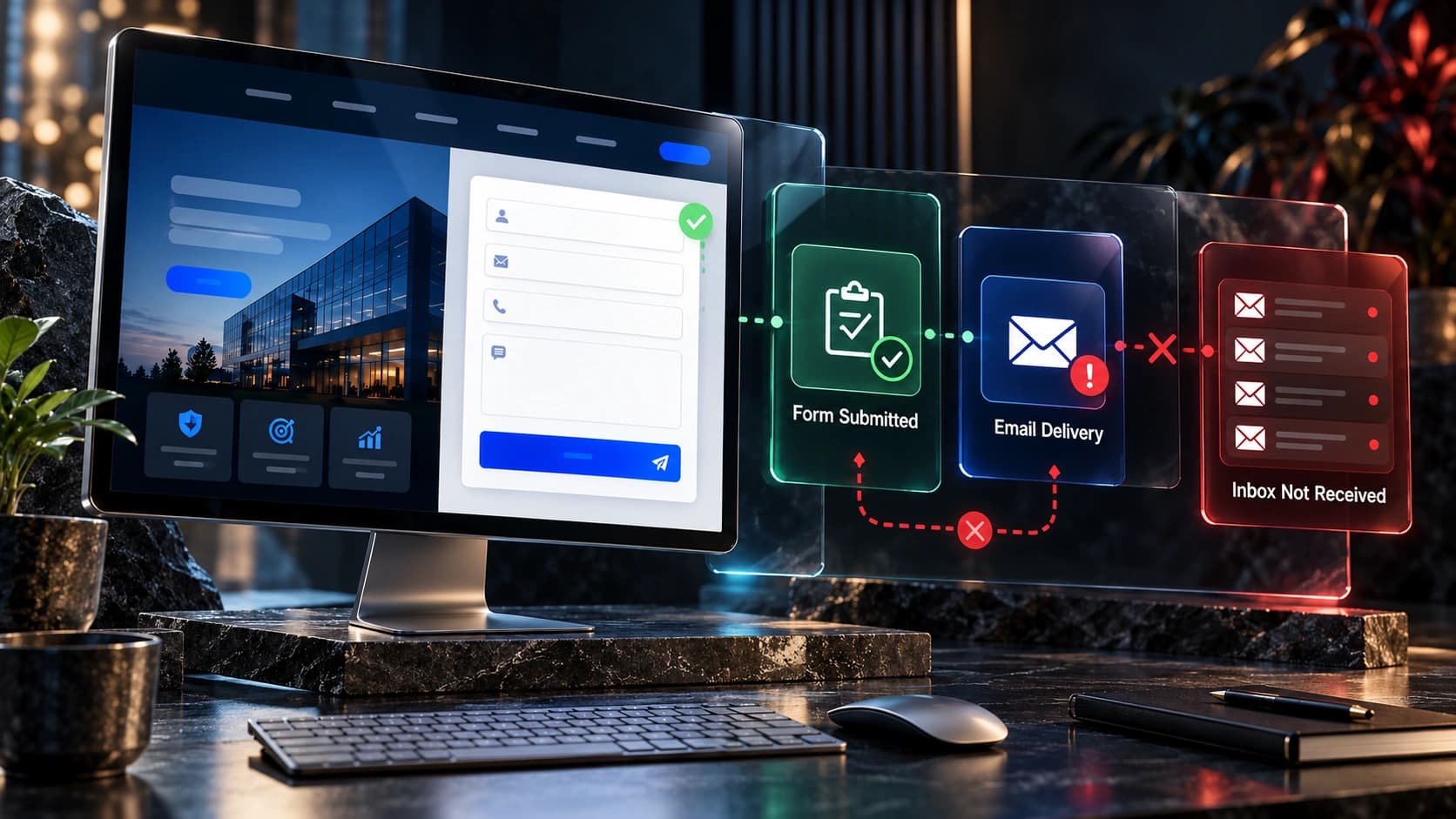
What goes wrong: A homepage CTA is useless when the enquiry disappears after submission.
How to improve it: Test confirmation, stored records, notification, assignment and follow-up ownership. Avoid making changes solely because a competing site uses a particular layout. Match the implementation to your actual visitors and offer.
How to check: Submit monitored test leads and check the sales inbox. Document the original behavior and compare it with the revised experience before attributing improvements to the design.
15. Review search appearance and internal linking
What goes wrong: The homepage should communicate the business to search engines and visitors.
How to improve it: Write a descriptive title, accurate meta description, useful links and appropriate canonical. Avoid making changes solely because a competing site uses a particular layout. Match the implementation to your actual visitors and offer.
How to check: Inspect the live source and Search Console for indexing or crawl issues. Document the original behavior and compare it with the revised experience before attributing improvements to the design.
16. Set up post-launch measurement
What goes wrong: A homepage is never fully evaluated by appearance alone.
How to improve it: Track successful enquiries and qualified outcomes alongside device and traffic-source context. Avoid making changes solely because a competing site uses a particular layout. Match the implementation to your actual visitors and offer.
How to check: Review the baseline before interpreting changes. Document the original behavior and compare it with the revised experience before attributing improvements to the design.
A practical homepage section order
| Section | Visitor question | Recommended content |
|---|---|---|
| Hero | What does this business do? | Clear offer and primary CTA |
| Services | Which service fits my need? | Short descriptions and links |
| Problems solved | Do you understand my situation? | Specific use cases |
| Proof | Can I trust this provider? | Real projects and credentials |
| Process | What happens next? | Simple, accurate steps |
| FAQ | What should I know before contacting? | Practical answers |
| Contact | How do I start? | Working form or booking route |
Example: evaluating a homepage before launch
Consider a hypothetical B2B IT provider. The homepage has an impressive animation but never says whether it offers managed support, cybersecurity or cloud migration. A visitor cannot determine if the company serves small offices or large enterprises. The most useful fix is to clarify the offer and service paths before investing in another visual effect.
By contrast, a local contractor may have clear service information but a floating mobile bar that covers the phone button. That issue requires responsive testing and a simpler layout, not a new brand identity. Prioritize problems according to their impact on the actual customer journey.
Related resources: complete service website guide, redesign or targeted CRO, and traffic without enquiries.
How to measure whether the changes are helping
Do not judge a change by aesthetics alone. Define a clear outcome before implementation: completed enquiries, qualified consultations, successfully delivered forms, or visitors finding the appropriate service. Review the source and intent of traffic, device type, and whether the sales team actually receives and follows up on leads. Small sample sizes can make week-to-week differences misleading; avoid declaring a winner based on a handful of enquiries.
Google Analytics 4 provides recommended events such as generate_lead for completed enquiries, but a tracked event is not proof of a sale. Use your CRM to verify lead quality and eventual outcomes. Consult Google’s event reference and the Google SEO Starter Guide for technical guidance.
A practical implementation checklist
- Record the current customer journey and actual points of confusion before making changes.
- Prioritize issues affecting clarity, accessibility, lead delivery, and trust.
- Write the proposed replacement content in customer language before finalizing visuals.
- Test on real phones and desktops, including keyboard navigation and slow connections.
- Submit test forms and confirm that notifications and CRM ownership work.
- Measure qualified enquiries and review the results with the people who handle sales.
- Keep a dated change log and reverse changes that demonstrably harm the experience.
Accessibility is not a cosmetic enhancement. Review form labels, focus states, readable text, semantic headings and understandable error messages against the W3C Web Content Accessibility Guidelines.
Frequently asked questions
How many sections should a homepage have?
Only enough to answer the key buyer questions. A concise homepage with good service links can be more useful than a very long page with repetitive sections.
Should a service homepage include a form in the hero?
Only when the form fits the audience and does not overwhelm the first screen. A clear button to a short form can work well too.
Should the homepage show pricing?
Show accurate pricing when relevant or explain the factors that determine a quote.
Do I need testimonials on the homepage?
Authentic, relevant proof is useful, but invented testimonials are not. Project examples and verifiable credentials are alternatives.
How do I choose the main CTA?
Match it to the action your team can reliably support, such as a quote request or consultation.
How should I test the mobile homepage?
Check readability, navigation, media crop, sticky elements, keyboard use and successful contact submission.
What should be in the homepage SEO title?
A natural description of the core service and business, with location context when genuinely relevant.
How often should I update the homepage?
Review when the offer, services, team or evidence changes, and when user data reveals meaningful problems.
What Avenzo Digital can help with
At Avenzo Digital, we build and improve websites for service businesses. Our work includes website design and development, redesign and conversion-focused improvements. We do not promise a particular number of leads or sales: the appropriate work depends on your visitors, offer and sales process.
Want to discuss the current website? Request a consultation and ask about a free homepage mockup. Share your existing website and what you want customers to do so the discussion can focus on a useful next step.