
In this guide 20 sections
A service-business website should do more than look modern. It needs to help the right visitors recognize their problem, understand your offer, trust your company, and take a useful next step. For a contractor, consultant, law firm, cleaning company, IT provider, or B2B service agency, that next step could be a quote request, scheduled consultation, or a phone call.
Many service websites have the familiar ingredients—hero banner, service cards, testimonials, contact form—but those ingredients are not automatically arranged into a helpful customer journey. Visitors may not understand the offer, find the right service, or know what will happen after they reach out. Other websites capture forms successfully but lose enquiries through broken notifications or slow follow-up.
How do you build a high-converting service business website? Start with the audience and their decision-making needs, not a template. Make the service clear, organize pages around specific customer questions, show genuine evidence of your work, minimize unnecessary contact friction, and test the entire lead path. Measure qualified opportunities rather than celebrating page views alone.
2027 planning note: This guide was prepared in November 2026 for businesses planning 2027 website investments. Its recommendations are practical design and measurement principles, not claims about future 2027 conversion-rate benchmarks or guaranteed outcomes.
What makes a service-business website different?
An online store often has product listings, a cart, and checkout. A service-business buyer may need several steps before deciding to purchase: understanding what is provided, comparing providers, checking service areas, reviewing evidence, asking questions, and discussing scope.
That makes clarity and credibility essential. People may arrive from Google Search, a local listing, an advertisement, a referral, or a LinkedIn profile. Your website should help each visitor determine whether your service is appropriate and what to do next.
A business can have a polished site and still lose opportunities because of unclear messaging or unreliable operations. We cover those broader problems in Why Your Website Gets Traffic but No Leads. This article focuses on building the website experience correctly from the beginning.
The service website blueprint: pages that work together
| Page | Main customer question | Useful action |
|---|---|---|
| Homepage | What do you do, and is it for someone like me? | Explore a relevant service or request a consultation |
| Dedicated service pages | Can you solve this particular problem? | Request an appropriate quote or next step |
| About/team | Who will do the work, and can I trust them? | Meet the team or review credentials |
| Projects/case studies | What have you actually delivered? | See similar work and discuss a project |
| Process/how it works | What happens after I contact you? | Understand the engagement process |
| Areas served, if applicable | Do you work in my city or region? | Check service availability and contact details |
| Helpful articles/FAQs | What should I know before making a decision? | Read a relevant guide or service page |
| Contact or booking | How can I reach you, and what happens next? | Submit a working form, call, or book |
Not every small business needs eight separate navigation items. Some pages can be combined, especially for a new business. The goal is to answer the relevant questions without creating unnecessary content or making visitors navigate through dozens of generic pages.
Step 1: define the audience, offer, and conversion goal
Before designing a homepage, write a simple brief. Identify the specific customers you serve, the problems they bring, the services you provide, and what action represents a useful opportunity for the business.
A local roofing company may prioritize phone calls and inspection requests. A web-development agency may prioritize qualified consultation enquiries. A B2B cybersecurity provider may need a discovery form that captures the organization’s situation without asking for sensitive data unnecessarily.
Write a clear positioning statement
Try this structure: We help [customer type] solve [specific problem] through [defined service], so they can [realistic outcome].
For example: “Website design and development for service businesses that need a clearer online presence and dependable enquiry forms.” The statement explains the service and audience more directly than “Transforming the future through digital innovation.”
Do not invent outcomes such as guaranteed sales increases. Use promises the company can actually support.
Choose a primary conversion event
Pick the action you can reliably track and respond to, such as a successful quote submission, consultation booked, or inbound call connected. Secondary actions, such as downloading a guide or viewing a portfolio, can help you understand the journey, but they are not the same as a qualified lead.
In Google Analytics 4, the recommended generate_lead event can represent a completed lead request. Google’s recommended events documentation explains this convention. Your CRM should still confirm whether a usable enquiry was received and qualified.
Step 2: plan the customer journey before choosing the design
Imagine a person searching “commercial office cleaning near me.” They arrive on your service page and need to know the service scope, where you operate, whether you serve their type of building, what affects pricing, and how to request an estimate.
If the page instead opens with abstract branding, a decorative video, and generic claims, the visitor has extra work to do. Organizing information around the buyer’s questions makes the page more useful than filling it with visually impressive sections.
Sketch the main paths from homepage, search landing page, blog, project example, and advertising campaign to a relevant next step. The path does not have to be perfectly linear, but every important page should offer a clear route forward.
List the questions people ask before signing: who the service is for, what is included, service locations, timing, typical process, what the company needs from the customer, and which details affect price. Those questions should shape page content and navigation.

Step 3: build a homepage that explains your service quickly
The homepage should orient a visitor—not force every detail about the business into the first screen. Prioritize a specific headline, helpful supporting copy, a visible action, and enough proof to make people comfortable exploring.
Recommended service-business hero structure
- Eyebrow or context: a concise service category or relevant audience, where appropriate.
- Headline: describe what the company does in language customers recognize.
- Supporting sentence: explain who benefits and what practical issue the service addresses.
- Primary CTA: use a specific, truthful action such as “Request a Project Quote” or “Schedule a Consultation.”
- Secondary path: offer “See Our Work” or “Explore Services” without competing visually with the primary CTA.
- Relevant visual: show actual work, a useful product interface, or a real project image instead of an unrelated decorative photograph.
For example, “Custom Website Design for Service Businesses” is clear about the category. A supporting line could explain that the team builds responsive websites, organizes service pages, and makes contact pathways easier for visitors to use. The CTA could be “Get a Free Homepage Mockup” only when that offer is genuinely available and its terms are explained.
What comes below the hero?
Introduce the principal services, explain common customer problems, show credible examples, describe the working process, answer practical objections, and provide a contact route. Avoid repeating the same sales pitch in five differently styled sections.
Each section should have a reason to exist. When reviewing a proposed section, ask: does it answer a buyer question, demonstrate evidence, or help someone take the next step? If not, it may not need to be on the page.
Step 4: design service pages for the specific search and buying intent
One generic “Our Services” page rarely answers every question that different customers bring. A business offering website development, website redesign, and conversion improvement should describe these services separately because the customer problems and deliverables differ.
A useful service page can follow this structure:
- Service-specific headline: identify the service in clear language.
- Who it helps: describe typical customer situations without implying everyone is a fit.
- What’s included: explain deliverables and meaningful boundaries.
- Process: show the steps between enquiry and completion.
- Trust: include genuine relevant work, credentials or client feedback.
- Cost factors: explain what affects pricing or request a scoped quote.
- Frequently asked questions: address timing, requirements, revisions, ongoing support, and common objections.
- Clear conversion path: make the appropriate action available after helpful information.
Where useful, provide the same information in more than one reading style: concise sections for quick scanning and deeper explanations for people making a more considered purchase. A mobile visitor may need the answer immediately; a procurement manager may need detailed scope to share internally.
Look at the user’s likely question before writing an SEO heading. Google encourages useful, people-first content, descriptive titles, and clear links in its SEO Starter Guide.
Step 5: give buyers genuine reasons to trust the business
Service buyers often need to evaluate a company before sharing money, sensitive information, or access to important systems. A refined visual style can help make the site feel coherent, but appearance alone is not proof of competence.
Useful evidence can include:
- Real completed projects with descriptions of the work performed.
- Verifiable qualifications, licenses or professional credentials when relevant.
- Authentic customer feedback shared with appropriate permission.
- A realistic explanation of the process and who is responsible for delivery.
- Clear company contact information and service coverage.
- Before-and-after examples only when they truly represent the work and context.
For a web-development agency, a project showcase should make the work understandable: what was developed, why it was needed, which capabilities were implemented, and what is known about the result. Avoid making up performance statistics or presenting invented testimonials as real customer reviews.
Real photographs of the company, the work, or the resulting product can support trust. Third-party editorial photographs are useful for blog illustrations, but should not be passed off as photos of your own employees or clients.
How to present case studies without exaggeration
Use a clear format: client or project category, initial challenge, project scope, major implementation decisions, final deliverables, and any outcomes that can be supported by evidence. If the work was website development rather than a conversion redesign, describe it accurately.
A concise, truthful case study is stronger than a lengthy description filled with marketing adjectives. Put the most relevant projects near the services they demonstrate.

Step 6: make mobile usability a primary design requirement
Mobile responsiveness is not just about shrinking desktop cards. On a smaller screen, people have less room to scan information and interact with forms. A large hero image can push the actual offer far down the page; a sticky CTA can overlap input fields; a full-width menu can become difficult to close.
Test real tasks on mobile devices: read a service page, find a location, view a project, complete the form, call the company, and return from the confirmation page. Review both portrait and landscape where relevant.
Mobile design checklist
- Use comfortable text sizes, clear hierarchy, and sufficient contrast.
- Avoid horizontal overflow, cropped headings, and overlapping floating elements.
- Make buttons and controls easy to tap without covering other content.
- Keep meaningful content in a logical reading order.
- Use images that crop appropriately instead of obscuring the subject or important copy.
- Ensure forms work with mobile keyboards, validation messages, and slow connections.
- Keep navigation consistent and provide a clear path back to services and contact information.
Accessibility should be part of the same review. Proper field labels, semantic headings, keyboard access, visible focus, sufficient contrast, and understandable error messages help a wider range of visitors. The Web Content Accessibility Guidelines provide detailed criteria.
Step 7: use a contact form that leads to an actual response
Every enquiry form should have a job. A quote request may need contact details, a brief description of the project, and perhaps a website URL or service location. A consultation booking may need only information required to schedule the conversation and prepare a meaningful response.
Don’t collect detailed data merely because a form builder makes fields easy to add. Each additional field should earn its place. At the same time, shortening a form too much can make it difficult to distinguish serious requests from irrelevant submissions, so evaluate both completion and lead quality.
End-to-end form testing
- Submit a test enquiry from a phone and desktop.
- Check required fields and validation behavior.
- Confirm a useful success message or thank-you page appears.
- Verify the enquiry was stored by the website or CRM.
- Verify the correct person receives a notification.
- Check that consent and contact preferences are handled appropriately.
- Confirm a real follow-up task or appropriate workflow is created.
- Make sure analytics records a successful submission, not simply a button click.
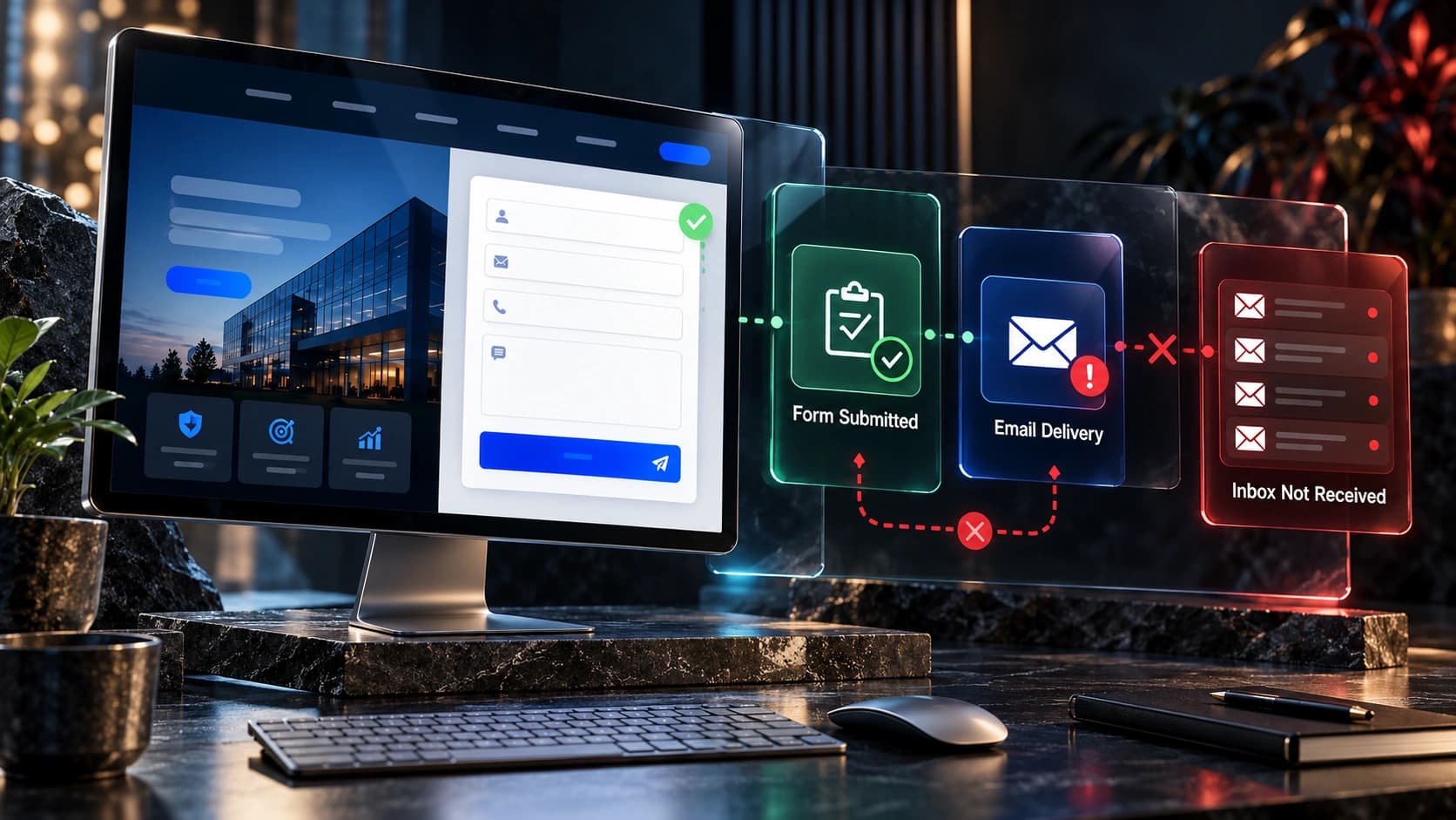
This protects against a common failure: a form that looks functional but loses leads after submission. See our guide to contact forms that fail to deliver enquiries.

Step 8: design CTAs around the next customer decision
A call to action should explain what happens, not merely demand a click. “Submit,” “Learn More,” and “Get Started” can be too generic when the user has a specific task.
Choose truthful, context-specific CTA text: “Request a Cleaning Quote,” “Book an Initial Consultation,” “Get a Website Estimate,” or “See Completed Projects.” When the button leads to a form, explain whether there is a fee, how the information will be used, and what response the visitor can expect.
Use visual hierarchy rather than making every button the same size and color. A primary action can repeat naturally after relevant service details, but avoid placing three competing buttons in every section.
Be especially careful with sticky mobile CTAs. They can help users reach a contact action, but they should never cover a form, obstruct navigation, or take over too much screen space.
Step 9: build SEO into the content plan, not as an afterthought
Search optimization starts with understanding what people look for and creating pages that genuinely answer those searches. For service businesses, this often means useful main service pages, specific solutions, legitimate coverage areas, helpful FAQs, and relevant educational resources.
Google’s SEO Starter Guide recommends useful content, descriptive titles, understandable URLs, and clear internal linking. Good site architecture helps both visitors and search engines discover related information.
A simple service-business SEO structure
A website design agency might have a homepage, service pages for website design and redesign, a portfolio, and guides addressing common buyer questions. A local cleaning company could organize its services by actual cleaning type, with location pages only when there is meaningful local relevance and truthful service coverage.
Do not create hundreds of nearly identical location pages simply by swapping city names. Visitors need accurate service information, differences that matter, and real ways to contact the business.
Technical SEO essentials
- Important pages return the correct HTTP status and can be discovered through internal links.
- Canonical tags point to intended preferred live URLs.
- Sitemaps contain relevant indexable pages.
- Titles, descriptions and headings are useful and unique where appropriate.
- Images have reasonable dimensions, descriptive alternative text when needed, and suitable loading behavior.
- Broken links, accidental noindex directives, and unnecessary redirect chains are checked before launch.
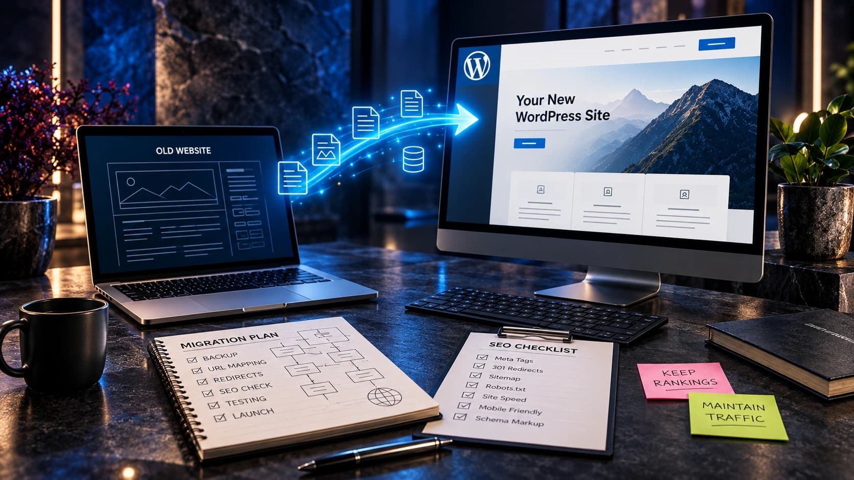
If replacing an established website, plan redirects and preserve valuable URLs. Our redesign-without-losing-SEO guide covers migration details and lead protection.
Step 10: keep page performance and maintenance practical
A site can look excellent in a static mockup but feel slow when heavy video, animations, fonts, widgets and third-party scripts are loaded. Performance should be assessed on actual devices and important user tasks—not only in design presentations.
Google’s Core Web Vitals focus on loading experience (LCP), responsiveness (INP), and visual stability (CLS). They are useful diagnostics, but a passing technical score does not prove the content is understandable or the form works. See Google’s current Core Web Vitals guidance.
Use appropriately sized images, reserve space to prevent layout shifts, minimize unnecessary code, and review whether third-party tools actually provide business value. Keep useful visual effects, but don’t let motion block the primary action or frustrate people who prefer reduced motion.
Choose a platform your team can maintain. WordPress, Next.js with a CMS, and headless combinations can all support good websites when implemented well; they involve different editing and maintenance responsibilities. Our WordPress vs Next.js comparison explains those trade-offs.
Step 11: measure real enquiries and qualified opportunities
Traffic and scroll depth can provide useful context, but they are not the same as a new customer. A service-business website should connect website activity to a meaningful funnel: relevant visits, successful enquiries, contacted leads, qualified conversations, proposals, and purchases.
In Google Analytics 4, a completed lead submission may use the recommended generate_lead event. Only treat the action as successful when the submission is actually received. Google explains the event in its recommended events reference.
A simple hypothetical reporting example
Assume a website receives 2,000 visits in a month and 40 completed contact requests. Its website enquiry rate is 40 divided by 2,000, or 2%. If 15 of those enquiries are qualified and three become customers, the business should examine qualification and the sales process as well as the initial website rate.
These numbers are illustrative, not a benchmark, prediction, or Avenzo client result. A site with fewer but better-qualified enquiries may be more valuable than one with many irrelevant submissions.
| Stage | What to measure | Why it matters |
|---|---|---|
| Landing-page visits | Visits by source, device, and service page | Separates relevant demand from broad traffic |
| Contact completion | Successful, stored form or booking requests | Shows whether a visitor could reach the business |
| Lead qualification | Enquiries suitable for the service | Distinguishes useful demand from irrelevant volume |
| Sales response | Contact rate and first-response time | Exposes missed handoffs or unanswered requests |
| Customer outcomes | Proposals, won opportunities, revenue where appropriate | Connects the site to the real business goal |
Make sure lead reporting respects privacy and retention requirements. Identify which staff are responsible for checking contact failures and responding to new records. See why website leads sometimes do not become customers for sales-process diagnostics.

Step 12: build in stages rather than polishing everything at once
Every website project benefits from clear stages and ownership. The sequence below keeps the most important decisions ahead of visual decoration.
Discovery and content map
Document the audience, services, essential customer questions, existing search traffic if available, and main conversion events. Inventory current URLs and lead integrations if replacing an older site.
Wireframes and copy
Plan the homepage and main service templates. Write the core message and CTA before committing to complex motion or image treatments. Test whether potential customers understand the page structure.
Visual design system
Set typography, colors, spacing, button styles, component patterns and responsive behavior. Define how trust evidence, project images, forms, and alerts should appear consistently.
Development and integrations
Implement the content management approach, pages, forms, CRM routing, analytics and required features. Review accessibility, device behavior and security responsibilities.
Pre-launch quality assurance
Test URLs, content, images, navigation, forms, tracking, privacy links, mobile devices, redirects, and performance. Keep a rollback plan if updating a live website that already receives enquiries.
Post-launch learning
Watch real contact flow, search visibility, broken pages and feedback. Make specific improvements as evidence emerges rather than redesigning again based on small or inconclusive changes.
A high-converting service-business homepage: section-by-section example
The sequence below is one practical model, not a rigid template that every business must follow. Rearrange sections according to customer priorities and evidence.
| Section | Example purpose |
|---|---|
| 1. Clear hero | Explain the main service, target audience and next step |
| 2. Service overview | Help visitors navigate to a specific service |
| 3. Problems solved | Connect services to real customer situations |
| 4. Relevant proof | Show real projects, qualifications or authentic feedback |
| 5. Working process | Explain what happens from enquiry to delivery |
| 6. Differentiators | Describe verifiable details that distinguish the company |
| 7. FAQs | Answer timing, pricing factors, preparation and support questions |
| 8. Contact path | Provide a usable form, booking option or phone number |
The goal is not to fill a long homepage with every available section. Keep enough information to support a confident decision, while giving visitors routes to more detailed pages when needed.
What should a small business budget for this kind of website?
The cost depends on whether you’re starting from a template, hiring a designer and developer, or creating an advanced system with custom workflows. Content preparation, number of unique page templates, integrations, project photography, SEO migration and maintenance also affect the scope.
Ask for an itemized quote that identifies page templates, copywriting, mobile design, contact form setup, CRM integration, QA, revisions, hosting and post-launch support. Avoid comparing a simple template refresh directly with a custom software project.
Our website redesign cost guide for 2027 planning provides illustrative ranges based on published 2026 context. Those ranges are not guaranteed 2027 prices or fixed Avenzo service fees.
Common service website mistakes to avoid
Using an attractive but vague headline
Visitors should be able to identify your service without decoding buzzwords. Replace generic promises with specific, truthful descriptions of what the business does.
Showing generic stock images as though they were completed projects
Editorial imagery can illustrate a blog, but portfolio examples should accurately show the real work. Don’t substitute unrelated photos for customer work or imply a stock-model image depicts your own team.
Sending every visitor to one generic contact page
Different service pages may require different context. A commercial cleaning quote and an enterprise software consultation should not necessarily ask the same questions.
Forcing a long form before explaining the service
Let visitors learn enough to decide whether to contact you. Ask only useful initial questions and review both completion and lead quality.
Adding animations that interfere with navigation or load time
Subtle motion can support communication. Excessive or sluggish effects can delay content, shift layout, and reduce usability—especially on mobile.
Publishing dozens of thin city pages for SEO
Service area pages should provide real information and useful local context, not repeat identical content with a city name replaced.
Forgetting the response after form submission
A website that successfully collects a contact request but loses it in an unmonitored inbox has not completed its business function. Test the whole customer journey.
Frequently asked questions
What is a high-converting service business website?
It is a site that helps relevant visitors understand the service, evaluate the provider, and complete a meaningful action such as a qualified quote request or consultation. Conversion quality and business outcomes matter more than a single traffic or click metric.
Which pages should a small service business website have?
Most need a clear homepage, appropriate service information, trustworthy company details, proof of work where available, and an easy contact route. A blog, case studies, process page and service-area pages can be added when they serve real customer questions.
What should the homepage headline say?
Explain the service and who it helps. Use language visitors recognize. A headline doesn’t need to be clever if clarity would make the next decision easier.
Does a high conversion rate always mean a better website?
No. Conversion rates depend on traffic intent, lead definitions and offer. A website that creates many low-quality or duplicate enquiries may have a high form-completion rate without producing more customers.
Should I show prices on my service website?
That depends on the service and variability of scope. You can publish fixed prices when they’re accurate, or explain the factors that shape a custom quote. Visitors should not be surprised by major basic conditions after enquiring.
Can a WordPress service website convert as well as a custom Next.js website?
Yes. Either platform can support clear content, fast mobile pages, accessible forms, and reliable integrations. Business requirements and implementation quality matter more than the label on the technology.
How many form fields should I use?
There is no universal perfect count. Start with the information needed to respond usefully, then consider whether additional qualification fields improve the quality of conversations enough to justify the extra friction.
How can I improve local service website SEO?
Provide accurate service information, useful pages for genuine services and coverage areas, descriptive titles, logical links, and content that answers real buyer questions. Support this with appropriate local business information and technically accessible pages.
How do I know whether my lead form works?
Submit test enquiries on desktop and mobile. Verify the visible confirmation, stored record, correct CRM assignment, email notification, and response workflow. A success message alone is not enough.
Should I redesign an old website or improve individual pages?
If the site is technically stable and problems affect only a few pages, targeted conversion improvements may be more economical. If navigation, mobile behavior, branding and content structure are broadly broken, a redesign may be justified. Read our redesign versus CRO decision guide.
What is the most important website metric for a service business?
A practical primary measure is often qualified enquiries or genuine customer opportunities associated with the website. Page visits and clicks are useful supporting metrics, but they do not show the entire sales outcome.
Build the website around the customer’s next decision
A useful service-business website does not need every trending design effect or a complicated framework. It needs a clear offer, organized pages, credible proof, good mobile usability, reliable contact systems, and a way to measure what happens after the visitor takes action.
Build those foundations first. Then improve through real customer questions, technical testing, and qualified lead feedback rather than making changes only because a competing website looks newer.
At Avenzo Digital, we provide website design and development, website redesign, and conversion-focused improvements for businesses that need a more effective web presence. The appropriate approach starts with the service, the audience, and the actual work the website must perform.
Want to see a clearer direction for your site? Request a consultation and ask about a free homepage mockup. Share your current website or business requirements so we can discuss what a practical website project should include.