
In this guide 19 sections
A high-converting website contact page makes it easy for the right visitor to reach the business and ensures the enquiry actually arrives. Use a clear heading, appropriate contact method, short relevant form, accurate response expectations, accessible mobile design, and reliable CRM or email routing. Measure completed, qualified enquiries—not just clicks.
For a service business, the contact page is where marketing promises meet operational reality. This guide explains how to design, write, test, and improve that experience without resorting to fake urgency or unnecessarily long forms.
1. Give visitors an immediate answer about how to reach you
A contact page should explain how a prospective customer can get help and what happens next. The first screen needs a descriptive heading, a short sentence identifying the service, and a usable primary contact route. “Contact Us” is acceptable as a navigation label, but the page itself can be more informative: “Request a Website Project Consultation” or “Ask for a Commercial Cleaning Quote.” Show a phone number only if someone monitors it, and publish a business email only if enquiries are handled there. Avoid promising an immediate reply unless the company can consistently meet that expectation. A customer should not have to scroll past a giant photograph, animation, or unrelated marketing section to find a form. If the business serves different audiences, give them clear paths without turning the page into a maze of competing actions.
2. Match the contact action to the visitor’s intent
A prospective client researching a large custom project may prefer a consultation request. Someone seeking urgent repair work may need to call immediately. A customer with an existing support issue should not be routed through the new-business sales form. Think about the intent behind the visit and the urgency of the service. For example, a B2B agency can offer a short project-enquiry form and a clearly labelled existing-client support link. A local trades business may put a phone number and service-area details ahead of a longer form. Avoid presenting three equally prominent buttons that force visitors to guess. Make the primary path obvious and offer secondary choices where they solve genuine problems. Clear routing can improve both customer experience and internal lead handling.
3. Ask only for information you will use
Every form field adds a decision or typing task. Start with the information needed to respond: a name, suitable contact method, and a short explanation of the request. Add service type, location, or existing website URL when those details materially affect the next step. A website redesign form might need a current URL; a local home service might need a town or postal code. A detailed project budget question can be helpful for some specialized services but unnecessary for others. Evaluate its effect on qualified enquiries instead of assuming more fields automatically mean better leads. Avoid collecting sensitive details, credentials, financial information, or extensive personal data without a legitimate reason and appropriate protections. The first form should begin a useful conversation, not replace the entire discovery process.

4. Use meaningful labels and helpful validation
Place persistent labels with each field and explain the expected format where it matters. A placeholder that disappears while someone types is not a reliable substitute for a label. Required fields should be clearly marked, and errors should identify the specific problem in understandable language. If an email address is malformed, explain what needs correcting without deleting the rest of the form. Support keyboard navigation, visible focus states, and appropriate mobile input types. Avoid tiny checkboxes and low-contrast instructions. The W3C Web Content Accessibility Guidelines provide a useful basis for evaluating form labels, errors, and operability. Test the experience with assistive technology where possible, not just by looking at a screenshot. A polished contact page can still fail customers if its form is difficult to operate.
5. Make mobile contact effortless
Many visitors will reach a contact page on a phone after searching, viewing a service page, or clicking an advertisement. Test whether the form fits the screen, whether the keyboard obscures the submit button, and whether the page shifts unexpectedly as fields receive focus. A phone number can use a tap-to-call link, but it should be visible as readable text too. Avoid sticky banners that cover input fields or confirmation messages. Check that select menus, calendars, and consent controls work with touch. Use sufficient spacing around interactive elements without forcing excessive scrolling. A shorter mobile form is not always necessary if the questions are important, but the layout and interaction must remain comfortable. Review on actual devices as well as browser emulators.
6. Explain response expectations clearly
A visitor who submits a form should know whether the company received it and when a human might respond. Use a confirmation message that reflects the actual process, such as “We’ve received your enquiry and will review the details during business hours.” State the expected response window only if the team can reliably deliver it. Do not imply that a consultant has reviewed the request when only an automatic email was generated. For services with emergency support, distinguish the urgent route from ordinary enquiry handling. If the visitor must schedule a call after submitting, make that step explicit. Clarity reduces uncertainty and avoids repeated submissions. It also helps sales staff meet the expectations created by the website.
7. Test delivery beyond the visible success message
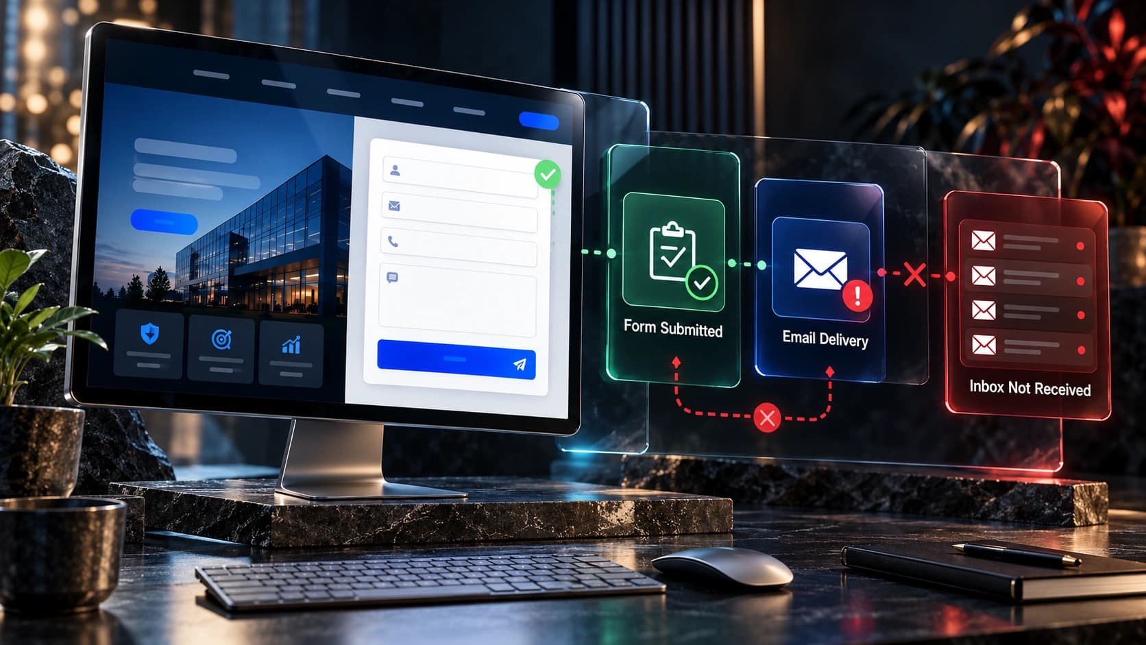
A form can display “Thank you” while the email notification fails or the CRM never receives the lead. Test the entire chain: submission, server acceptance, stored record, notification, owner assignment, and follow-up task. Submit realistic test enquiries from desktop and mobile. Confirm that the right person receives the details and that duplicate submissions are handled sensibly. Check spam filtering, inactive email accounts, automation errors, and integration permissions. Keep a reliable record of submissions in a system with appropriate security and retention settings. If the website uses a headless frontend, verify that the API integration handles errors and returns accurate user-facing feedback. A successful button click is not the same as a successful business enquiry.

8. Provide a useful thank-you experience
After a successful submission, show a confirmation that explains the next step. A dedicated thank-you page may help with analytics and customer orientation, but it should not expose private form data in the URL or be used as the only proof of success. If you offer a scheduling link, make clear whether booking is optional or required. Provide a way to return to the website, review relevant information, or contact the business if the request is urgent. Avoid immediately displaying a sales popup or asking the visitor to complete another long form. The goal is to close the loop on the action they just took. Review the confirmation page on mobile and ensure it is accessible to screen-reader users.
9. Make trust details easy to verify
A contact page is often the last place a cautious buyer visits before reaching out. Provide the company name, relevant contact information, and service coverage. If you have a physical office that welcomes visitors, show the correct address and any appointment requirements. If you work remotely, do not invent a public office address to appear more established. Real project evidence, credentials, and links to an authentic about page can support trust without overwhelming the form. Avoid fake reviews or unsupported badges. Keep legal and privacy links accessible, and make it clear how enquiry information will be used. A professional page does not need dozens of trust logos; it needs accurate information and a dependable contact process.
10. Choose the right contact methods
Some businesses need phone, email, and a form; others can operate well with a consultation form and calendar. Add channels that the company can genuinely maintain. A chat widget that never receives a reply may be worse than a clear contact form. If you use messaging apps, explain whether they are suitable for new enquiries, customer support, or urgent issues. Make sure channel choices do not fragment customer history across several unmonitored systems. For teams using a CRM, route interactions into a consistent record where appropriate. If a prospect contacts you twice, staff should understand the context rather than repeatedly asking for the same details. Channel choice should reduce friction without creating operational confusion.
11. Avoid distractions and competing promotions
The contact page has a focused purpose: help a visitor reach the business. Large carousels, unrelated blog recommendations, intrusive popups, or repeated promotional banners can interrupt that task. Keep navigation available, but do not make the form compete with several unrelated offers. If you have a legitimate free homepage mockup offer, explain it near the appropriate project-enquiry route rather than presenting it as a guaranteed result. Use visual hierarchy to distinguish the main action from supporting information. The page can still reflect the company’s brand through typography, colors, and thoughtful imagery. Visual sophistication should support comprehension, not bury the contact controls.

12. Track actual lead completions
Configure analytics around successful contact actions rather than clicks on the submit button. In GA4, the recommended generate_lead event can be used for completed lead-generation actions. Confirm that the event fires only after the form is accepted and that the CRM or inbox has the corresponding enquiry. Track important sources and landing pages where appropriate, while respecting privacy requirements. Do not count an automatically opened contact page as a lead. Review how many enquiries are relevant, contacted, and qualified. A higher form completion rate can be misleading if most submissions are spam or requests the company cannot serve. Combine website analytics with sales outcomes for a more useful picture.
13. Plan consent, spam prevention, and privacy
Collect only necessary information, explain its purpose, and link to an accurate privacy notice. Marketing consent should not be disguised as a required condition for asking a service question when it is not legally necessary. Use proportionate spam protection such as server-side validation, rate limiting, or suitable bot-detection tools, while considering accessibility and privacy impacts. Do not reveal whether a particular customer email exists in your CRM through error messages. Protect submissions in transit and at rest, restrict staff access, and define retention practices. For regulated industries, obtain appropriate professional guidance on the exact requirements. A contact page is part of a business data workflow, not merely a design component.
14. Connect enquiries to an accountable sales process
Every valid enquiry should reach a person or monitored queue. Define who responds, what information they receive, and when a follow-up task is created. If the assigned person is unavailable, the system needs a fallback. Avoid automations that send multiple contradictory messages or continue contacting people who opted out. Preserve relevant context, such as requested service and original landing page, so the salesperson can respond intelligently. Review unanswered enquiries regularly. If leads are lost after submission, redesigning the form alone may not fix the issue. The contact page and CRM should work as one reliable process, with clear responsibility for failures and exceptions.

15. Measure improvement through controlled changes
Start with a baseline: successful submissions, valid enquiries, contact rate, qualified conversations, and common form errors. Change one meaningful element at a time when practical, such as a confusing heading, unnecessary required field, or broken notification. For low-traffic websites, avoid declaring a winner after a handful of conversions. Combine quantitative data with customer feedback and observed usability issues. Review lead quality as well as volume. An experiment that produces more submissions but fewer suitable prospects may not help the business. Document what changed and when so the team can interpret results honestly. Optimization is a continuous process of identifying friction and testing solutions, not a guarantee that every new design will outperform the old one.
Contact page structure: a practical example
| Element | Purpose | What to check |
|---|---|---|
| Headline | Confirm the reason to contact | Does it identify the right service? |
| Supporting copy | Explain what happens next | Are response expectations accurate? |
| Form | Collect useful information | Are all required fields justified? |
| Alternate channel | Support different urgency or preferences | Is the channel monitored? |
| Privacy link | Explain data handling | Is the notice accurate and accessible? |
| Confirmation | Close the loop | Does a successful submission create a real record? |
This is an illustrative template, not a guarantee of a particular conversion rate. Adapt it to the real service and internal process.
Frequently asked questions
What should be on a website contact page?
A clear contact purpose, an appropriate form or contact channel, accurate company details, response expectations, and privacy information. The exact mix depends on the service.
How many fields should a contact form have?
Only the fields needed to respond usefully and route the request. Test whether additional qualification questions improve downstream lead quality.
Should I display my phone number?
Display it when phone contact is appropriate and someone can handle calls. A monitored form may be better than an unanswered number.
Does a thank-you page prove the lead was delivered?
No. Verify the record exists in the receiving system and that the correct team is notified. A visual confirmation alone cannot establish delivery.
Should I include a map?
Use a map when physical location matters to visitors. Do not imply a remote business has a public office or that customers can visit without an appointment.
Can I use a calendar instead of a contact form?
Yes, when scheduling is the right next step. Explain what the meeting is for and ensure the booking reaches the correct person.
How do I measure contact-page conversions?
Track successful submissions or completed bookings and connect them to CRM outcomes. Do not count button clicks as completed enquiries.
What if the contact form gets spam?
Use appropriate validation, rate limits, and accessible spam protection while monitoring false positives. Avoid collecting unnecessary personal information.
Next steps for your service business
Review why contact forms fail to deliver enquiries, how to write a qualified-lead service page, and why leads fail to become customers. The homepage checklist and service-business website guide cover the wider journey.
At Avenzo Digital, we design and develop websites with clear enquiry pathways. Request a consultation and ask about a free homepage mockup if you want to explore a more useful website experience. The offer is a design discussion, not a promise of sales results.