
In this guide 19 sections
To fix confusing website calls to action, make every important button describe the next step, match its destination to that promise, and give each page a clear primary action. Then test the complete journey through forms, bookings, and sales follow-up. A button that receives clicks but creates no usable enquiries has not solved the business problem.
Service businesses often lose opportunities because visitors are unsure whether they are requesting a quote, booking a consultation, starting a purchase, or downloading information. This guide explains how to diagnose that confusion and improve the experience without resorting to misleading urgency or endless popups.
The examples below are illustrative; no conversion gains are guaranteed.
Quick CTA audit checklist
- Is the action clear before clicking?
- Does the destination match the promise?
- Is there one obvious primary action?
- Does the form work on a phone?
- Are submissions actually delivered and followed up?
- Are success events measured accurately?
1. Why calls to action become confusing
A call to action, or CTA, is the point where a page asks a visitor to do something. Confusion starts when the visitor cannot predict what clicking will do. A button marked Get Started might open a pricing page, a lengthy questionnaire, or an appointment calendar. The label gives no clue. A more useful button describes the next step, such as Request a Website Estimate or Book a Discovery Call. The language should match the actual destination and the commitment required. If the first step is a free consultation, do not suggest that the user is placing an order. Review every prominent button from the perspective of someone seeing your business for the first time.
Review the language with someone unfamiliar with the business. Ask what they think will happen before they click, then compare that expectation with the real experience. This simple exercise can expose gaps that a design team has stopped noticing.
2. Audit each CTA destination before changing button colors
Make a spreadsheet with the page URL, CTA text, link target, expected visitor intent, and actual result. Click each button on desktop and mobile. Record whether it opens a new page, a modal, a calendar, an email client, or a form. Check whether the destination answers the promise. For example, if a service page offers a quote, the next screen should not begin with an unrelated newsletter signup. Include footer links, floating buttons, cards, and menu items; small secondary links can also interrupt the journey. Prioritize broken and misleading actions before visual refinements. A beautiful button cannot compensate for a broken booking workflow.
Make the action consistent across pages where it serves the same purpose, but do not copy labels blindly when the destination or customer intent changes. Consistency should support understanding rather than impose a rigid template.
3. Choose one primary action for each page
A homepage can offer several useful routes, but it should have a clear primary next step. A service page might prioritize Request a Quote while linking secondarily to relevant work. A case study may prioritize Discuss a Similar Project. A blog article might guide readers to the relevant service or consultation. A pricing page might prioritize Request a Detailed Proposal. Decide the primary action by asking what an informed visitor is reasonably ready to do after reading that particular page. Do not force a purchase-oriented button on educational content where the reader still needs information. One primary action does not mean removing all navigation; it means making the hierarchy understandable.
Write down the operational owner of the next step. A clear website invitation is only useful when the business can reliably handle the resulting enquiry and explain what happens after contact.

4. Write labels that describe the next step
Use verbs and objects that a customer can understand. Request a Project Quote is more descriptive than Submit. View Website Projects is more specific than Learn More. Schedule a Consultation is clearer than Start Your Journey. However, avoid long, cluttered labels. The best wording depends on what happens after the click, the visitor’s stage, and the service. A button labeled Get a Free Mockup should lead to a genuine mockup-request process with any limitations explained. Never use a button that implies an instant download when a salesperson must first review the enquiry.
Review the language with someone unfamiliar with the business. Ask what they think will happen before they click, then compare that expectation with the real experience. This simple exercise can expose gaps that a design team has stopped noticing.
5. Match the CTA to the content above it
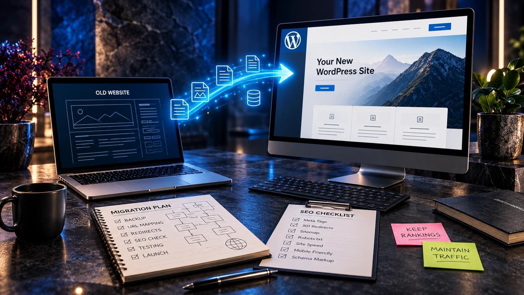
A visitor reading about website migration may be worried about preserving URLs, search visibility, and existing leads. A relevant CTA can offer a migration discussion, not a generic design package. Someone reading about website maintenance may want an audit or support consultation. The surrounding copy should make the connection explicit: explain the problem, provide a useful answer, then offer an appropriate next step. This is also important for advertisements. If the ad promises a website audit, the landing page should show how to request that audit, not silently replace the offer with an unrelated paid service.
Make the action consistent across pages where it serves the same purpose, but do not copy labels blindly when the destination or customer intent changes. Consistency should support understanding rather than impose a rigid template.
6. Make the visual hierarchy obvious without making everything loud
The primary CTA can have stronger contrast, clear spacing, and a consistent shape. Secondary links can be quieter but still discoverable. If every card contains a bright button and every section repeats a different offer, nothing stands out. Use design tokens for button sizes, typography, hover states, and focus indicators so the interface feels coherent. Check contrast against the actual background; a dark navy website may need a different treatment than a white section. Test the buttons against photographs and gradient overlays, not only on clean mockups. Avoid blinking, shaking, or other effects that distract from reading.
Write down the operational owner of the next step. A clear website invitation is only useful when the business can reliably handle the resulting enquiry and explain what happens after contact.

7. Avoid competing offers in the same decision moment
A hero with Book a Call, Download a Guide, Get a Quote, See Pricing, Start a Trial, and Get a Free Mockup gives the visitor too many choices. Some offers belong later in the page or on dedicated pages. Rank them by visitor readiness. If a free mockup is the main acquisition offer, describe what is included and place it first; let users browse projects as a quieter alternative. If an emergency service relies on phone enquiries, a visible call action may matter more. The goal is not an arbitrary number of buttons but reducing unnecessary decisions when someone is ready to act.
Review the language with someone unfamiliar with the business. Ask what they think will happen before they click, then compare that expectation with the real experience. This simple exercise can expose gaps that a design team has stopped noticing.
8. Use honest expectations next to the action
People hesitate when the next step is uncertain. Under a consultation button, explain whether the call is free, what will be discussed, and whether a confirmation email will arrive. Under a quote form, indicate which details are needed and when the business expects to respond, provided the company can meet that promise. If there is no guaranteed response window, do not invent one. For a mockup offer, clarify whether the visitor will receive a concept, an audit, or a sales consultation. Transparency filters mismatched expectations and helps the right prospects move forward confidently.
Make the action consistent across pages where it serves the same purpose, but do not copy labels blindly when the destination or customer intent changes. Consistency should support understanding rather than impose a rigid template.
9. Design mobile CTAs around actual tasks
On a phone, a visitor may want to call, send a short enquiry, or check whether the company serves their area. The button must be easy to tap, and sticky action bars must not cover form fields, consent controls, or the mobile navigation. Test small screens, landscape orientation, mobile keyboards, and zoom. Check whether the button is visible after the hero and whether the form scrolls correctly when validation fails. A fixed CTA that looks good in a screenshot can become a major obstacle when the keyboard opens. Consider the entire task, not just the button’s appearance.
Write down the operational owner of the next step. A clear website invitation is only useful when the business can reliably handle the resulting enquiry and explain what happens after contact.
10. Use accessible links and buttons correctly
Use a link when an action navigates to another URL and a button when it triggers an interaction such as opening a dialog or submitting a form. Controls should have visible focus styles, meaningful accessible names, and sufficient contrast. Avoid making several identical Learn More links without context. People navigating by keyboard or assistive technology should understand what each action does. WCAG provides testable accessibility guidance, but accessibility review should also include real interaction testing. Do not rely on color alone to distinguish the primary and secondary actions.
Review the language with someone unfamiliar with the business. Ask what they think will happen before they click, then compare that expectation with the real experience. This simple exercise can expose gaps that a design team has stopped noticing.
11. Reduce form friction after the click
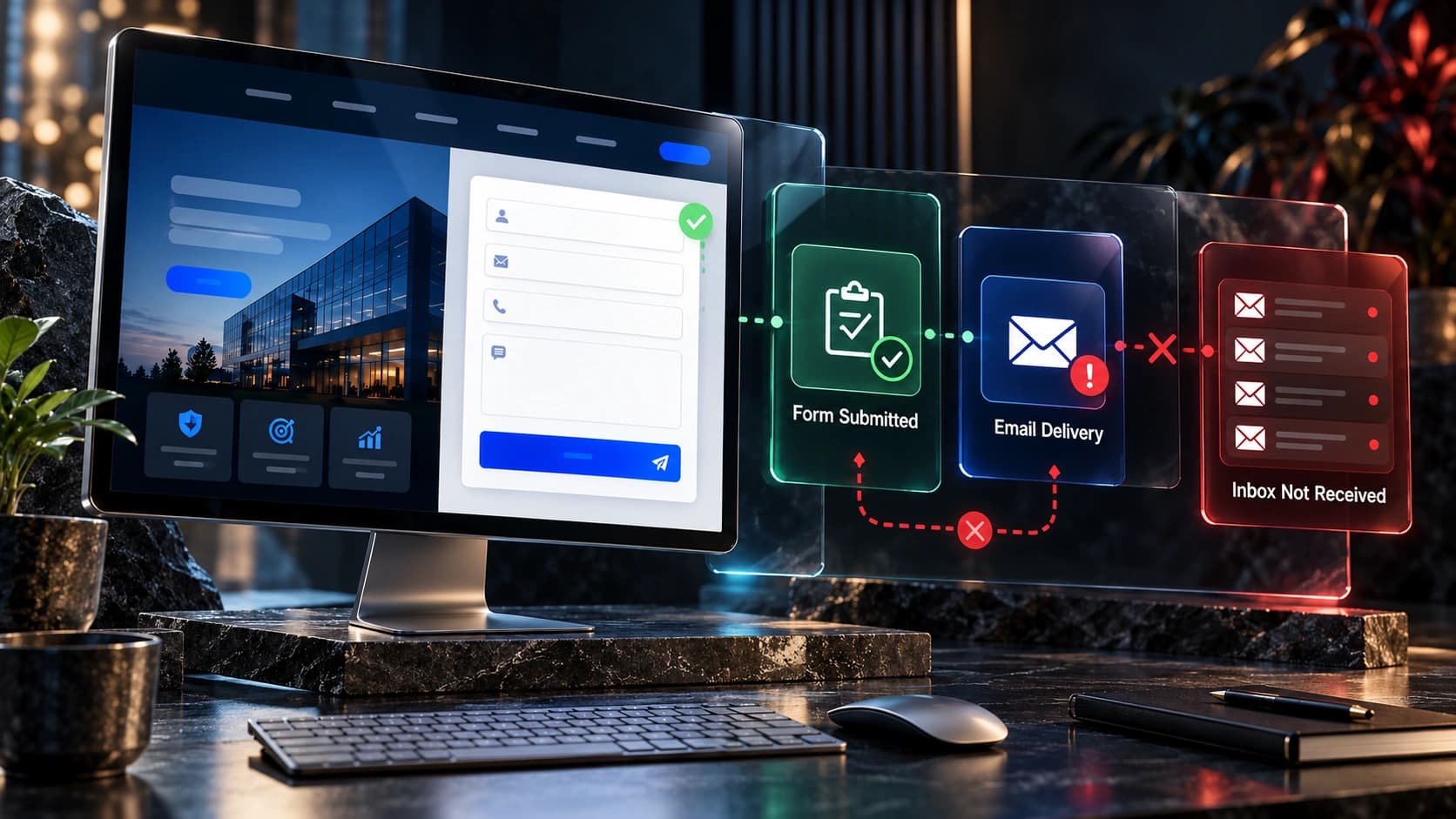
CTA optimization does not end when someone clicks. If Request a Quote opens a form asking for twenty mandatory fields, the action may feel misleading. Start with what the business needs to respond meaningfully: a contact method, relevant service, and brief project description. Collect additional detail later when appropriate. Validate inputs clearly and preserve information when errors occur. Show a genuine success message only after the enquiry is received. Check CRM routing and notifications so the form does not silently lose leads. A clicked button is not the same as a qualified enquiry.
Make the action consistent across pages where it serves the same purpose, but do not copy labels blindly when the destination or customer intent changes. Consistency should support understanding rather than impose a rigid template.
12. Track successful actions, not vanity clicks
Track the difference between CTA clicks, completed forms, booked meetings, and qualified leads. A click event helps diagnose where visitors hesitate, but it does not prove that a prospect reached your sales team. In GA4, the recommended generate_lead event can describe a completed lead action. Your CRM should separately record contact and qualification outcomes. Use a consistent event naming plan and avoid counting failed submissions as leads. Segment results by page and device when there is enough data, and review actual lead quality before declaring a button change successful.
Write down the operational owner of the next step. A clear website invitation is only useful when the business can reliably handle the resulting enquiry and explain what happens after contact.

13. Test hypotheses rather than copying a competitor
A competitor’s bright button or aggressive popup might be inappropriate for your audience. Form a specific hypothesis such as: visitors misunderstand what happens after Request a Free Audit, so adding a short explanation may improve qualified enquiries. Change one meaningful variable at a time where possible and compare a sensible observation period. For low-traffic websites, formal A/B tests may be inconclusive; qualitative feedback, usability testing, and monitoring lead outcomes can be more practical. Document what changed and what evidence supports the decision instead of declaring success based on a few clicks.
Review the language with someone unfamiliar with the business. Ask what they think will happen before they click, then compare that expectation with the real experience. This simple exercise can expose gaps that a design team has stopped noticing.
14. Practical examples for different service businesses
For a cleaning company, Request a Cleaning Estimate can lead to a form asking about property type and location. For a law firm, Request a Consultation should explain what the initial contact does and does not establish. For a B2B technology provider, Discuss Your Integration Requirements may fit better than Buy Now. For a website agency, Request a Free Homepage Mockup should explain the concept offer and required details. These are hypothetical examples, not verified performance results. The common principle is to match wording, destination, and commitment to the customer’s actual decision.
Make the action consistent across pages where it serves the same purpose, but do not copy labels blindly when the destination or customer intent changes. Consistency should support understanding rather than impose a rigid template.
15. A simple 30-day CTA improvement process
During the first week, inventory the important pages, buttons, and destinations, then repair broken links. In week two, select the primary action for each page and rewrite ambiguous labels. In week three, test mobile interactions, accessibility, form completion, and CRM delivery. In week four, review completed enquiries, lead quality, and any user feedback. Keep a change log and watch for unexpected regressions. A longer sales cycle may require more time before customer outcomes become clear. This plan is an operational sequence, not a guarantee of higher conversion rates.
Write down the operational owner of the next step. A clear website invitation is only useful when the business can reliably handle the resulting enquiry and explain what happens after contact.
CTA examples: before and after
| Vague label | Clearer alternative | Appropriate destination |
|---|---|---|
| Get Started | Request a Website Quote | Short project enquiry form |
| Learn More | See Website Redesign Services | Detailed service page |
| Submit | Send My Enquiry | Validated form submission |
| Click Here | View Completed Projects | Genuine project portfolio |
| Claim Now | Ask About a Free Homepage Mockup | Clear mockup request process |
Frequently asked questions
What is a website CTA?
A call to action is a link, button, or prompt inviting a visitor to take a meaningful next step, such as requesting a quote, viewing work, or booking a consultation.
How many CTA buttons should a homepage have?
There is no universal number. Prioritize one primary action and provide secondary routes when they help different visitors. Avoid placing competing offers in the same decision moment.
Should every page use the same CTA?
No. The next step should reflect the page’s purpose and the reader’s readiness. Service pages, educational articles, and case studies can have different appropriate actions.
Is a sticky mobile CTA a good idea?
It can be useful if it does not cover content, navigation, or form controls. Test it with the mobile keyboard, screen zoom, and different device sizes.
Does changing button color increase conversions?
Not reliably by itself. Clarity, placement, destination, trust, and the quality of the next step often matter. Evaluate changes using meaningful outcomes rather than assumptions.
Should a CTA open a popup or another page?
Either can work if it is accessible, understandable, and suitable for the task. Avoid surprising users with unrelated forms or dialogs that are hard to close.
How do I measure CTA performance?
Track clicks as diagnostic events and separately measure successful submissions, bookings, qualified enquiries, and downstream customer outcomes.
What makes a CTA misleading?
A label is misleading when it suggests a free, instant, or low-commitment action but sends users into a different process or hides important conditions.
Related guides and next steps
For broader context, read our contact page guide, homepage checklist, service-page writing guide, GA4 and CRM lead measurement guide, and mobile conversion guide.
For technical standards, consult W3C WCAG 2.2 Quick Reference, Google Analytics recommended events, and Google Search Central’s SEO Starter Guide.
Need a clearer website journey? Contact Avenzo Digital for a website consultation and ask about a free homepage mockup. We can discuss the actual service, customer journey, and lead-capture problems before recommending a redesign.