In this guide 17 sections
A growing service business needs navigation that helps visitors find the right service, understand the company and reach an appropriate contact option without guessing. The best structure is usually simple at the top level, descriptive in its labels and supported by relevant service pages, breadcrumbs and contextual internal links.
Quick answer: group pages by customer intent rather than internal departments, keep the primary menu focused, use recognizable labels such as Services, Work, About and Contact, and test whether real users can find common information on mobile. A larger website does not automatically need a larger header menu.
This guide covers navigation architecture for companies adding services, industries, case studies, locations and educational content while preserving a usable customer journey.
1. Start with the tasks visitors are trying to complete
People do not arrive to admire a sitemap. They want to find a service, check whether you operate in their area, understand your approach, see proof of relevant work, or contact the company. Navigation should reflect those tasks.
Practical implementation
List the five to eight most important visitor questions and the pages that answer them. Compare this list against current navigation labels. Remove or rename labels that make sense only to your internal team.
Illustrative example
Hypothetical scenario: A customer looking for commercial cleaning may not know whether it lives under Solutions, Capabilities or Facilities. A direct Commercial Cleaning link under Services is more predictable.
2. Choose clear top-level categories
A common service-business structure is Services, Industries or Who We Help when relevant, Our Work, About, Resources and Contact. You may need fewer items. Each category should have a distinct purpose, not become a dumping ground for every page.
Practical implementation
Write one sentence defining what belongs under each navigation category. If two categories consistently contain the same kind of content, consider combining them or changing the names.
Illustrative example
Hypothetical scenario: A web agency could group Website Design, Redesign and Development under Services; project examples under Work; and educational guides under Resources. That is easier to interpret than a menu filled with internal technology names.
3. Create service categories without hiding important pages
When a business adds many services, a flat list can become overwhelming. Group related services only when the grouping matches how customers think. Avoid nesting several levels deep unless there is a compelling reason.
Practical implementation
Use a service overview page that links to the primary individual services. Keep the highest-demand services visible and ensure every detailed page is reachable through a logical path.
Illustrative example
Hypothetical scenario: An IT provider might have Cybersecurity, Managed IT and Cloud Services as clear categories. It should not require someone to open three successive hover menus to reach a common offering.
4. Use descriptive labels rather than clever language
Navigation labels are signposts. Words such as Discover, Transform, Explore or Expertise may sound polished but give limited information about what lies behind them. Familiar labels reduce the mental work required.
Practical implementation
Replace vague headings with words that predict the destination. Ask people unfamiliar with the site what they expect each label to contain.
Illustrative example
Hypothetical scenario: A menu item labelled Our Work is easier to understand for portfolio examples than Impact Stories unless the audience has already learned that brand-specific terminology.
5. Decide whether you need a dropdown or mega menu
Dropdowns can organize moderate collections of related pages. Mega menus can help when there are many genuinely distinct categories, but they introduce layout, keyboard and mobile complexity. A simple menu is often better for smaller websites.
Practical implementation
Inventory the number and hierarchy of links. Test keyboard focus, touch interaction, pointer movement, and whether the dropdown closes unexpectedly. Avoid choosing a mega menu solely because it looks impressive.
Illustrative example
Hypothetical scenario: A firm with six services may only need a normal dropdown. A nationwide provider with dozens of service categories might benefit from a larger panel, provided it remains understandable.
6. Make mobile navigation an independent design task
A desktop navigation that looks elegant may be frustrating on a phone. Hover-only interactions do not translate well to touch. Long lists can push important links offscreen, and sticky bars can overlap menus or forms.
Practical implementation
Test opening, closing, expanding categories, following links and returning to the previous level on actual phones. Keep text readable, targets comfortable and focus visible.
Illustrative example
Hypothetical scenario: If tapping Services immediately navigates away instead of expanding the submenu, a mobile visitor may never see the nested links. Separate navigation and expansion controls where necessary.

7. Use internal links to support navigation
The header is not the only way people move through a website. Relevant links within service explanations, FAQs, case studies and articles can guide visitors toward more specific answers. Links should make sense in context.
Practical implementation
Connect each service overview to its detailed pages, link related case studies to the relevant service and give articles a useful next step. Avoid filling every paragraph with repetitive keyword links.
Illustrative example
Hypothetical scenario: An article explaining website redesign timelines can link naturally to a redesign service page and an SEO migration guide. This is more useful than a footer containing hundreds of unrelated links.
8. Plan URL structure and breadcrumbs
A readable URL helps communicate page context, but URLs should not be changed casually on an established site. Breadcrumbs can help visitors understand where they are, especially on deeper service or resource pages.
Practical implementation
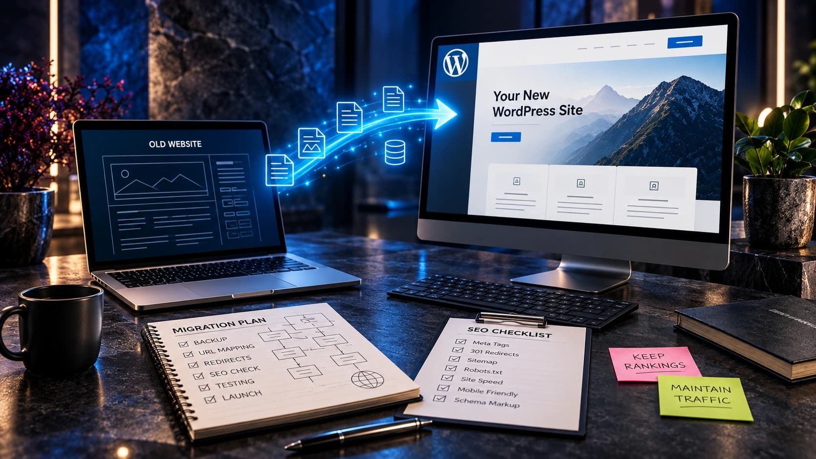
Document the preferred hierarchy and canonical URLs. If reorganizing existing URLs, map old addresses to appropriate new destinations with redirects and test internal links.
Illustrative example
Hypothetical scenario: A page moving from /services/website-design/ to /website-design/ may not need a URL change at all if users can already find it. Changing URLs for visual neatness alone can introduce avoidable migration work.
9. Separate service pages from industry and location pages
Service pages explain what you do. Industry pages explain how that service applies to a distinct customer context. Location pages explain legitimate service coverage and local details. Repeating the same copy across all three creates confusion.
Practical implementation
Give each page type a defined purpose and include unique, truthful information. Only create an industry or location page when it addresses a real audience and adds meaningful value.
Illustrative example
Hypothetical scenario: A B2B website design page might address procurement workflows and complex lead qualification. A city page should explain genuine availability and relevant local context, not simply substitute a city name into generic text.

10. Preserve access to trust information
People considering a service may want to check projects, team details, process, credentials and contact information. If these are buried or hard to find, a visitor may leave before making an enquiry.
Practical implementation
Ensure relevant proof is accessible from the homepage and service pages. Make company identity and contact options easy to find without overwhelming the primary menu.
Illustrative example
Hypothetical scenario: A buyer reading a high-value consulting service page should be able to reach an authentic case study or team page without returning to the homepage and starting over.
11. Measure whether navigation actually works
Navigation performance cannot be judged only by how modern the menu looks. Observe whether people can complete representative tasks. Search Console and analytics can provide supporting clues, but they cannot explain every failed interaction.
Practical implementation
Run short usability tests with people unfamiliar with the site. Ask them to find a specific service, confirm service coverage and request a quote. Note hesitation and wrong turns without coaching.
Illustrative example
Hypothetical scenario: If three of five test participants look under About for pricing information, investigate whether pricing context is missing from the relevant service page rather than simply adding another menu item.
12. Maintain the menu as the business grows
New pages should not automatically become top-level links. Without governance, menus accumulate redundant services, outdated campaigns and duplicate destinations.
Practical implementation
Assign ownership for navigation changes. Review the menu after major service launches, acquisitions or redesigns. Keep an inventory of important pages and check for broken links and orphaned content.
Illustrative example
Hypothetical scenario: A business adding one new service can update its service overview and internal links before deciding whether that service deserves a permanent top-level navigation item.

Implementation checklist
- Start with the tasks visitors are trying to complete: List the five to eight most important visitor questions and the pages that answer them. Compare this list against current navigation labels. Remove or rename labels that make sense only to your internal team.
- Choose clear top-level categories: Write one sentence defining what belongs under each navigation category. If two categories consistently contain the same kind of content, consider combining them or changing the names.
- Create service categories without hiding important pages: Use a service overview page that links to the primary individual services. Keep the highest-demand services visible and ensure every detailed page is reachable through a logical path.
- Use descriptive labels rather than clever language: Replace vague headings with words that predict the destination. Ask people unfamiliar with the site what they expect each label to contain.
- Decide whether you need a dropdown or mega menu: Inventory the number and hierarchy of links. Test keyboard focus, touch interaction, pointer movement, and whether the dropdown closes unexpectedly. Avoid choosing a mega menu solely because it looks impressive.
- Make mobile navigation an independent design task: Test opening, closing, expanding categories, following links and returning to the previous level on actual phones. Keep text readable, targets comfortable and focus visible.
- Use internal links to support navigation: Connect each service overview to its detailed pages, link related case studies to the relevant service and give articles a useful next step. Avoid filling every paragraph with repetitive keyword links.
- Plan URL structure and breadcrumbs: Document the preferred hierarchy and canonical URLs. If reorganizing existing URLs, map old addresses to appropriate new destinations with redirects and test internal links.
- Separate service pages from industry and location pages: Give each page type a defined purpose and include unique, truthful information. Only create an industry or location page when it addresses a real audience and adds meaningful value.
- Preserve access to trust information: Ensure relevant proof is accessible from the homepage and service pages. Make company identity and contact options easy to find without overwhelming the primary menu.
- Measure whether navigation actually works: Run short usability tests with people unfamiliar with the site. Ask them to find a specific service, confirm service coverage and request a quote. Note hesitation and wrong turns without coaching.
- Maintain the menu as the business grows: Assign ownership for navigation changes. Review the menu after major service launches, acquisitions or redesigns. Keep an inventory of important pages and check for broken links and orphaned content.
Related Avenzo Digital guides
These guides cover adjacent problems in greater detail:
- diagnosing confusing navigation
- homepage checklist
- writing effective service pages
- planning a redesign
Frequently asked questions
How many items should a main menu contain?
There is no universal number. Keep the primary menu focused on meaningful categories and test whether users can find key destinations.
Should every service appear in the header?
Not necessarily. Group related services logically and provide an accessible service overview page.
Are mega menus bad for SEO?
Not inherently. Their value depends on usable implementation, accessible links and a logical information architecture.
Should I put pricing in the main menu?
If pricing is a major buyer question and you have useful pricing information, make it easy to find; it does not always require a top-level item.
Do breadcrumbs replace the main menu?
No. They provide context and a path to parent pages but are complementary to primary navigation.
What is the best navigation for mobile?
One that works reliably with touch, keyboard and assistive technology, with readable labels and manageable submenus.
Should industry pages be grouped under Services?
Sometimes, but separate Who We Help or Industries navigation may be clearer if industry-specific information is substantial.
When should I redesign the navigation?
When the business offering or site architecture has changed, users repeatedly cannot find information, or the existing menu is technically inaccessible.
Conclusion: make the next decision easier
Start with the visitor’s actual problem, clarify the action you want them to take and verify that the business can respond properly. An effective website supports meaningful customer decisions rather than simply generating more clicks. Review the evidence, keep promises accurate and improve the experience through practical testing.
Avenzo Digital helps businesses with website design and development, website redesign and conversion-focused website improvements. Request a consultation and ask about a free homepage mockup to discuss your current website and the most useful next step. The offer is subject to an appropriate project discussion and does not guarantee sales results.