
In this guide 21 sections
Your website gets visitors. Google Analytics shows activity. Your blog posts attract readers, or your advertising campaigns are bringing people to your landing pages. But the inbox stays quiet, the phone barely rings, and quote requests are rare.
If your website gets traffic but no leads, the problem usually involves traffic quality, unclear messaging, weak trust signals, conversion friction, inaccurate tracking, or missed follow-up. More traffic cannot reliably fix those problems. You need to find where the path from visitor to customer breaks down.
This guide explains 15 practical problems that can stop a service-business website from generating enquiries, along with checks you can perform before spending money on a complete redesign.
Quick answer: Why does a website get visitors but no enquiries?
Begin with the basics: confirm your contact form works, check whether visitors are searching for your actual services, make your offer obvious, and ensure the mobile experience is usable. Then investigate trust, speed, landing-page relevance, and response time. A conversion problem is not necessarily a design problem—and a redesign is not always the first solution.
- Traffic comes from informational searches rather than people looking to buy.
- The homepage does not explain the service or target audience clearly.
- Calls to action, forms, or contact details are hard to use.
- Visitors cannot verify your experience or understand the process.
- Paid ads send users to pages that do not match the promise.
- Analytics or follow-up processes fail after a visitor submits an enquiry.
1. Your visitors aren’t looking for what you sell
A visitor researching “how to fix a leaking faucet” is different from someone searching “emergency plumber near me.” Both can appear in your analytics, but the second visitor may be closer to hiring a provider. The same distinction applies to web design, legal services, cleaning, consulting, and nearly every service business.
What to check: Open Google Search Console and review your top search queries and landing pages. Separate informational questions from searches showing commercial intent. Then compare the pages that receive visits with the pages that produce qualified inquiries. High traffic from a broad educational article does not automatically indicate a failed website.
What to improve: Build or strengthen service pages for people who are actively comparing providers, and add useful, relevant next steps to educational articles. Keep answering genuine questions without forcing every visitor to request a quote.
2. Your homepage does not immediately explain your offer
“Reimagining innovation for the future” may sound sophisticated, but it does not tell a new visitor what the company does. People often arrive with a specific task: they want a contractor, a quote, a consultation, or evidence that a provider can solve their problem.
Look at your homepage without scrolling. Can a first-time visitor identify your service, whom it is for, why it matters, and what action to take next? If those answers require detective work, your messaging needs attention.
Fix: Use a concrete headline, a supporting sentence that explains the outcome, a visible primary button, and one believable trust signal. For example, “Website design and development for service businesses” communicates far more than a vague promise to “transform your digital future.”
3. Your call to action isn’t compelling or clear
A button labeled “Submit” technically describes an action, but it does not tell someone what they will receive. “Request a Website Quote,” “Book a Consultation,” or “Get a Free Homepage Mockup” establishes a clearer expectation.
Check: Are the main buttons visible on mobile? Do different buttons lead to the same generic page? Are you asking for a meeting before explaining your process or value?
Fix: Choose one primary action for each important page, support it with relevant copy, and repeat it naturally after information that answers a buyer’s questions. Secondary actions can be available without competing visually with the main one.
4. Your enquiry form asks for too much too soon
Imagine clicking “Get a Quote” and finding a form requesting a name, address, annual revenue, detailed project scope, budget, phone, company size, start date, and several other required fields. A highly qualified visitor may abandon the form rather than spend ten minutes completing it.
Fix: Start with the information required to respond meaningfully, such as name, email, website URL where relevant, and a brief description of the need. Move detailed qualification questions to a later stage unless they are necessary to provide the service.
A shorter form does not automatically mean a better form. Measure both completion rate and lead quality so that reducing friction doesn’t create unnecessary follow-up work.
5. Your form looks functional but isn’t delivering leads
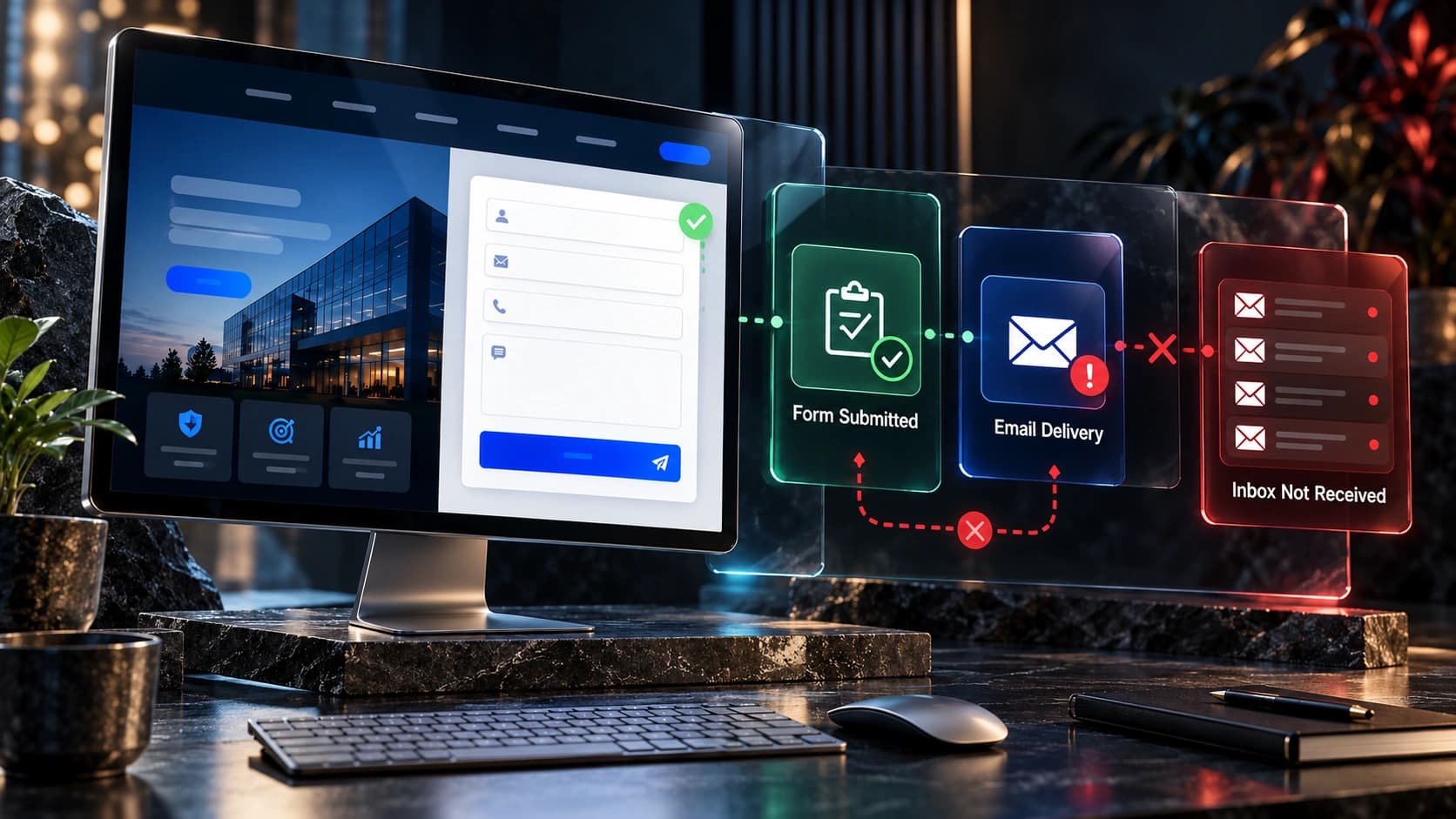
This is one of the most expensive invisible website problems. A visitor fills in every field, clicks Submit, and receives a success message—but the email notification never arrives, the CRM does not save the record, or the wrong team member receives it.
Broken integrations, spam filtering, email authentication, JavaScript errors, and outdated recipient addresses are all possible causes. The website can appear perfect while enquiries disappear behind the scenes.
Run a real test: Submit the form from a phone and a desktop computer. Confirm the visitor message, stored submission, internal notification, and CRM record. Check that the assigned employee can actually see the lead. Repeat the test after major website or plugin updates.
For detailed technical troubleshooting, read our guide on website contact forms that aren’t sending enquiries.
6. Your mobile website makes simple tasks difficult
Your desktop design may have generous spacing and attractive images, but the mobile version might show giant headings, tiny text, cropped buttons, awkward sticky banners, and contact forms wider than the screen. For a person trying to book a service during a busy day, that friction matters.
Fix: Test on actual mobile devices. Can visitors compare services, find contact details, complete a form, and tap a call button without zooming or dismissing overlapping elements? Review navigation, text size, tap-target spacing, and how images crop at narrow widths.
Google’s guidance on mobile-first indexing also reinforces the importance of having accessible, usable content on the mobile version of the site.
7. Your pages load slowly or shift while people interact
Heavy images, unnecessary JavaScript, overloaded plugins, third-party widgets, and poorly configured hosting can slow down a site. Layout shifts are equally frustrating: visitors aim for a button, then the page moves when an image or font finishes loading.
Fix: Start with your most commercially important landing pages. Use PageSpeed Insights to investigate loading, responsiveness, and stability. Compress oversized imagery, reserve space for media, and review scripts that block user interaction.
Animation itself is not the enemy. Keep motion that improves understanding while avoiding effects that delay content or interfere with controls. See Google’s Core Web Vitals documentation for the measurement framework.
8. People can’t find evidence that your business is credible
A polished website can create a positive first impression, but visitors still want reasons to trust the people behind it. Generic stock imagery, unsupported superlatives, vague service claims, and anonymous testimonials may not answer their questions.
Show authentic examples of completed work, what problems each project addressed, real customer feedback where permission has been obtained, and clear descriptions of the services you actually provide. Explain your delivery process and make it easy to verify your business information.
For Avenzo, a useful project portfolio includes real website work and explanations of development decisions, rather than claiming that design alone guarantees increased revenue. Avoid fabricated reviews or performance statistics that cannot be substantiated.
9. Visitors cannot understand the service or what happens next
Even when someone likes your business, uncertainty can stop them from reaching out. Is the consultation free? Can you redesign an existing site? Is hosting included? How does a project move from brief to launch? Must a customer already have content?
Fix: For every main service, explain who it serves, what’s included, your process, the information you’ll need, and what happens after an enquiry. If you do custom pricing, clarify the factors affecting quotes rather than forcing visitors to guess whether you’re within their budget.
Specific answers remove uncertainty more effectively than extra decorative sections.
10. Too many competing buttons create decision friction
When every part of a page shouts “Watch,” “Download,” “Subscribe,” “Chat,” “Book,” and “Get Started,” the visitor has to do more work to decide what matters. Different pathways are useful, but they need hierarchy.
Fix: Give each page a primary purpose. A service page might prioritize a quote request; a case study might lead to a relevant project consultation; a technical guide might recommend a related troubleshooting resource. Group secondary actions and avoid placing equally prominent CTAs next to each other.
Check whether the primary action is consistent between the hero, mid-page content, and closing section.
11. Your advertisements promise one thing and your landing page delivers another
Someone who clicks a Google ad for “WordPress website redesign” expects to land on a page about WordPress redesign—not a generic agency homepage with a dozen unrelated services. Likewise, an ad offering a free mockup should lead to a page explaining that offer and how to request it.
Fix: Align campaign keyword, ad copy, landing-page headline, imagery, and primary CTA. Reduce unnecessary distractions and explain the next step before asking people to share information. Monitor qualified enquiries alongside clicks and cost per lead.
For paid traffic, our guide to Google Ads landing pages that do not convert covers more specific diagnostics.

12. Your blog answers questions but gives readers nowhere useful to go
Educational articles can introduce people to your expertise, but an informational visit is rarely identical to buying intent. Readers searching for a quick WordPress fix might leave as soon as they find the answer. Readers researching redesign costs may be comparing possible providers.
Fix: Link each article to relevant service pages and next-step resources. This guide, for example, naturally connects to conversion rate optimization, website redesign, and help with broken forms. Links should help readers solve their problems, not interrupt every paragraph with a sales pitch.
Use Google Search Console to see which posts generate relevant impressions before deciding what supporting content to create next.
13. Accessibility problems prevent some people from taking action
Low-contrast text, unclear field labels, inaccessible menus, and controls that cannot be operated by keyboard can stop visitors from using important parts of your site. These barriers affect people using assistive technology, but they can also make ordinary mobile and desktop use frustrating.
Fix: Review text contrast, semantic headings, labelled inputs, clear validation messages, focus indicators, and keyboard navigation. Test with text enlargement and make informative images accessible through meaningful alternative text.
The Web Content Accessibility Guidelines provide a useful standard for planning and evaluating improvements.
14. You’re measuring visits instead of meaningful business outcomes
A dashboard showing thousands of sessions may look encouraging, but it doesn’t answer how many people successfully submitted a quote request. A tracking setup that records button clicks but not completed enquiries can make performance look better or worse than reality.
Fix: Define useful events such as successful form submissions, confirmed appointment bookings, qualified CRM leads, and completed quote requests. Distinguish those from early interactions such as scrolling or opening a contact page.
Break the results down by landing page, traffic source, campaign, and device. A smaller landing page with strong qualified lead performance may deserve more investment than a high-traffic article that reaches an unrelated audience. Our lead-generating pages tracking guide provides additional measurement ideas.
15. You lose opportunities after someone contacts you
Conversion doesn’t end when the form sends successfully. A visitor requests a quote on Monday, hears nothing for several days, and eventually books a competitor. The website did its job, but the process after it failed.
Fix: Send useful confirmations, assign enquiries to an accountable person, establish response expectations, and keep unanswered messages visible. A CRM can help with routing and reminders, but automation should support thoughtful human follow-up—not replace it with irrelevant sequences.
Measure the full process: enquiries received, enquiries contacted, qualified opportunities, proposals sent, and customers won. Otherwise, website traffic and website leads tell only part of the story.
How to diagnose your website’s lead-generation problem
Make the audit manageable rather than changing everything at once. The sequence below prioritizes failures that can directly prevent enquiries.
- Verify lead capture. Test the form, confirm notifications and CRM records, and check mobile contact links.
- Review traffic intent. Examine Search Console queries, landing pages, and whether visitors are researching or buying.
- Audit your highest-value pages. Check clarity, service relevance, trust signals, mobile usability, and CTA visibility.
- Check technical friction. Investigate speed, form validation, accessibility, and layout changes.
- Document a baseline. Record completed enquiries, qualified leads, conversion rates, and follow-up outcomes.
- Improve one priority at a time. Test a better headline, simpler form, clearer CTA, or stronger project evidence before assuming an entire rebuild is necessary.
When traffic is limited, prioritize observed user problems and practical usability testing over broad claims about statistically significant improvements. Document what changed so you can compare performance fairly.
Website redesign or conversion optimization: which do you need?
When the current platform is stable, the site is usable, and only selected pages are underperforming, focused conversion optimization may be sufficient. When the navigation, content structure, technology, and mobile experience are broadly broken, a redesign or rebuild can be the more practical long-term decision.
Keep what already works: valuable URLs, existing search visibility, useful content, reliable integrations, and functional lead capture. A redesign should solve an identified business problem rather than simply replace an older visual style. Read Website Redesign vs Rebuild for a deeper decision framework.
Frequently asked questions
Why do I have website traffic but no enquiries?
Often the visitors are not the right audience, the services aren’t clear, important trust information is missing, or the contact process is too difficult. Start by checking your forms and conversion tracking, then inspect search intent, landing-page messaging, and mobile usability.
Does more traffic automatically generate more leads?
No. Traffic that doesn’t match your services may produce few qualified enquiries. Before purchasing more traffic, confirm whether existing relevant visitors can understand your offer and contact you successfully.
Should I redesign my website if it gets no leads?
Not always. A redesign may help when the structure and customer experience are broadly poor, but a broken form, vague headline, or mismatched advertising landing page can often be fixed more directly. Diagnose the source of the problem first.
What is a good website conversion rate?
There is no universally meaningful rate for every industry. Visitor intent, traffic source, price, offer, and lead definition all influence outcomes. Evaluate qualified leads and customer results over time, not only a single percentage.
Can a shorter contact form improve conversions?
It can reduce friction when the original form asks for unnecessary information. However, fewer fields may also affect the quality of leads collected. Measure completed submissions and the number of enquiries that turn into suitable sales conversations.
How do I check whether my website form is working?
Complete a real test submission on desktop and mobile. Confirm the visitor receives feedback, the enquiry is stored, the email notification arrives, and the CRM assigns the lead correctly.
Can SEO help if my website isn’t converting?
Yes, when your SEO strategy attracts people searching for your services and your website gives them a clear next step. SEO improves discovery; page experience, trust, messaging, and follow-up determine whether that discovery develops into a business opportunity.
Turn website visits into meaningful business opportunities
It’s easy to focus on rankings, impressions, and clicks. Those metrics matter, but they’re only the start. A successful service-business website helps the right visitors understand the offer, evaluate trust, and take an easy next step.
At Avenzo Digital, we design and develop websites with clear information architecture, thoughtful customer journeys, and practical conversion goals in mind. If your site gets attention but not enough enquiries, the next move is to identify the actual point of friction.
Want to see what a clearer homepage could look like? Discuss your website and request a free homepage mockup. We can review the existing experience and help you decide which improvements are worth making first.