
In this guide 16 sections
Quick answer: To fix a slow mobile website, measure the problem first, optimize oversized images, review JavaScript and third-party widgets, improve rendering and caching, and test forms and navigation on real phones. Preserve useful features while removing unnecessary performance costs.
Why mobile website speed matters
A slow mobile website makes simple customer tasks unnecessarily difficult. Visitors may be trying to read a service description, compare examples or send a quote request while using a limited connection. Delayed content, unresponsive buttons and jumping layouts create friction before the business can even explain its offer. The solution is not to delete every photograph, animation or useful feature. It is to identify which resources and interactions are responsible for the delay and improve them deliberately. This guide shows business owners and developers how to diagnose loading problems, prioritize repairs and confirm that a faster page still works as intended. Performance metrics help explain technical behavior, but the final test is whether real users can complete important tasks. Avoid claims that any single speed score guarantees higher search rankings or sales.
Start with a baseline rather than guessing
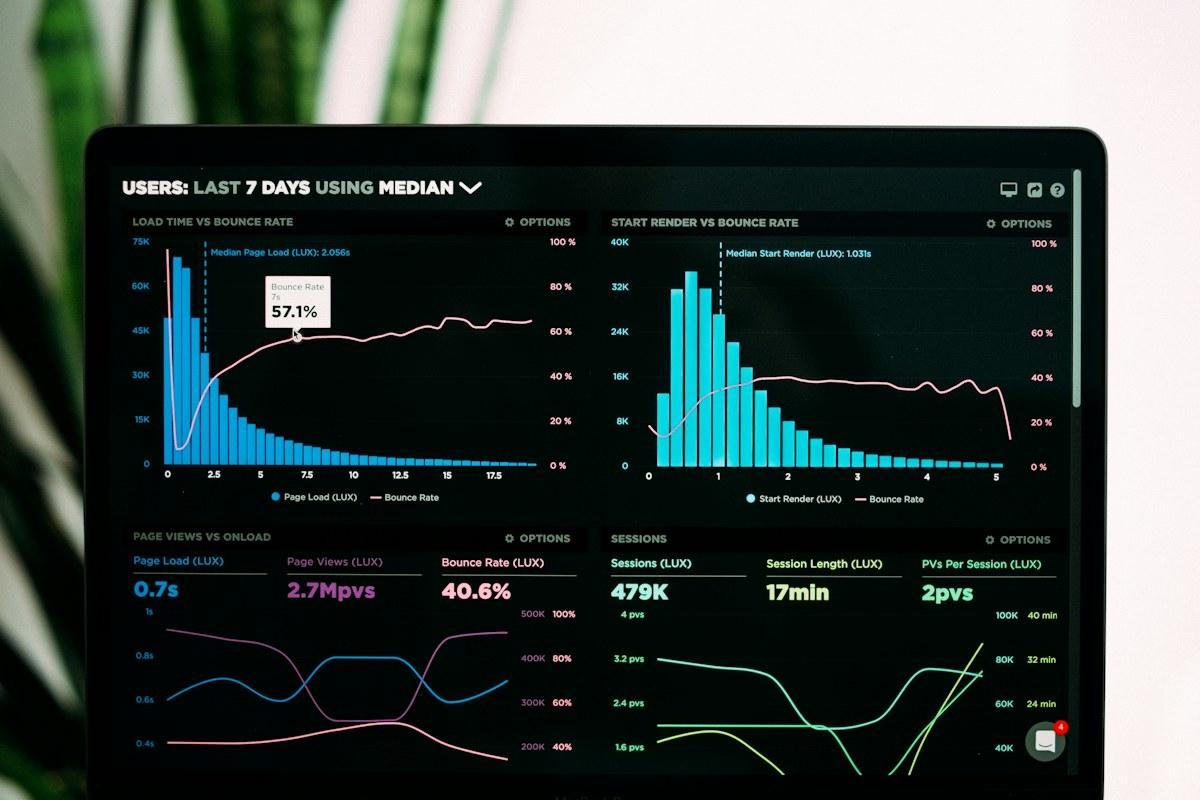
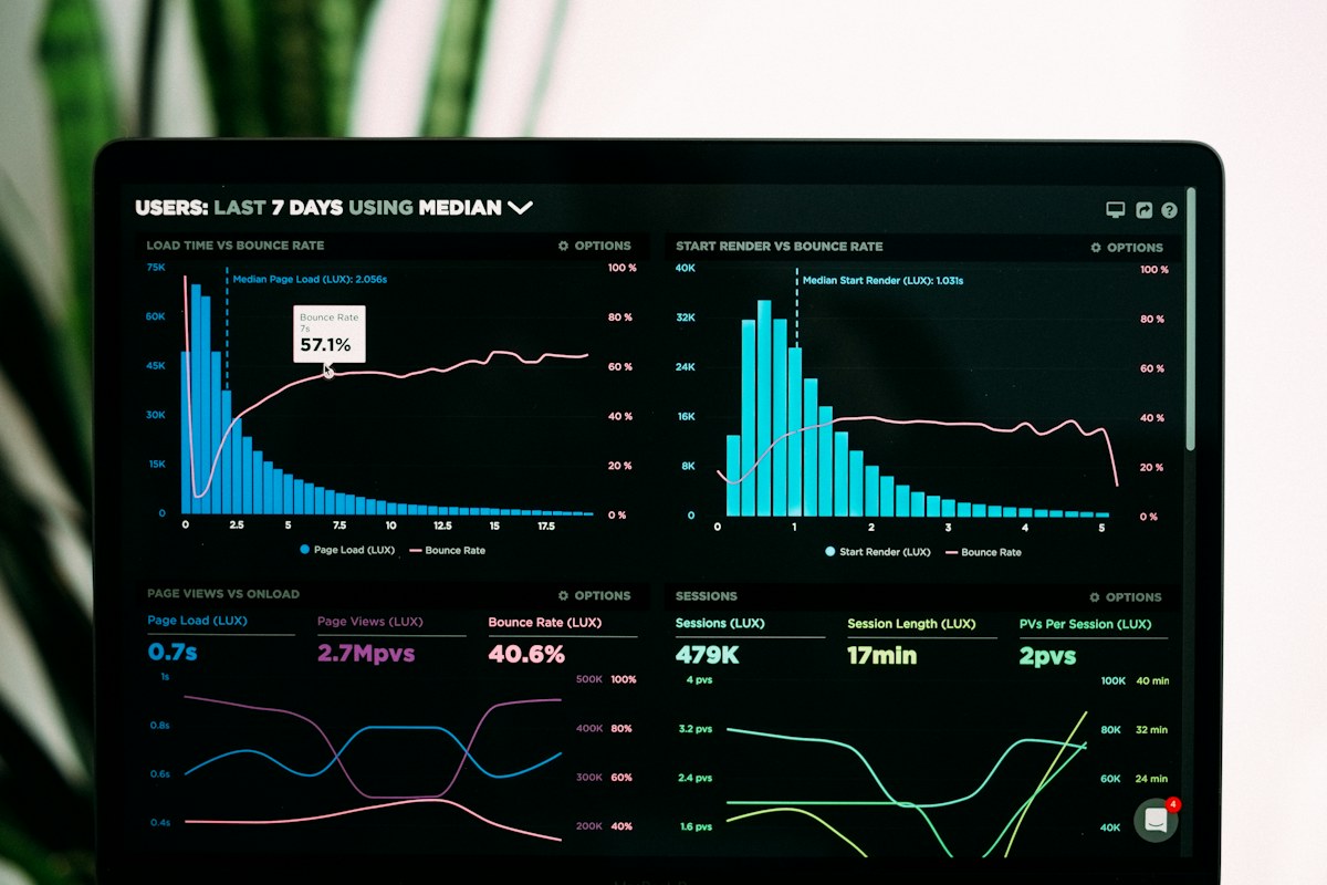
Choose representative pages: the homepage, a high-traffic service page, a blog article and the contact page. Test both mobile and desktop, because the bottlenecks can differ. Record current performance and user-facing symptoms before making changes. Google’s PageSpeed Insights can provide lab diagnostics and, where available, field data. Do not assume one test run represents every visitor. Results vary with connection quality, device, cache state and server conditions. Also use browser developer tools or other diagnostics to identify large resources, long-running scripts and slow network requests. Record whether the page is slow to display meaningful content, slow to respond to taps, or visually unstable. These are different problems with different fixes. A simple before-and-after worksheet prevents the team from claiming success because one metric improved while the contact form became less usable.
Understand LCP, INP and CLS
Google’s Core Web Vitals describe three important aspects of experience. Largest Contentful Paint (LCP) measures when the main visible content is rendered. Interaction to Next Paint (INP) assesses responsiveness to user interactions. Cumulative Layout Shift (CLS) describes unexpected movement of visible elements. Google’s Web Vitals documentation explains the metrics and their interpretation. A page might load its hero quickly but still feel broken when a menu button takes too long to respond. Another page might respond quickly but move its form downward as fonts and images arrive. Do not optimize only one number. Identify which metric matches the actual customer complaint, then inspect the likely causes. These measurements are valuable signals, not a complete accessibility, usability or conversion audit.
Fix oversized images before removing useful content
Photographs and large background images are common contributors to unnecessary mobile downloads. Inspect the actual dimensions served to a phone. A card displayed at a few hundred pixels wide generally does not need the same original file used for a large desktop banner. Generate responsive image variants, choose appropriate formats and compress with visual quality in mind. Use the HTML srcset and sizes approach where supported so the browser can select a suitable resource. Google’s image guidance explains responsive delivery. Keep important portfolio details legible; excessive compression can make screenshots and fine text unusable. Review the largest image on the page first, then repeated card thumbnails and blog media. A well-optimized authentic project photograph is usually more valuable than replacing it with an irrelevant generic placeholder simply to improve a synthetic score.
Prioritize the main visible image correctly
Not all images should load at the same time. Below-the-fold images can often be lazy-loaded, reducing initial network work. But lazy-loading the hero image that contributes to LCP can delay the very content the visitor is waiting for. Inspect which element is identified as the largest visible content and whether it is discovered early. In some implementations, a preload or appropriate fetch priority can help the browser retrieve the important asset sooner, but those optimizations should be measured rather than applied to every image. Avoid making a large decorative video the primary hero asset when a smaller still image would communicate the offer just as well. If the design depends on a video, provide a sensible poster and consider whether playback should begin only after the important content is ready. Test the actual page after each change.
Reduce unnecessary JavaScript and third-party scripts
Websites often accumulate chat widgets, analytics tags, popups, tracking pixels, heatmaps, animation libraries and embedded tools. Each may have a legitimate purpose, but together they can increase download, parsing and execution work. Audit which scripts are actually used and which business team owns them. Remove abandoned tools, prevent duplicate analytics installations and delay nonessential widgets where practical. Be careful with tag managers: moving scripts into a tag manager does not automatically make them free to execute. Check whether scripts block the main thread or interfere with interaction. On a Next.js website, inspect client-side components and avoid sending unnecessary JavaScript for static content. On WordPress, audit plugins and their front-end assets. Do not remove consent management, security features or business-critical integrations simply to improve a score without understanding the consequences.

Avoid heavy animations that block useful interactions
Motion can make a site feel polished, but complex entrance sequences, scroll listeners and repeated blur effects can make mobile navigation feel sluggish. Prefer effects that support comprehension and run smoothly on representative devices. Avoid delaying the headline, service explanation or contact button until a long animation completes. Respect reduced-motion preferences where appropriate. If a hero animation is slow, investigate its implementation and loading sequence rather than removing all movement across the website. Test whether cards remain readable while animating and whether controls can be tapped before the animation finishes. A well-designed interaction should remain useful even if the animation does not play. Ask whether each effect contributes to the visitor’s understanding of the service. If it exists only as decoration and imposes measurable cost, simplify it.
Control font loading and layout shifts
Custom web fonts can improve brand consistency but can also delay text or cause visible movement when a fallback font is replaced. Limit unnecessary font families, weights and variants. Use appropriate font-loading behavior and consider metric-compatible fallback fonts where feasible. Test whether headlines wrap differently after the custom font loads. Reserve space for images, embeds and dynamic content so they do not push buttons or forms around unexpectedly. A floating promotion bar that appears after the visitor starts reading can be particularly disruptive on mobile. CLS is not only a technical score; it can cause people to tap the wrong element. Review the page with a slow connection and a fresh cache to reveal shifts hidden during normal office testing. Keep body text readable and accessible rather than shrinking typography to make everything fit.
Check server response, caching and hosting
Sometimes the main delay occurs before the browser can begin rendering content. Review server response times, origin performance, cache behavior and expensive backend requests. A content delivery network can help deliver static assets closer to visitors, but it does not fix a slow database query or an overloaded application server. On a headless WordPress and Next.js architecture, examine the content-fetching and rendering strategy: static generation, revalidation and dynamic rendering have different trade-offs. Avoid rebuilding every page dynamically when content rarely changes, unless the business requires it. On traditional WordPress, evaluate page caching, database health and plugin overhead. Confirm that caching does not break forms, personalization or frequently updated information. Performance improvements should preserve correct functionality, security and content freshness.

Make mobile navigation and forms feel responsive
Speed is not only the time until the first image appears. A mobile visitor needs a menu that opens reliably, a form that responds to input and a confirmation that explains whether the enquiry was received. Test taps, validation errors, dropdowns and submission behavior under realistic network conditions. Avoid loading a large calendar or chat interface before the visitor asks to use it if a lightweight entry point would suffice. Ensure form labels remain visible and error messages are understandable. Do not record a successful lead event simply because someone clicked Submit. Verify that the server or CRM actually accepted the request. A fast page with a broken form is not a successful business website. For deeper lead-path diagnostics, read why website leads fail to become customers.
Optimize CSS without breaking the design system
Large stylesheets and unused component styles can add overhead, especially on sites that have gone through several redesigns. Audit which CSS is required for initial rendering and which styles belong to pages or components not currently in use. Keep critical layout and typography stable while the rest of the page loads. Avoid broad, untested CSS deletions that silently break mobile spacing or forms. If a framework or page builder generates substantial CSS, inspect its optimization settings and test representative templates after changes. A shared design system can help keep code manageable, but it should not force every page to load resources for every possible component. Check the actual deployed output rather than assuming the source files tell the whole story. Visual regression screenshots can help detect unintended differences between before and after.
How to test performance changes safely
Work in a staging environment or controlled branch whenever possible. Make one meaningful category of change at a time, such as responsive image delivery or script deferral, then compare the same pages and user tasks. Record lab metrics and, when available, field measurements over a suitable period. Field data reflects real visitor conditions and may not change immediately after deployment. Inspect contact submissions, navigation, tracking and content after every significant optimization. If a script is deferred, verify that dependent components still initialize correctly. If images are lazy-loaded, confirm they appear when scrolling and do not cause layout shifts. Keep a rollback path for changes that introduce functional problems. The best optimization is one that improves the experience without sacrificing features customers actually need.

Prioritize fixes by impact and effort
Start with problems that affect important pages and real user tasks. A massive homepage image may be a quick win if it can be resized without losing quality. A complex CRM integration might require careful engineering and should not be disabled merely to reduce JavaScript. Build a simple priority list with the issue, affected pages, observed symptom, expected benefit, risk and owner. Fix broken interactions and major loading bottlenecks before spending days shaving tiny amounts from already acceptable resources. Consider traffic and business importance: a slow quote page may deserve attention ahead of an obscure archive. But do not ignore accessibility or security just because a page has low traffic. Review the list after each improvement, because the dominant bottleneck can change once the first one is resolved.
A practical mobile performance checklist
Review the largest image and responsive variants. Check whether the hero image is loaded at the right priority. Audit third-party scripts and duplicate tags. Inspect JavaScript execution and interaction delays. Reduce unnecessary animation work. Verify font loading and reserve layout space. Check server response and cache behavior. Test menus, contact forms and booking interactions on real phones. Compare representative pages under consistent conditions. Confirm analytics and lead routing still work after optimization. Review Core Web Vitals without treating them as the only measure of quality. Finally, document what was changed, what improved and which issues remain. This makes future maintenance easier and prevents a new design or plugin from quietly undoing the performance work.
Frequently asked questions
Why is my website slow only on mobile?
Mobile devices and connections often have different resource and processing constraints. Large images, JavaScript, fonts, network latency and responsive layout behavior may expose problems that are less obvious on desktop.
Does PageSpeed Insights show the exact experience of every visitor?
No. Lab tests are controlled diagnostics, while available field data reflects aggregated real-user conditions. Use both alongside task testing.
Should I remove all website animations?
No. Keep useful, accessible motion and simplify effects that block content, consume excessive resources or make controls difficult to use.
Should every image be lazy-loaded?
No. Images below the fold are often good candidates, but lazy-loading the main visible hero image can delay important content.
Will a CDN fix a slow website?
A CDN may improve static asset delivery, but it cannot automatically repair inefficient scripts, slow backend operations or broken interactions.
Does a perfect speed score guarantee more leads?
No. Lead generation also depends on traffic relevance, service clarity, trust, usable forms and follow-up.
What should I optimize first?
Identify the largest bottleneck on an important page and verify it against real user tasks. Common starting points include oversized images and unnecessary scripts.
Can I optimize a Next.js or WordPress site without redesigning it?
Often yes. Many improvements involve assets, rendering, caching, scripts and component behavior rather than changing the visual design.
Improve mobile speed without sacrificing your website’s purpose
At Avenzo Digital, we approach performance as part of a usable website experience. Explore our website development services, mobile conversion guide, redesign versus CRO guide and design mistakes checklist. To discuss your website, request a consultation and ask about a free homepage mockup. A visual mockup is a starting point for discussion, not a guaranteed performance result.