
In this guide 7 sections
A small business website can look polished and still drive potential customers away. People may struggle to identify the service, find a relevant example, understand the next step, or complete a contact form. The solution is not necessarily a complete redesign: identify where visitors get confused and fix the experience systematically.
Quick answer: The most damaging website design mistakes are unclear offers, confusing navigation, weak mobile usability, slow pages, unconvincing proof, and unreliable contact paths. Fix the problems that prevent a qualified visitor from understanding your service or contacting your team before adding more decoration.
The 15 mistakes below are common diagnostic patterns, not a ranked list based on invented research. Each includes a symptom, a practical correction and a way to test whether the correction helps. Examples are hypothetical and do not represent actual client results.
15 Website Design Mistakes That Make Small Businesses Lose Customers: detailed checks
1. A headline that never says what you do
What goes wrong: Visitors see slogans such as “Empowering tomorrow” but cannot identify whether you offer accounting, cleaning or web development.
How to improve it: Write the service and target audience in the first headline. Use the supporting line to explain the specific problem solved and any important scope limits. Avoid making changes solely because a competing site uses a particular layout. Match the implementation to your actual visitors and offer.
How to check: Ask someone unfamiliar with your business to look at the page briefly and describe the service in their own words. Document the original behavior and compare it with the revised experience before attributing improvements to the design.
2. Too many competing calls to action
What goes wrong: The hero presents five buttons with similar visual weight, so visitors cannot tell whether they should call, book, shop or download.
How to improve it: Choose one primary action aligned with the page’s purpose. Provide a secondary route only when it serves a different legitimate intent. Avoid making changes solely because a competing site uses a particular layout. Match the implementation to your actual visitors and offer.
How to check: Review CTA clicks alongside successfully completed actions; a click without a working next step is not success. Document the original behavior and compare it with the revised experience before attributing improvements to the design.
3. Navigation organized around internal jargon
What goes wrong: Menus say “Solutions Ecosystem” or “Our Methodology” when customers are searching for specific services.
How to improve it: Use labels customers recognize. Group related services logically and make contact and completed work easy to find. Avoid making changes solely because a competing site uses a particular layout. Match the implementation to your actual visitors and offer.
How to check: Ask prospective users to locate a particular service without instructions, on desktop and mobile. Document the original behavior and compare it with the revised experience before attributing improvements to the design.

4. A mobile hero that hides the offer
What goes wrong: A huge image, animation or excessive top padding pushes the headline and contact action far below the first screen.
How to improve it: Adapt the layout to small screens rather than shrinking the desktop version. Keep meaningful copy legible and images properly cropped. Avoid making changes solely because a competing site uses a particular layout. Match the implementation to your actual visitors and offer.
How to check: Inspect real phones in portrait mode and check whether the visitor can identify the service without scrolling extensively. Document the original behavior and compare it with the revised experience before attributing improvements to the design.
5. Low-contrast text and undersized typography
What goes wrong: Elegant pale-gray body text on a light background becomes tiring to read, especially in long service descriptions.
How to improve it: Use readable sizes, clear line spacing and sufficient contrast. Make headings visually distinct without using oversized text everywhere. Avoid making changes solely because a competing site uses a particular layout. Match the implementation to your actual visitors and offer.
How to check: Check key pages against WCAG contrast guidance and test text resizing and keyboard focus. Document the original behavior and compare it with the revised experience before attributing improvements to the design.
6. Slow, unstable pages overloaded with effects
What goes wrong: Large images, video backgrounds and third-party scripts delay meaningful content or cause buttons to shift while loading.
How to improve it: Compress and size images, reserve space for media, and remove unnecessary scripts. Preserve animations that genuinely help comprehension. Avoid making changes solely because a competing site uses a particular layout. Match the implementation to your actual visitors and offer.
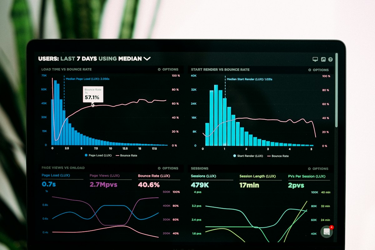
How to check: Use real-user performance data where available and inspect Core Web Vitals, including LCP, INP and CLS. Document the original behavior and compare it with the revised experience before attributing improvements to the design.
7. Stock photos presented as company evidence
What goes wrong: A generic handshake image appears beside a claim about a completed project, leaving the visitor unsure what the company actually did.
How to improve it: Use genuine project photographs, screenshots and documented deliverables for proof. Keep stock photos as editorial illustration, not testimonials. Avoid making changes solely because a competing site uses a particular layout. Match the implementation to your actual visitors and offer.
How to check: Review every proof image and caption for accurate attribution and whether it depicts the claimed work. Document the original behavior and compare it with the revised experience before attributing improvements to the design.
8. Service pages that never explain deliverables
What goes wrong: A page repeats “premium solutions” but never states what is included, who the service fits or what affects cost.
How to improve it: Explain scope, common use cases, process, boundaries, prerequisites and relevant FAQs in direct language. Avoid making changes solely because a competing site uses a particular layout. Match the implementation to your actual visitors and offer.
How to check: Compare recurring sales questions with page content and note which misunderstandings decrease. Document the original behavior and compare it with the revised experience before attributing improvements to the design.
9. A contact form with unnecessary friction
What goes wrong: A first-time visitor must complete a lengthy questionnaire, create an account or provide information not needed to respond.
How to improve it: Ask for the minimum useful details and provide a reasonable alternative such as a phone number or consultation link. Avoid making changes solely because a competing site uses a particular layout. Match the implementation to your actual visitors and offer.
How to check: Measure successful form completion and downstream lead suitability rather than form submissions alone. Document the original behavior and compare it with the revised experience before attributing improvements to the design.
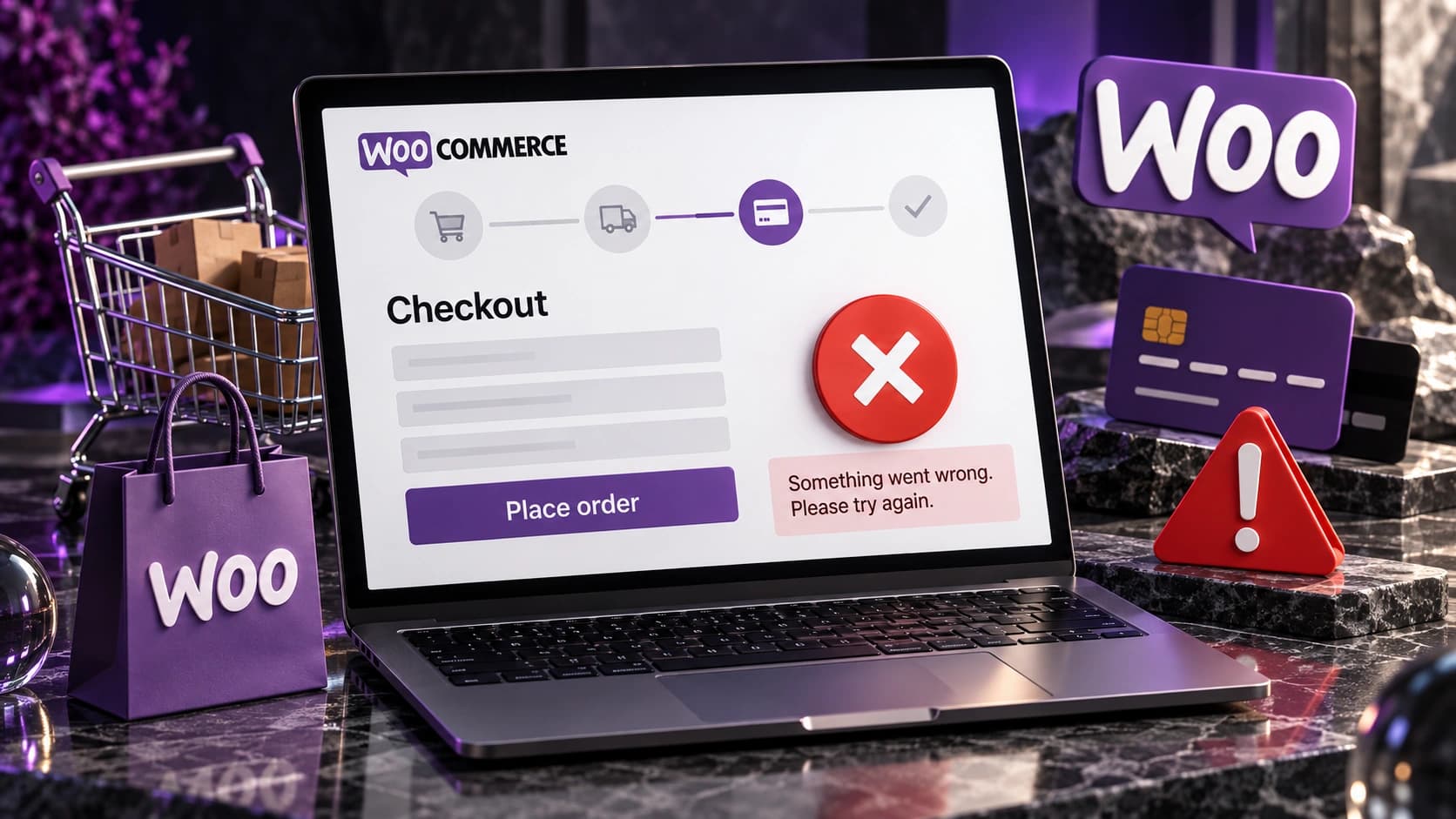
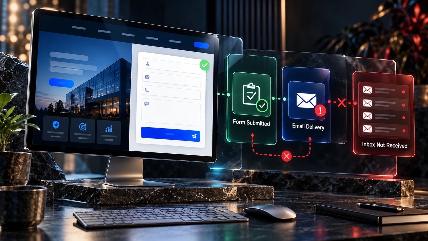
10. Forms that silently fail after submission
What goes wrong: The success message appears, but the email notification is blocked or the CRM assigns the enquiry to an inactive owner.
How to improve it: Test storage, notification, assignment and follow-up as one journey. Provide a clear confirmation and realistic response expectations. Avoid making changes solely because a competing site uses a particular layout. Match the implementation to your actual visitors and offer.
How to check: Submit monitored test leads and verify receipt in the correct sales queue. Document the original behavior and compare it with the revised experience before attributing improvements to the design.

11. No explanation of the next step
What goes wrong: Visitors do not know whether a quote request creates an obligation, how long the process takes or who will respond.
How to improve it: Explain what happens after submission, whether a consultation costs money and what information the team will need. Avoid making changes solely because a competing site uses a particular layout. Match the implementation to your actual visitors and offer.
How to check: Review whether prospects ask the same process questions repeatedly after submitting. Document the original behavior and compare it with the revised experience before attributing improvements to the design.
12. Unverified claims and vague testimonials
What goes wrong: The page announces “number one” status, guaranteed results or anonymous five-star praise without evidence.
How to improve it: Replace unverifiable superlatives with authentic credentials, consented reviews and detailed project descriptions. Avoid making changes solely because a competing site uses a particular layout. Match the implementation to your actual visitors and offer.
How to check: Audit each factual claim and remove any that the business cannot substantiate. Document the original behavior and compare it with the revised experience before attributing improvements to the design.
13. Ignoring local or industry relevance
What goes wrong: A service company serves specific areas or industries, but visitors cannot establish whether they qualify.
How to improve it: Explain actual coverage, service eligibility and relevant industry experience without producing thin duplicate city pages. Avoid making changes solely because a competing site uses a particular layout. Match the implementation to your actual visitors and offer.
How to check: Track enquiries that fall outside the service area and ask why visitors misunderstood availability. Document the original behavior and compare it with the revised experience before attributing improvements to the design.

14. A design that obscures prices and scope
What goes wrong: A buyer receives a quote far beyond expectations because the page never distinguished a basic package from custom work.
How to improve it: Explain price factors, exclusions, deliverables and when a tailored quote is required. Avoid fabricated price ranges. Avoid making changes solely because a competing site uses a particular layout. Match the implementation to your actual visitors and offer.
How to check: Review lost-deal notes for repeated scope or budget misunderstandings. Document the original behavior and compare it with the revised experience before attributing improvements to the design.
15. No testing after launch
What goes wrong: A website is approved visually but no one tests navigation, form validation, analytics, redirects or mobile layout.
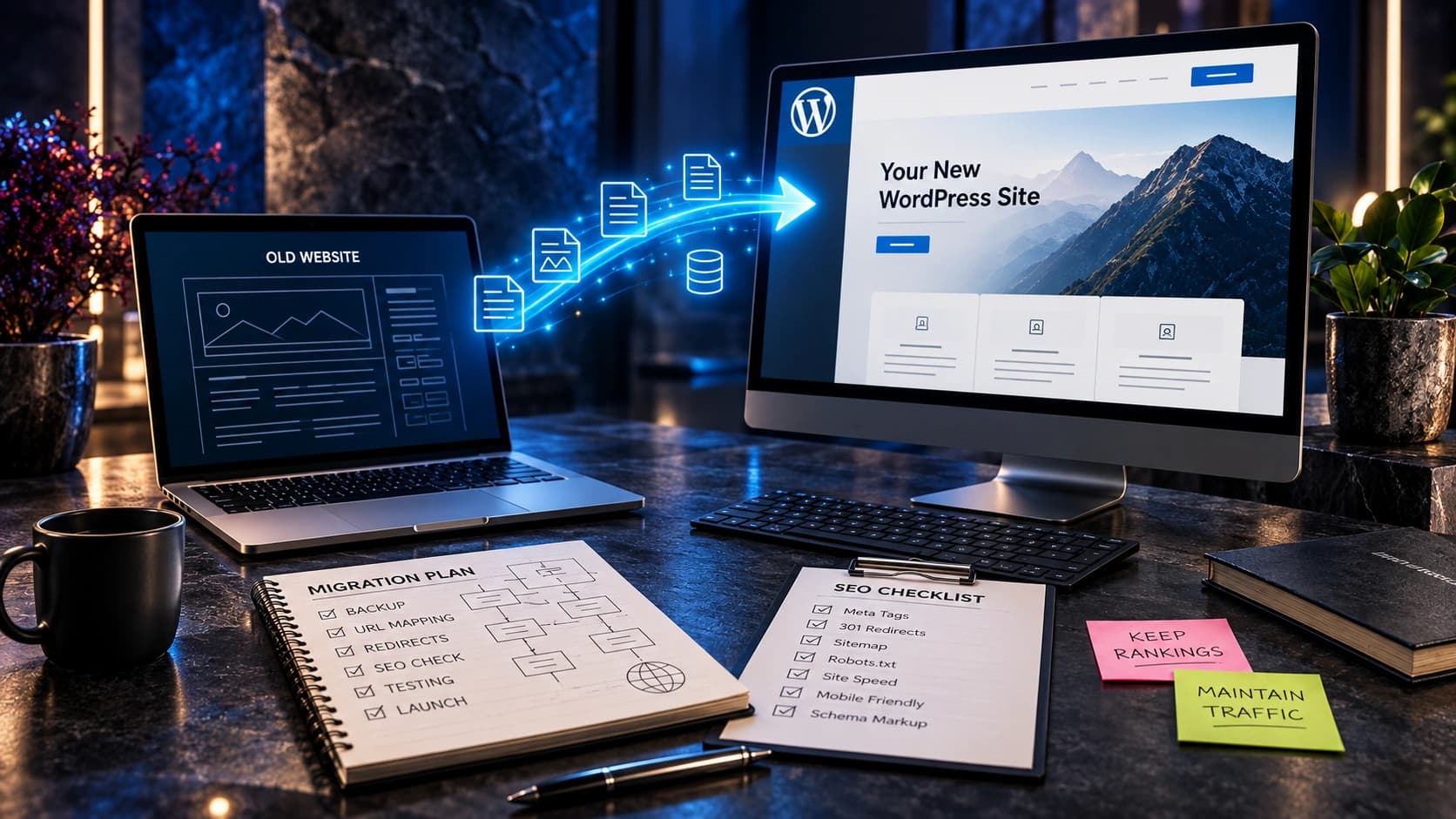
How to improve it: Create a launch checklist with accountable owners and a rollback plan. Test the actual production domain after deployment. Avoid making changes solely because a competing site uses a particular layout. Match the implementation to your actual visitors and offer.
How to check: Review real form records, error logs and customer feedback after launch rather than assuming a successful deploy means a working site. Document the original behavior and compare it with the revised experience before attributing improvements to the design.
How to prioritize the 15 fixes without wasting your budget
Start with failures that directly prevent a customer from acting: inaccessible navigation, broken contact forms, unreadable mobile content, and misleading service information. Next, address the questions visitors need answered before they can make a confident decision. Finally, refine visual details that improve coherence without delaying the page or distracting from the service.
Consider a hypothetical local cleaning company with 30 enquiries each month. Its mobile form fails on one popular device, its service area is unclear, and its hero photograph is slightly dated. The broken form and unclear coverage should come first because they affect whether relevant visitors can enquire. Replacing the photograph might still be useful, but it should not take precedence over operational failures.
Keep the original measurement baseline and review results by acquisition source. A change that increases generic enquiries but reduces qualified ones is not automatically an improvement. For more diagnosis, read why websites get traffic without leads, redesign versus CRO, and why leads may not become customers.
How to measure whether the changes are helping
Do not judge a change by aesthetics alone. Define a clear outcome before implementation: completed enquiries, qualified consultations, successfully delivered forms, or visitors finding the appropriate service. Review the source and intent of traffic, device type, and whether the sales team actually receives and follows up on leads. Small sample sizes can make week-to-week differences misleading; avoid declaring a winner based on a handful of enquiries.
Google Analytics 4 provides recommended events such as generate_lead for completed enquiries, but a tracked event is not proof of a sale. Use your CRM to verify lead quality and eventual outcomes. Consult Google’s event reference and the Google SEO Starter Guide for technical guidance.
A practical implementation checklist
- Record the current customer journey and actual points of confusion before making changes.
- Prioritize issues affecting clarity, accessibility, lead delivery, and trust.
- Write the proposed replacement content in customer language before finalizing visuals.
- Test on real phones and desktops, including keyboard navigation and slow connections.
- Submit test forms and confirm that notifications and CRM ownership work.
- Measure qualified enquiries and review the results with the people who handle sales.
- Keep a dated change log and reverse changes that demonstrably harm the experience.
Accessibility is not a cosmetic enhancement. Review form labels, focus states, readable text, semantic headings and understandable error messages against the W3C Web Content Accessibility Guidelines.
Frequently asked questions
Which website design mistake should I fix first?
Start with any broken contact path or a page that does not explain your service. Then prioritize mobile usability, navigation and trust based on actual user evidence.
Do I need a full redesign to correct these mistakes?
Not always. Targeted changes may be enough when the underlying site is stable. A rebuild is more reasonable when major structural and technical issues affect many pages.
Can a slow website reduce enquiries?
A slow or unstable experience can interfere with navigation and form completion. Measure the actual problem before assuming speed is the only cause.
Are stock photos bad for small business websites?
Not inherently. They can illustrate concepts, but should not be represented as client work, company staff or evidence of a claimed result.
How can I tell whether my CTA is working?
Track successful completions and qualified enquiries, not just button clicks. Test the destination and the notification workflow.
How many services should appear in the navigation?
Enough to help visitors find what they need without overwhelming them. Group services according to customer understanding, not internal departmental structure.
What should I test on mobile?
Navigation, reading comfort, media cropping, sticky elements, keyboard behavior, form errors and successful submission.
What is the biggest trust mistake?
Presenting claims that cannot be verified. Specific authentic work and transparent company information are more useful than generic awards or unsupported promises.
What Avenzo Digital can help with
At Avenzo Digital, we build and improve websites for service businesses. Our work includes website design and development, redesign and conversion-focused improvements. We do not promise a particular number of leads or sales: the appropriate work depends on your visitors, offer and sales process.
Want to discuss the current website? Request a consultation and ask about a free homepage mockup. Share your existing website and what you want customers to do so the discussion can focus on a useful next step.