
In this guide 20 sections
A small-business website accessibility checklist should cover keyboard navigation, meaningful headings, readable text, sufficient contrast, image alternatives, accessible forms, predictable interactions, and testing with assistive technology. These are practical starting points for making a website usable by more people. They do not by themselves establish legal compliance or guarantee that a website meets every requirement of the Web Content Accessibility Guidelines (WCAG).
Accessibility is not an optional decorative layer added after design. Customers may use a keyboard instead of a mouse, magnify content, rely on a screen reader, navigate on a small device, or need extra time to read and complete a form. A website that prevents these tasks can lose enquiries even when its visuals look polished. For service businesses, that problem can affect people trying to understand services, read prices, request quotes, or schedule appointments.
This guide explains how to evaluate the most important customer journeys, prioritize issues, and work with a developer to make improvements. It uses WCAG 2.2 as a technical reference, with links to W3C’s primary guidance. Requirements vary by location and type of organization; seek qualified legal advice when you need a jurisdiction-specific compliance assessment.
What website accessibility means in everyday business terms
An accessible website makes essential information and actions available to people with different abilities, technologies, and preferences. A person should not have to use a mouse to open the navigation, identify an input field only by its placeholder, or guess why a contact form failed. A visitor who enlarges the text should still be able to read the content without important information disappearing.
The W3C organizes accessibility around four principles: content should be perceivable, operable, understandable, and robust. These principles help explain why accessibility involves more than color contrast. A high-contrast button is still unusable if a keyboard user cannot reach it; a form label is not useful if the error message cannot be associated with its field.
Read the official WCAG 2.2 Recommendation and the W3C’s Introduction to Web Accessibility before translating criteria into a project checklist.
Start by mapping the tasks visitors must complete
Audit journeys, not just pages. For a local service company, those journeys might be finding a service area, reading a service description, opening the menu, contacting the team, and submitting a quote request. A B2B agency may add case-study browsing, calendar booking, document downloads, and interactive project filters.
Write each journey as a sequence of actions. Then test it using only the keyboard, at increased browser zoom, and with at least one screen reader where possible. Record the exact step at which the journey becomes difficult. This approach exposes barriers that automated scanners may miss, such as a calendar widget that opens but cannot be closed without a mouse.
Assign issues according to impact: a blocked quote form is more urgent than a decorative icon with a minor description problem. Prioritization should still consider the number of people affected and the effort needed to repair the underlying component.

1. Make the entire website usable with a keyboard
Unplug the mouse or avoid the trackpad and use Tab, Shift+Tab, Enter, Space, and arrow keys where appropriate. Can you open the menu, move between links, activate buttons, complete fields, dismiss overlays, and submit a form? If the answer is no, identify the component responsible.
Keyboard focus should be visible. A visitor must be able to tell which link, button, or field is active. Avoid removing focus outlines unless replacing them with an equally clear focus indicator. Ensure custom dropdowns and dialogs follow appropriate interaction patterns rather than relying on click handlers attached to generic containers.
Focus order should follow the meaning of the page. A visually attractive card grid becomes confusing when keyboard focus jumps unpredictably between distant elements. Modals should not trap people indefinitely; when a dialog closes, focus should return to a sensible place. The W3C’s ARIA Authoring Practices Guide offers implementation patterns for common interactive components.
2. Use headings that describe the actual content
Headings help readers scan and give assistive technology users a way to navigate sections. Use one meaningful main heading for the page and arrange subsequent headings according to the document structure. Do not select a heading level only because its default font looks larger or smaller.
For a website redesign service page, the main heading might name the service. Subsections could explain who the service is for, what is included, the process, project examples, and frequently asked questions. Avoid generic headings such as “Solutions” when they leave the reader unsure what follows.
Semantic HTML is important. A paragraph styled to look like a heading does not provide the same navigation structure as a real heading element. Similarly, a clickable text label styled as a button is not automatically a functioning button. Use native elements when they match the intended action.
3. Check text contrast, size, spacing, and zoom
Body text must be readable against its background. WCAG 2.2 AA generally specifies a contrast ratio of at least 4.5:1 for normal text and 3:1 for large text, with defined exceptions. A bright brand accent may work well for a button background but be too light for small text on white. Test actual foreground and background combinations, including hover and disabled states where relevant.
Do not assume that dark text is always sufficient. Thin fonts, image overlays, gradients, and semi-transparent layers can create inconsistent readability. Check text over photographs across desktop and mobile crops. Avoid placing critical instructions in images, because text embedded in an image cannot respond like ordinary HTML text.
Test browser zoom and narrow viewports. Content should reflow so people can read and operate it without unnecessary two-dimensional scrolling. Pay attention to pricing tables, navigation menus, fixed banners, and long form labels. Users should not lose content when they enlarge text or adjust spacing.
4. Give images and icons appropriate alternatives
Informative images need alternative text that communicates their purpose. A project screenshot might identify the type of interface shown and the relevant feature. A decorative background image often needs an empty alternative so a screen reader can skip it. The right description depends on context, not on how many keywords can fit in the attribute.
Do not write “image of” before every description when that information is already obvious from the element. Avoid stuffing location keywords into alt text. A photograph of people working at a laptop should not be described as an actual customer team unless that is verified.
Icon-only controls need accessible names. A magnifying-glass search button should communicate “Search,” and a close icon should identify the action it performs. Ensure visual and accessible names remain consistent enough that voice-control users can identify the same control.

5. Make forms understandable before and after submission
Contact forms are often the most commercially important accessibility test. Every field should have a visible, programmatically associated label. A placeholder can provide an example, but it should not replace a label because placeholders disappear as people type and may be difficult to read.
Explain which fields are required and why sensitive details are requested. Group related controls, such as contact preferences or project options, in a meaningful structure. When validation fails, identify the affected field and describe how to fix the problem. Do not rely on red borders alone to communicate errors.
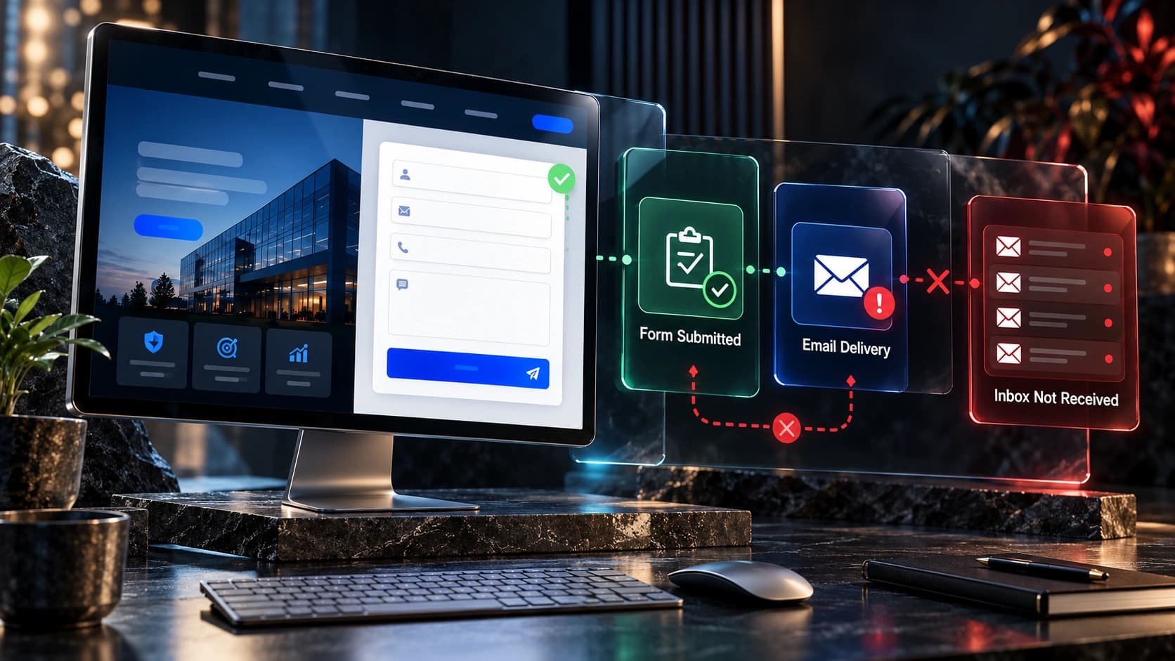
After a successful submission, provide a clear confirmation and ensure the information reaches the intended inbox or CRM. Accessibility and operational reliability are separate requirements: a technically accessible form can still fail to deliver the lead. See our guide to improving forms without sacrificing lead quality and contact-form delivery troubleshooting.
6. Give links and buttons descriptive names
“Click here” repeated throughout a page makes navigation harder, particularly when links are presented outside surrounding paragraphs. Prefer labels such as “Read the website redesign process” or “Request a website quote.” The label should describe the destination or action without becoming excessively long.
Distinguish links from buttons. A link usually navigates to another location; a button usually performs an action such as submitting a form or opening a dialog. The distinction affects keyboard behavior and what assistive technology announces. Avoid making entire complicated cards clickable when doing so creates nested links or confusing focus behavior.
Check the visible call to action against its accessible name. A visitor using voice control should be able to say the text they can see and activate the intended element. Our CTA clarity guide discusses the content and conversion side of this problem.
7. Review navigation, menus, dialogs, and overlays
Mobile menus and popup dialogs are common sources of inaccessible behavior. Test whether the menu button exposes its state, whether keyboard users can reach the links, and whether closing the menu restores a predictable navigation position. Avoid menus that disappear unexpectedly while someone is interacting with them.
Cookie banners, chat widgets, discount popups, and sticky contact bars should not cover important fields or trap focus. A customer who cannot dismiss an overlay may be unable to finish a quote request. If a dialog requires a decision, make the available choices understandable and keyboard-operable.
Don’t automatically add ARIA attributes everywhere. Native HTML controls already provide important semantics. Incorrect ARIA can make an interface harder to understand than a straightforward semantic implementation. Use tested component patterns and verify the actual result with assistive technology.

8. Make media, motion, and time limits manageable
Videos that contain speech or meaningful audio generally need accurate captions. Where important information is only visible, consider a text alternative or appropriate description. Captions should reflect the actual content rather than an automatically generated transcript that has never been checked.
Autoplaying animation can distract or create barriers. Provide controls where necessary, honor reduced-motion preferences, and avoid using motion as the only way to communicate a state change. A website can preserve tasteful transitions while reducing unnecessary movement for visitors who request it.
If a process imposes a time limit, consider whether users can extend it or whether the limit is necessary. Booking flows, authentication, and multi-step forms can become difficult when the interface expires without enough warning or loses information already entered.
9. Make status messages and errors discoverable
After a user clicks “Send,” “Save,” or “Book,” the page may update without navigating. A sighted visitor might see a toast message, while a screen reader user receives no indication that anything happened. Implement status messages using appropriate semantics and test how they are announced.
Success messages should explain the result: “Your enquiry was submitted” is more useful than a brief “Done.” Error messages should explain what went wrong and how to proceed without blaming the user. If an appointment slot becomes unavailable, identify that state and provide an understandable next step.
Do not claim that a form succeeded before the server confirms receipt. Similarly, a spinner should not run indefinitely without explanation. These details affect both accessibility and trust, especially when a visitor is submitting information related to a significant purchase.
10. Check downloadable documents and embedded services
A website may have accessible HTML pages but rely on an inaccessible PDF price sheet, third-party calendar, payment widget, or embedded map for a critical task. Include these dependencies in the audit. If the customer must use a document to understand the offer or complete a request, the document is part of the experience.
For PDFs, review reading order, headings, alternative text, document language, link descriptions, and form controls. For third-party widgets, test keyboard navigation, labels, and screen reader behavior before choosing the vendor. Ask the provider for an accessibility statement or testing information, but verify the integration yourself.
Where an embedded experience has a known limitation, consider whether an equivalent accessible route can be offered without making the alternative unnecessarily difficult. For example, a clear contact method may help when a third-party booking interface cannot support a particular assistive technology.

11. Use automated scans as a starting point, not a certificate
Automated tools can find missing labels, contrast issues, certain structural errors, and some misuse of accessibility attributes. They cannot reliably determine whether every image alternative is meaningful, whether the page copy is understandable, or whether a complex journey makes sense when navigated with a screen reader.
Combine automated checks with manual keyboard testing, zoom and reflow checks, screen reader exercises, and testing with people who use assistive technology when possible. The W3C provides a resource collection for evaluating web accessibility and a guide to WCAG.
Record the tool version, browser, device, page, steps to reproduce, expected behavior, and actual behavior. This creates actionable tickets instead of an unprioritized list of warnings. A screenshot alone is often insufficient to explain a keyboard or screen reader failure.
12. Prioritize fixes by customer impact and reusable components
When an audit identifies dozens of issues, first repair barriers that prevent people from completing core tasks. Then address recurring component problems: a broken navigation menu, inaccessible form input, or missing focus indicator may affect every page that uses the same component.
Prioritizing shared components is often more effective than fixing isolated pages one by one. For a Next.js site, improvements to a shared header, button, or form component can propagate throughout the application. In WordPress, the equivalent may be a theme template, block pattern, or page-builder component.
Keep a change log and retest after each release. An accessibility fix can be accidentally reversed by a redesign, plugin update, or new widget. Assign someone responsibility for reviewing new pages and major content changes before publication.
Example: auditing a service-business quote request
Consider a hypothetical cleaning company with a homepage, service pages, a coverage-area page, and a quote form. The audit begins with a customer who wants a commercial cleaning estimate. They must identify the service, check the location, understand what details to provide, and submit the form.
The tester opens the site using only a keyboard. The navigation is reachable, but the mobile menu has no visible focus. On the service page, the headings are styled paragraphs rather than semantic headings. On the quote form, required fields are marked only by color, and the confirmation appears visually without being announced.
The fixes are specific: add visible focus treatment, use semantic heading levels, make field requirements explicit in text, associate errors with inputs, and provide an accessible status message after confirmed submission. After these changes, the team tests the same journey again rather than assuming the changes work because the code compiled.
This is a fictional example, not a report about a real client. The value is in connecting technical checks to a complete customer task.
A practical accessibility review checklist
| Area | Test | Evidence to record |
|---|---|---|
| Keyboard | Complete the main journey without a mouse | Focus order, blocked controls |
| Headings | Navigate the page by headings | Meaningful structure and levels |
| Contrast | Check text and important controls | Measured contrast and state |
| Zoom | Increase text size and narrow the viewport | Reflow, hidden content, overlap |
| Images | Review alternative text in context | Useful descriptions or decorative treatment |
| Forms | Submit valid and invalid data | Labels, errors, confirmations |
| Navigation | Open and close menus and dialogs | Focus behavior and dismissibility |
| Media | Review captions and motion controls | Usable alternatives |
| Documents | Read essential PDFs and embeds | Accessibility of dependencies |
How accessibility fits a website redesign
Accessibility is easier to maintain when it becomes a design-system requirement. Define accessible color combinations, button states, form components, navigation behavior, heading patterns, and content guidance before building every page. During design review, inspect the actual interaction states rather than only the default desktop screenshot.
Ask developers to demonstrate keyboard navigation, error handling, zoom behavior, and assistive-technology testing as part of acceptance criteria. Document which WCAG version and conformance level the project is targeting, and distinguish verified results from remaining issues. Avoid broad promises such as “100% compliant” without a defensible assessment.
If you are planning a rebuild, read our website redesign timeline and proposal checklist to understand where testing and acceptance criteria belong.
Frequently asked questions
Does every small business website need to be accessible?
Accessibility is valuable for every business because visitors have diverse needs and technologies. Specific legal obligations vary by jurisdiction, industry, and organization. This guide does not replace legal advice about applicable requirements.
Is WCAG 2.2 the same as a law?
No. WCAG is a technical accessibility standard developed by W3C. Laws and regulations may reference particular versions or conformance levels. Confirm which requirements apply to your organization rather than assuming every jurisdiction uses the same rules.
Can an accessibility plugin fix everything automatically?
No. A plugin may provide useful controls or identify issues, but it cannot reliably correct every semantic, keyboard, content, or third-party interaction problem. Manual testing and implementation changes remain important.
What should I fix first?
Prioritize barriers that block essential tasks, particularly navigation, contact forms, bookings, and access to core service information. Fix shared components where possible so one improvement benefits many pages.
Do images always need descriptive alt text?
No. Informative images need alternatives appropriate to their purpose. Purely decorative images can often use empty alt attributes so assistive technology does not announce unnecessary detail.
Is color contrast enough to make a website accessible?
No. Contrast is one part of accessibility. Keyboard support, meaningful structure, understandable forms, captions, predictable behavior, and robust implementation also matter.
How often should accessibility be tested?
Test during design and development, before major launches, and whenever shared components, forms, or critical user journeys change. Include periodic reviews because content and integrations evolve.
Should we test on mobile as well as desktop?
Yes. Mobile introduces different navigation patterns, touch targets, screen sizes, virtual keyboards, and assistive-technology combinations. Test the actual tasks customers perform on their devices.
Build accessibility into the next improvement cycle
The best starting point is not a badge claiming a perfect score. It is a repeatable process: identify important journeys, test them with different interaction methods, fix barriers, and confirm the result. Make accessibility part of your content, design, and development workflow so improvements remain useful as the website grows.
At Avenzo Digital, we work on website design and development and redesign projects for service businesses. If you want to discuss a more usable website, request a consultation and ask about a free homepage mockup. We can review project scope and what a practical improvement process should include without promising unverified compliance outcomes.