A website can look perfectly organized on a desktop computer and completely different when you open the same page on a smartphone. Text may become too large or too small, buttons may move into unexpected positions,…

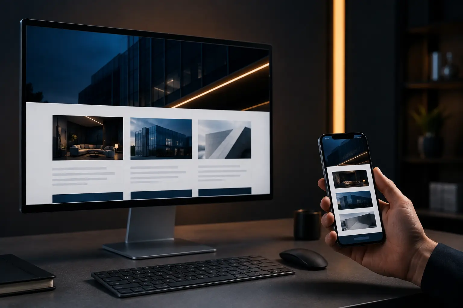
A website can look perfectly organized on a desktop computer and completely different when you open the same page on a smartphone. Text may become too large or too small, buttons may move into unexpected positions, images can extend beyond the screen, and entire sections may stack differently. For many businesses, this creates an immediate concern when their website looks different on mobile even though the desktop version seems fine.
In most cases, some differences between desktop and mobile are intentional. A responsive website design automatically adjusts layouts, images, menus, spacing, and content depending on the visitor’s screen size.
However, when mobile differences negatively affect readability, usability, or conversions, the problem may involve responsive design settings, outdated code, incorrect breakpoints, plugin conflicts, oversized images, or poor mobile optimization.
In this guide, you’ll learn why your website looks different on mobile devices, which differences are normal, what causes common responsive design problems, and how to make your website provide a consistent experience across smartphones, tablets, laptops, and desktop screens.
Why Does a Website Look Different on Mobile?
Websites appear differently on mobile devices because smartphones have significantly smaller screens than desktop computers. A desktop website may have enough horizontal space for multiple columns, large navigation menus, wide images, sidebars, and several elements displayed next to each other. Mobile screens cannot comfortably display the same layout at the same dimensions. Responsive websites therefore rearrange these elements automatically.
For example, a three-column section on desktop may become three vertically stacked sections on mobile. A full navigation menu may become a hamburger menu. Large headings may use smaller font sizes, and buttons may expand to make them easier to tap.
These differences are usually part of a properly planned website design and development process. Problems begin when the website looks different on mobile in ways that affect usability or prevent the website from adapting correctly.
Is It Normal for a Website to Look Different on Mobile?
Yes. A website should usually look slightly different on mobile devices. Responsive design does not mean displaying an identical desktop layout on every screen. Instead, it means providing a consistent experience while adapting the interface to different screen sizes.
A properly optimized mobile website may change its navigation layout, image dimensions, heading sizes, column structure, button width, section spacing, content order, form layouts, background images, and decorative elements. These adjustments make content easier to read and interact with.
The problem is not that your website looks different. The real question is whether those differences improve the mobile experience or create usability problems.
What Is Responsive Website Design?
Responsive website design is an approach that allows a website to automatically adapt to different screen sizes and devices. Instead of creating completely separate websites for desktop computers, tablets, and smartphones, responsive design uses flexible layouts, CSS rules, scalable images, and screen-size breakpoints to reorganize the same content.
A professionally developed responsive website should provide a usable experience whether someone visits from a large desktop monitor, laptop, tablet, or smartphone. Responsive design is especially important because customers frequently move between devices while researching businesses.
Someone might discover your business on a smartphone, return later from a laptop, and eventually submit an inquiry from another device. Your website should remain clear, professional, and easy to navigate throughout that journey.
Common Reasons Your Website Looks Different on Mobile
Several technical and design factors can change how a website appears on smartphones. Some differences are intentional, while others may indicate problems that need to be corrected.
How Responsive Breakpoints Change Your Mobile Layout
Responsive websites use breakpoints to change the design when a visitor’s screen reaches a specific width.
For example, a website may have separate design rules for desktop, tablet, and mobile devices.
At a desktop breakpoint, three service cards might appear next to each other. At a tablet breakpoint, they may appear in two columns. On mobile, all three cards may stack vertically. This is normal responsive behavior. Problems occur when breakpoints are configured incorrectly or certain elements are not properly optimized for smaller screens. Reviewing each responsive breakpoint is an important part of professional website improvement services.
Your Website May Not Be Fully Responsive
Older websites were sometimes designed primarily for desktop computers. If the original website was not built with responsive design principles, elements may have fixed widths that do not adjust properly on smaller screens.
For example, a content section set to a fixed width of 1,200 pixels may extend beyond a mobile screen that is only a few hundred pixels wide.
This can create horizontal scrolling, overlapping elements, broken navigation, or text that becomes difficult to read. Businesses operating older websites may need a website redesign rather than repeatedly fixing individual mobile problems.
Fixed Widths Can Break Mobile Layouts
Modern responsive websites typically use flexible widths based on percentages, viewport dimensions, or responsive containers. Problems often appear when developers use fixed pixel widths for sections, images, tables, forms, or other elements. A button with a fixed width may look correct on desktop but extend beyond the mobile screen.
Similarly, a large comparison table may become impossible to read without horizontal scrolling. Responsive CSS should allow these elements to resize or reorganize when screen space becomes limited. When your website looks different on mobile because fixed-width elements extend beyond the available screen, the responsive layout may need to be reviewed and adjusted.
Images May Be Too Large for Mobile Screens

Images are another common reason a website looks different on mobile. Large desktop images may need to resize, crop, or reposition on smaller screens. Problems can occur when images have fixed dimensions or when background images are configured primarily for desktop viewing.
Visitors may see cropped faces or products, important parts of an image cut off, blurry mobile images, images extending outside the screen, large gaps around images, or very slow loading times.
Proper image optimization helps maintain visual quality while also improving website speed across different devices.
Why Font Sizes Look Different on Mobile
Typography that works well on desktop does not always work well on mobile. Large headings can consume most of a smartphone screen, while very small text may become difficult to read. Responsive websites therefore commonly use different font sizes across devices.
However, poorly configured typography can create issues such as headings wrapping awkwardly, text overlapping nearby elements, or buttons becoming much taller than expected. Good mobile typography should prioritize readability without making the page feel unnecessarily long.
Navigation Menus Usually Change on Mobile
Desktop websites often display several menu items across the top of the screen.
There usually is not enough horizontal space to display the same navigation on a smartphone. Most responsive websites therefore replace desktop navigation with a mobile menu icon.
This is commonly known as a hamburger menu.
A mobile navigation system should still provide quick access to important pages such as services, about information, contact pages, and conversion points.
If visitors cannot easily navigate your website on smartphones, reviewing your website design and mobile navigation structure should become a priority.
Why Your Website Columns Stack Differently on Mobile
Multi-column layouts are common on desktop websites. A section might display an image on the left and text on the right. Another section might show three service cards in one row. On mobile devices, these columns generally need to stack vertically. Sometimes the order of those stacked elements can create problems.
For example, a page may unintentionally display several images before showing the related text, making the content confusing. Responsive layouts should be reviewed carefully to ensure that the mobile reading order remains logical.
Hidden Elements Can Make Mobile Pages Look Incomplete
Website builders often allow specific elements to be hidden on desktop, tablet, or mobile devices. Developers sometimes hide large animations, decorative images, videos, or complicated sections on mobile to improve performance. This can be beneficial.
However, important content can also be hidden accidentally. If a headline, button, testimonial, form, service description, or contact element disappears on mobile, visitors may struggle to understand the page or complete an important action. Every hidden element should have a clear reason.
How Website Builders Cause Mobile Display Problems
Platforms such as WordPress and visual page builders make responsive website design easier, but they still require careful configuration. Individual widgets, containers, sections, templates, themes, and plugins may have their own responsive settings. Small changes can sometimes create unexpected mobile results.
Businesses using WordPress may benefit from professional WordPress development when layout problems become difficult to manage through basic visual editor settings.
WordPress Theme Settings Can Affect Mobile Design
Your WordPress theme controls many elements of your website, including content width, menus, typography, headers, footers, and responsive behavior. An outdated or poorly configured theme may cause mobile display problems.
Theme updates can also occasionally change styles that were previously working correctly. Custom WordPress theme development can provide greater control over responsive layouts when standard themes do not support the design or functionality a business requires.
How Plugins Can Break Your Mobile Layout
WordPress websites often rely on several plugins for forms, sliders, popups, navigation, caching, animations, and other functionality. Not every plugin handles responsive layouts equally well. A plugin may load CSS that overrides your existing mobile styles or create elements with fixed widths.
Plugin conflicts can cause:
- Overlapping content.
- Broken forms.
- Incorrect spacing.
- Missing buttons.
- Misaligned popups.
- Unresponsive sliders.
- Horizontal scrolling.
Testing plugin behavior across multiple screen sizes can help identify whether the problem comes from the website design itself or third-party functionality. When a website looks different on mobile because of a plugin conflict, testing the affected functionality across multiple screen sizes can help identify the issue.
Why Your Website Looks Different Across Browsers
Chrome, Safari, Firefox, Edge, and mobile browsers do not always render every website element exactly the same way. Modern web standards have reduced these differences significantly, but small inconsistencies can still occur.
Certain CSS effects, form fields, fonts, animations, or advanced layouts may display slightly differently. Professional testing should therefore include multiple browsers rather than checking only one device.
Why Mobile Optimization Matters for User Experience
Mobile visitors usually expect information quickly. They want to understand what a business offers, navigate services, view important details, and contact the company without struggling with the interface. Poor mobile experiences create unnecessary friction.
Visitors may leave if they need to zoom in to read text, scroll sideways, wait for large images to load, or repeatedly tap small buttons. A well-planned UI and UX design strategy helps businesses create mobile interfaces that are easier to understand and use.
Mobile Design Can Affect Website Conversions
A website can generate strong desktop conversions while performing poorly on smartphones. For example, a contact form may work perfectly on desktop but require excessive scrolling on mobile. A call-to-action button may appear prominently above the fold on desktop but move far down the page on smaller screens.
Mobile conversion problems often involve:
- Hard-to-find calls to action.
- Complicated forms.
- Small buttons.
- Poor text readability.
- Slow pages.
- Distracting popups.
- Confusing navigation.
- Incorrect content order.
Improving mobile usability can support better conversion rate optimization because visitors experience fewer obstacles before completing important actions.
Website Speed Can Make Mobile Problems Worse
Mobile visitors may access your website through slower internet connections than desktop users. Large images, unnecessary scripts, animations, poorly optimized plugins, and excessive third-party code can significantly slow mobile loading times. Even if the design itself is responsive, a slow mobile website can create a poor experience.
Professional Core Web Vitals optimization can help identify performance issues affecting loading speed, visual stability, and interaction responsiveness. Improving performance should therefore be considered part of mobile optimization rather than a completely separate task.
How Mobile Design Can Affect SEO
Search engines need to understand and access your mobile website just as visitors do. Google primarily uses the mobile version of website content for indexing and ranking through mobile-first indexing. This means businesses should avoid creating major differences between important desktop and mobile content.
If essential text, internal links, structured information, or navigation disappears on mobile, search engines may have less information available when evaluating the page.
When a website looks different on mobile in ways that affect usability, performance, or content accessibility, reviewing these factors together can help identify the underlying issue. Strong SEO services should therefore evaluate mobile usability, crawlability, content consistency, internal linking, page speed, and responsive design together.
How to Check Whether Your Mobile Website Has a Problem
The easiest place to begin is manually reviewing important pages on a real smartphone.
Do not only check the homepage. Review the homepage, main service pages, landing pages, contact page, blog articles, forms, navigation menus, pricing sections, testimonials, and footer links. Look for anything that becomes difficult to read, tap, understand, or complete.
You should also check several screen widths using browser developer tools, although real-device testing remains important because browser previews cannot reproduce every practical mobile experience.
Common Mobile Website Problems to Look For
Some responsive issues are easy to recognize once you know what to check.
Common warning signs include horizontal scrolling, text extending outside containers, overlapping sections, images that do not resize, very large headings, tiny body text, buttons positioned too close together, forms wider than the screen, missing navigation links, incorrect content order, excessive blank space, popups covering important content, slow loading sections, or layout shifts while the page loads.
A combination of several issues may indicate that the site requires broader responsive improvements rather than isolated fixes.
Should Desktop and Mobile Websites Be Exactly the Same?
No. The objective should be consistency rather than identical presentation. Your brand, messaging, services, conversion goals, and important content should remain consistent. The presentation can change.
For example, a desktop hero section may place text beside an image, while the mobile version places the image underneath the text.
Both versions communicate the same information but use layouts appropriate for the available space. That is usually better than shrinking the desktop design until everything technically fits on a smartphone.
How to Make Your Website Look Better on Mobile
Improving the mobile version of a website usually requires reviewing the entire responsive experience instead of changing one element. Start by identifying the pages generating the most traffic, leads, or sales. Then review their layouts across several common screen sizes.
Important improvements may include adjusting responsive breakpoints, reducing mobile font sizes, improving content spacing, reordering columns, resizing images, simplifying navigation, improving button sizes, shortening forms, removing unnecessary animations, optimizing mobile page speed, fixing overflowing containers, and testing browser compatibility.
A professional website redesign may be more efficient when the existing website has extensive responsive issues across many pages.
Why Mobile Forms Need Special Attention
Forms are one of the most important elements on lead-generation websites. A form that is easy to complete on desktop may feel unnecessarily complicated on a smartphone. Mobile forms should use clear labels, appropriately sized fields, enough spacing between inputs, and only the information genuinely required.
Long forms may need to be simplified or divided into logical steps. For businesses using their website to generate inquiries, improving forms should be part of a broader lead generation website development strategy.
The objective is to make it easy for qualified visitors to complete the next step without sacrificing important lead information.
When Should You Consider a Responsive Website Redesign?
Not every mobile issue requires rebuilding the website. Small spacing, image, or typography problems can often be corrected through responsive CSS and page-builder settings.
However, redesigning may make more sense when the website was originally built only for desktop, mobile problems appear across most pages, the theme is outdated, the site uses extensive fixed-width layouts, navigation performs poorly on smartphones, mobile conversion rates are consistently weak, the website is difficult to maintain, page speed remains poor despite optimization, or the overall design no longer reflects the business.
In these situations, custom website design and development provides an opportunity to rebuild the experience around modern responsive standards instead of continually repairing older layouts.

Professional Responsive Design Helps Create a Consistent Experience
Responsive design requires more than making elements fit within a smaller screen. The website should still communicate the same brand, services, trust signals, and conversion message regardless of the device being used.
This requires careful control over typography, spacing, content hierarchy, navigation, forms, images, calls to action, performance, and accessibility.
Businesses that depend on their websites for inquiries, appointments, or online sales should treat mobile usability as an important part of their customer experience. When a website looks different on mobile, the goal should be to maintain consistency in the brand, messaging, and important content while adapting the presentation to the device.
Request a Website Review From Avenzo Digital
If your website looks different on mobile and feels broken or difficult to navigate, the issue may involve more than one responsive setting. Avenzo Digital helps businesses improve mobile experiences through responsive design, website redesign, performance optimization, WordPress development, UI/UX improvements, and conversion-focused development.
A professional review can help identify the design and technical issues affecting your website across smartphones, tablets, and desktop screens. Explore our responsive website design services to build a website that adapts properly across different devices while maintaining a clear and professional experience.
A responsive website review may include:
- Mobile and tablet layout analysis.
- Responsive breakpoint testing.
- Navigation and usability review.
- Typography and spacing checks.
- Image responsiveness analysis.
- Form and conversion testing.
- Mobile performance review.
- Cross-device consistency recommendations.
Conclusion
Your website does not need to look exactly the same on every device. Some differences between desktop and mobile are necessary because responsive websites must adapt to different screen sizes.
However, if your website looks different on mobile in ways that create overlapping content, difficult navigation, broken forms, poor readability, slow performance, or missing information, the responsive design should be reviewed.
Improving your responsive website design can create a more consistent experience for visitors while supporting stronger usability, SEO, conversions, and overall website performance. The goal is not to force the desktop design onto a smaller screen. The goal is to make every visitor feel like the website was designed for the device they are using.
Frequently Asked Questions
Why does my website look different on mobile?
Websites often use responsive design rules that automatically change layouts, font sizes, navigation, images, and spacing based on screen size. Some differences are intentional, while major layout problems can indicate incorrect responsive settings.
Should my website look exactly the same on desktop and mobile?
No. The content, branding, and purpose should remain consistent, but the layout may change to provide a better experience on smaller screens.
Why are my website images cropped on mobile?
Background settings, fixed image dimensions, container sizes, and responsive positioning can cause images to crop differently on smartphones.
Why is my website wider than the mobile screen?
Horizontal scrolling usually occurs when an image, container, table, form, or another element has a fixed width that exceeds the available screen width.
Can WordPress cause mobile layout problems?
WordPress itself is responsive when used correctly, but themes, plugins, page builders, custom CSS, and individual responsive settings can create mobile design issues.
Does mobile website design affect SEO?
Yes. Mobile usability, content accessibility, page speed, navigation, and responsive design can influence search performance, especially because Google primarily evaluates the mobile version of website content.
Why do my website fonts look different on my phone?
Responsive typography settings may intentionally change font sizes on smaller screens. Browser rendering and unavailable font files can also cause typography differences.
How can I test whether my website is mobile-friendly?
Check important pages on several real smartphones and screen sizes. Review navigation, forms, text readability, images, buttons, spacing, loading speed, and horizontal scrolling.
Can mobile website problems affect conversions?
Yes. Difficult navigation, broken forms, slow loading times, small buttons, and unclear calls to action can cause mobile visitors to leave before completing a purchase or inquiry.
When should I redesign my website for mobile?
Consider a redesign when mobile problems affect many pages, the website uses outdated or fixed layouts, performance remains poor, or repeated responsive fixes are no longer practical.