
PROJECT 40 · Legal Website Design & Development
SoCal Rider Law
A focused rider-law experience that connects accident questions with clear next steps.
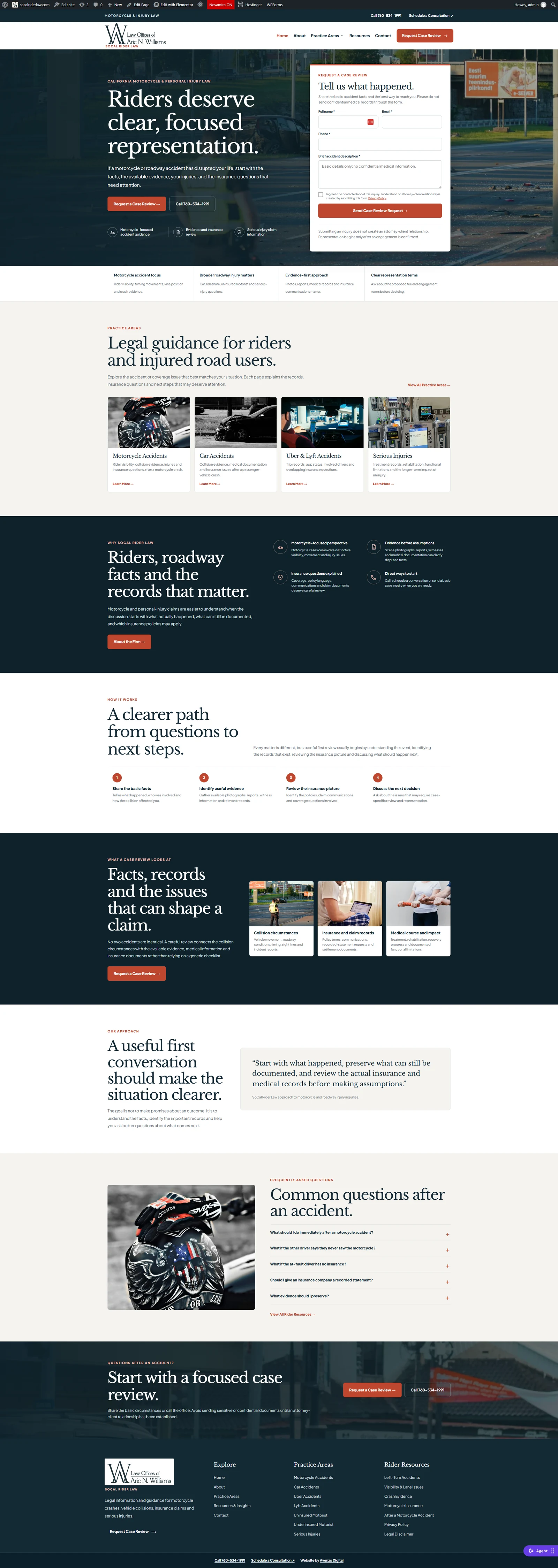
A cohesive website presentation covering the homepage, motorcycle accidents and Uber accidents, with a deep-teal visual system, red actions, evidence guidance and case-review forms.
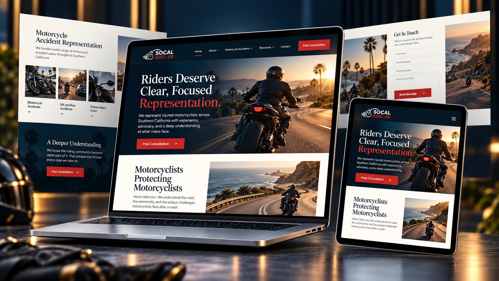
Project film
See the experience in motion.
A closer look at the SoCal Rider Law website experience.
More page films
Explore the supporting page designs.
Each film follows one of the supplied desktop page captures.
01. Project overview
A focused rider-law experience that connects accident questions with clear next steps.
A cohesive website presentation covering the homepage, motorcycle accidents and Uber accidents, with a deep-teal visual system, red actions, evidence guidance and case-review forms.
The supplied desktop captures document the page hierarchy, service content, supporting guidance and contact sections. The scrolling films preserve the original page designs; the 3D cover is a portfolio presentation.
02. Our strategy
Designing trust.
Driving action.
The experience was shaped around clarity, confidence and a natural path from first impression to the next business action.
Rider-law homepage
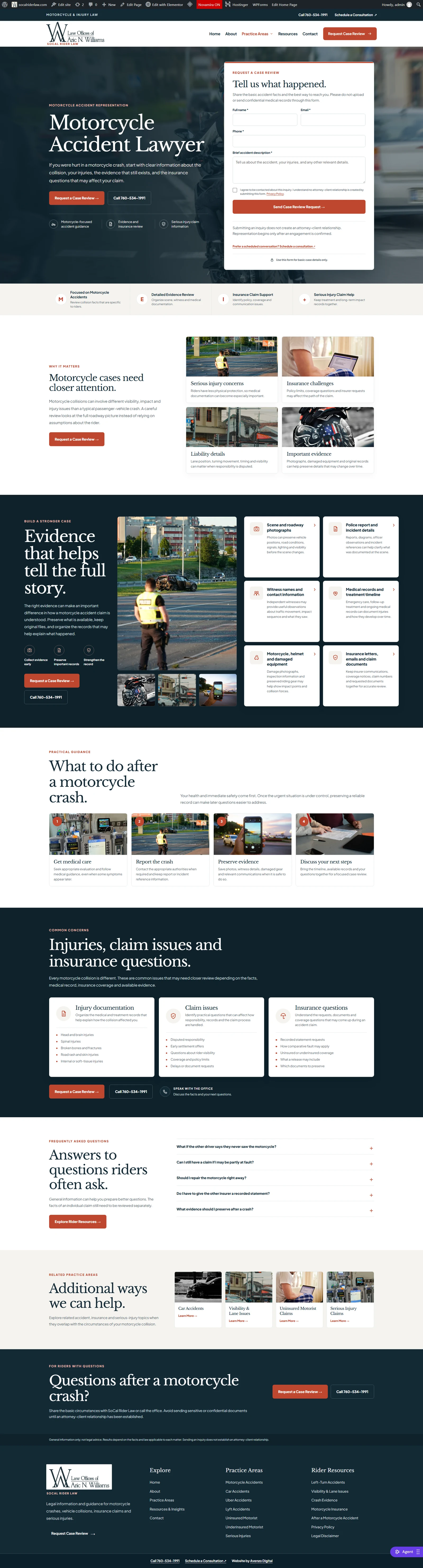
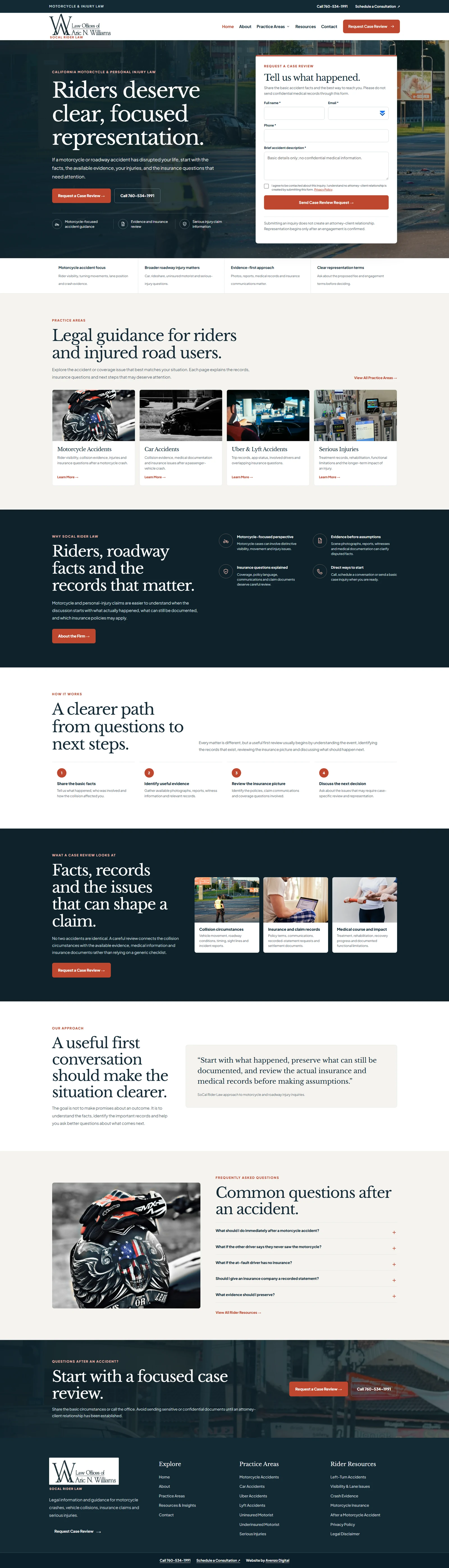
The homepage connects rider and road-user concerns with a visible inquiry form.
Motorcycle accidents
The motorcycle page organizes evidence, next steps, injuries and common questions.
Uber accidents
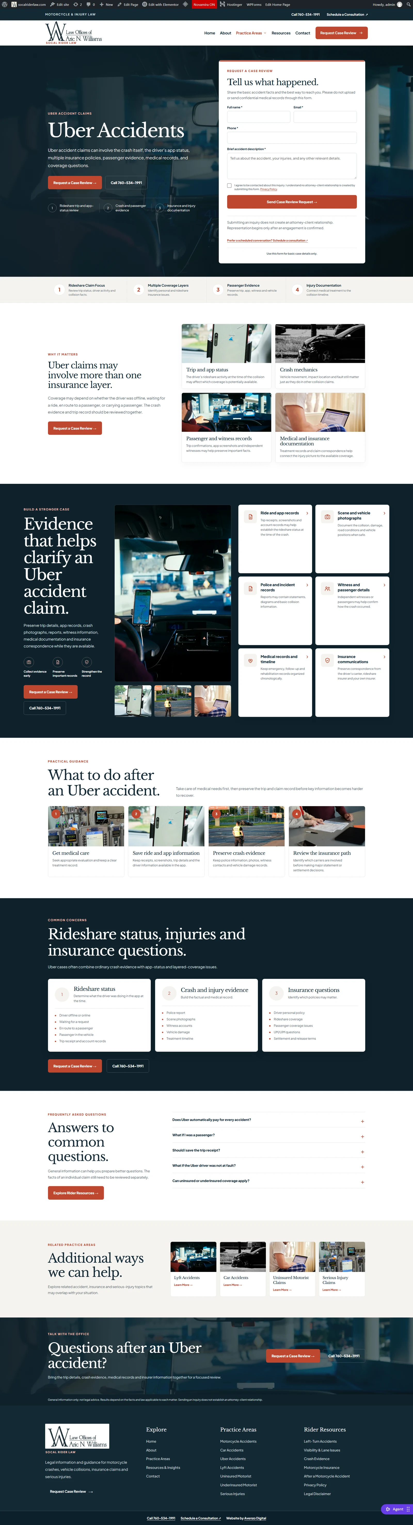
The Uber page explains rideshare-related concerns through a parallel content structure.
Earlier homepage capture
The earlier supplied homepage capture documents a second version of the same site.
03. Website showcase
A closer look at the SoCal Rider Law experience.
The supplied set includes two homepage captures and dedicated motorcycle and Uber accident pages. Each has its own scrolling film below.
04. Challenge & solution
The challenge
The project needed to communicate accident-page structure, practical guidance and case-review clarity without making the experience feel dense, fragmented or difficult to navigate.
Our solution
We organized the experience around clear information hierarchy, responsive presentation, trust signals and visible actions so visitors always understand what to do next.
05. The outcome
A stronger digital experience built for clarity and action.
The finished system brings content, hierarchy, responsive behavior and conversion paths together as one cohesive experience.
06. Services used
What went into this project.
A focused mix of strategy, design and implementation based on the needs of the experience.
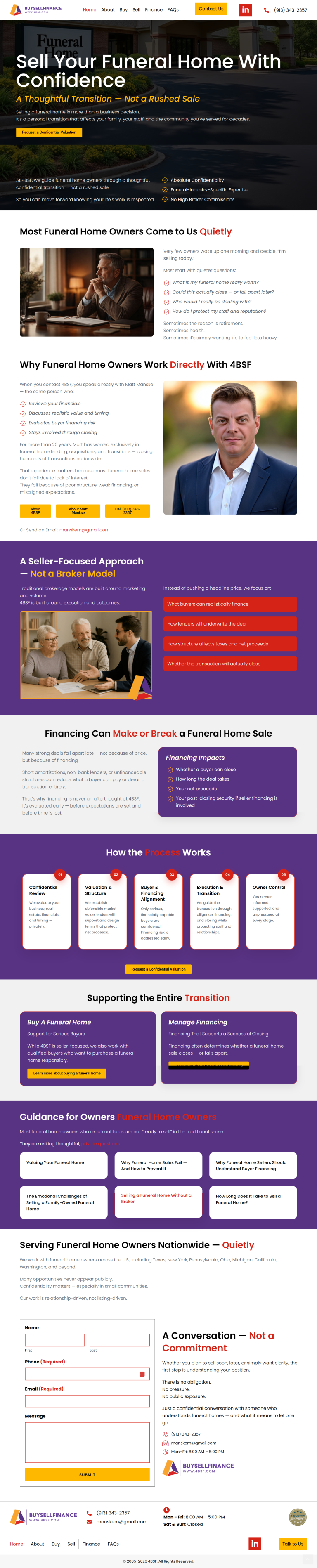
Funeral Home Sales & Financing
4BSF
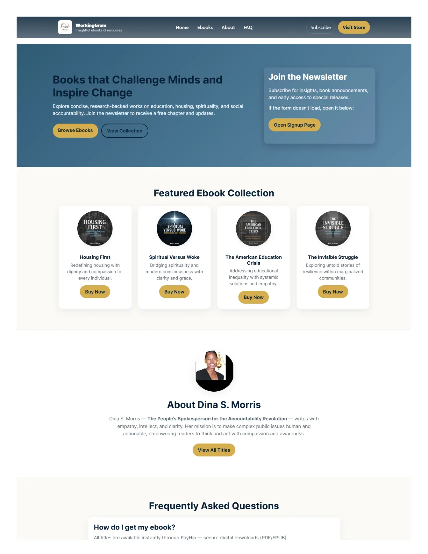
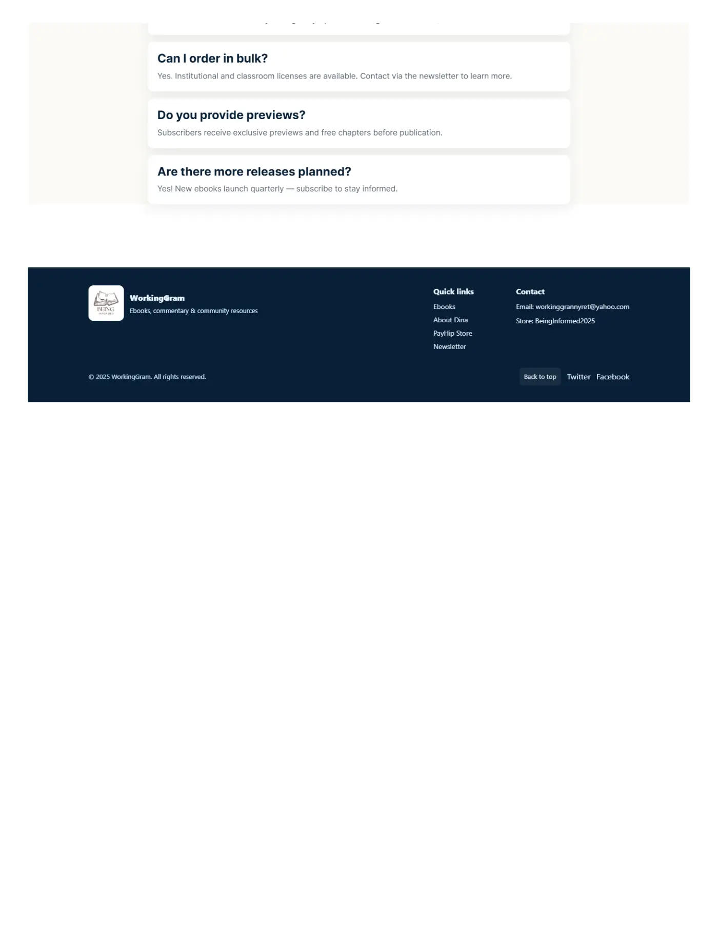
Books & eCommerce
WorkingGram

Immigration Services
ActNow Canadian Immigration
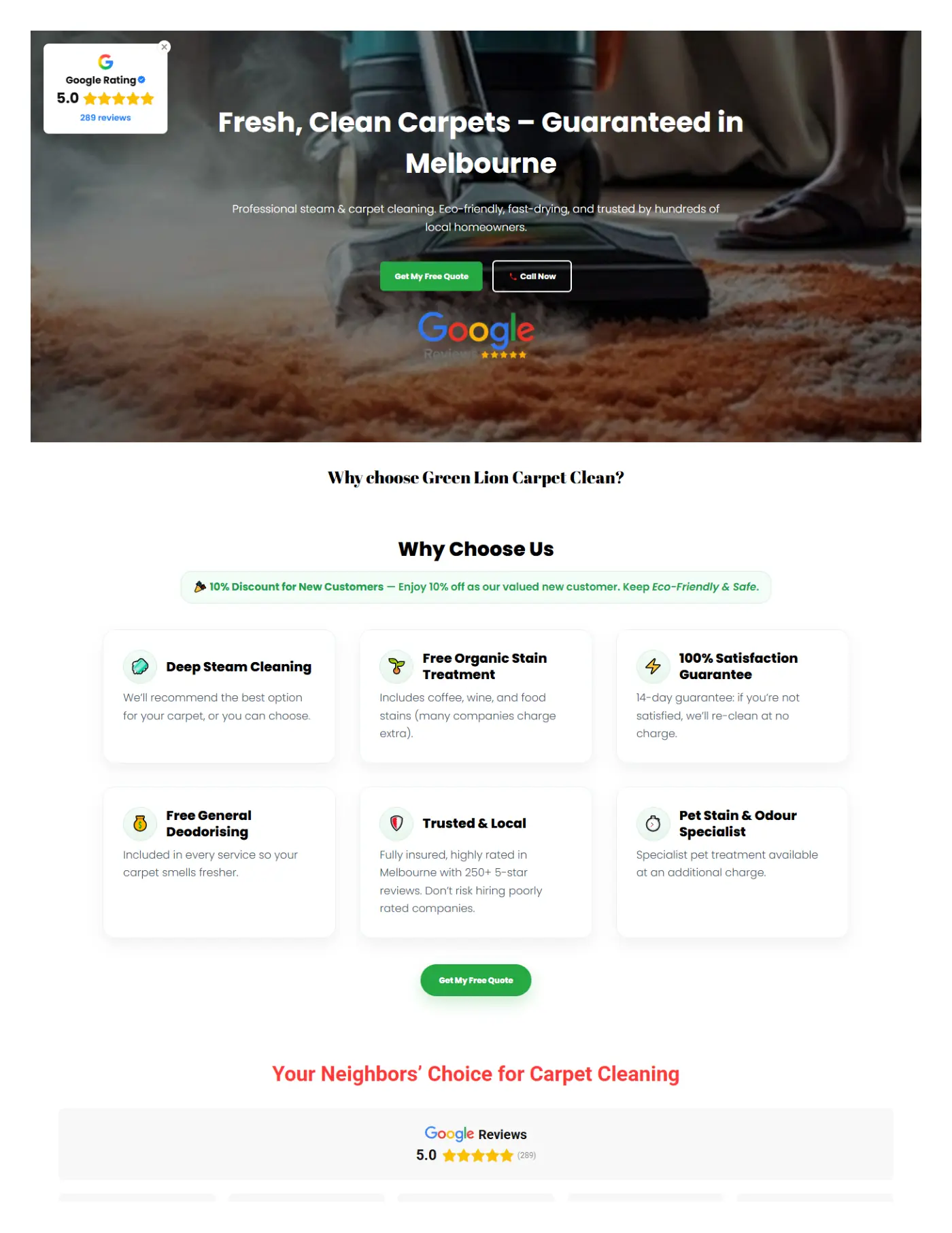
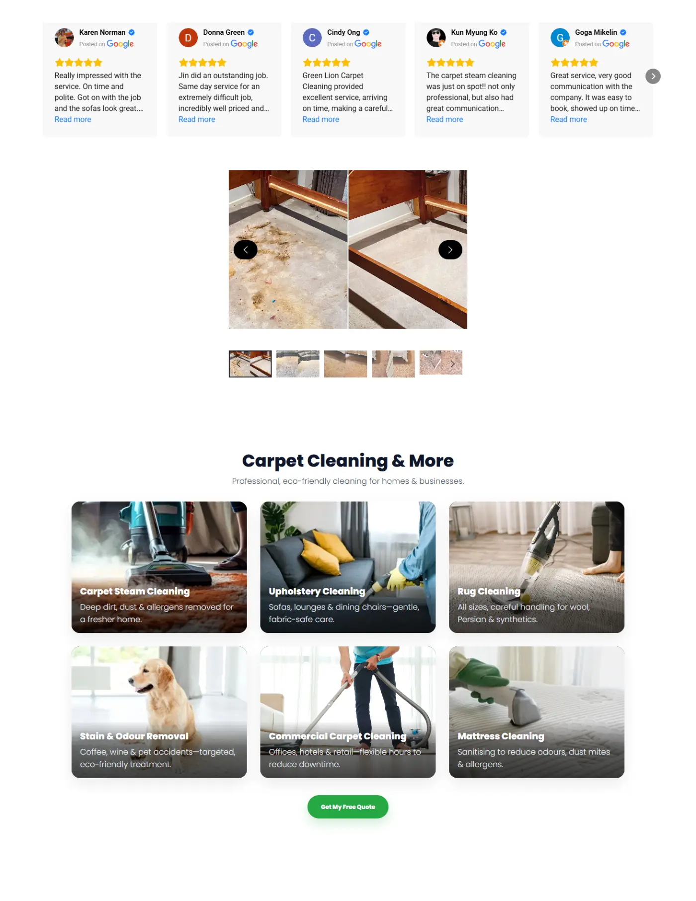
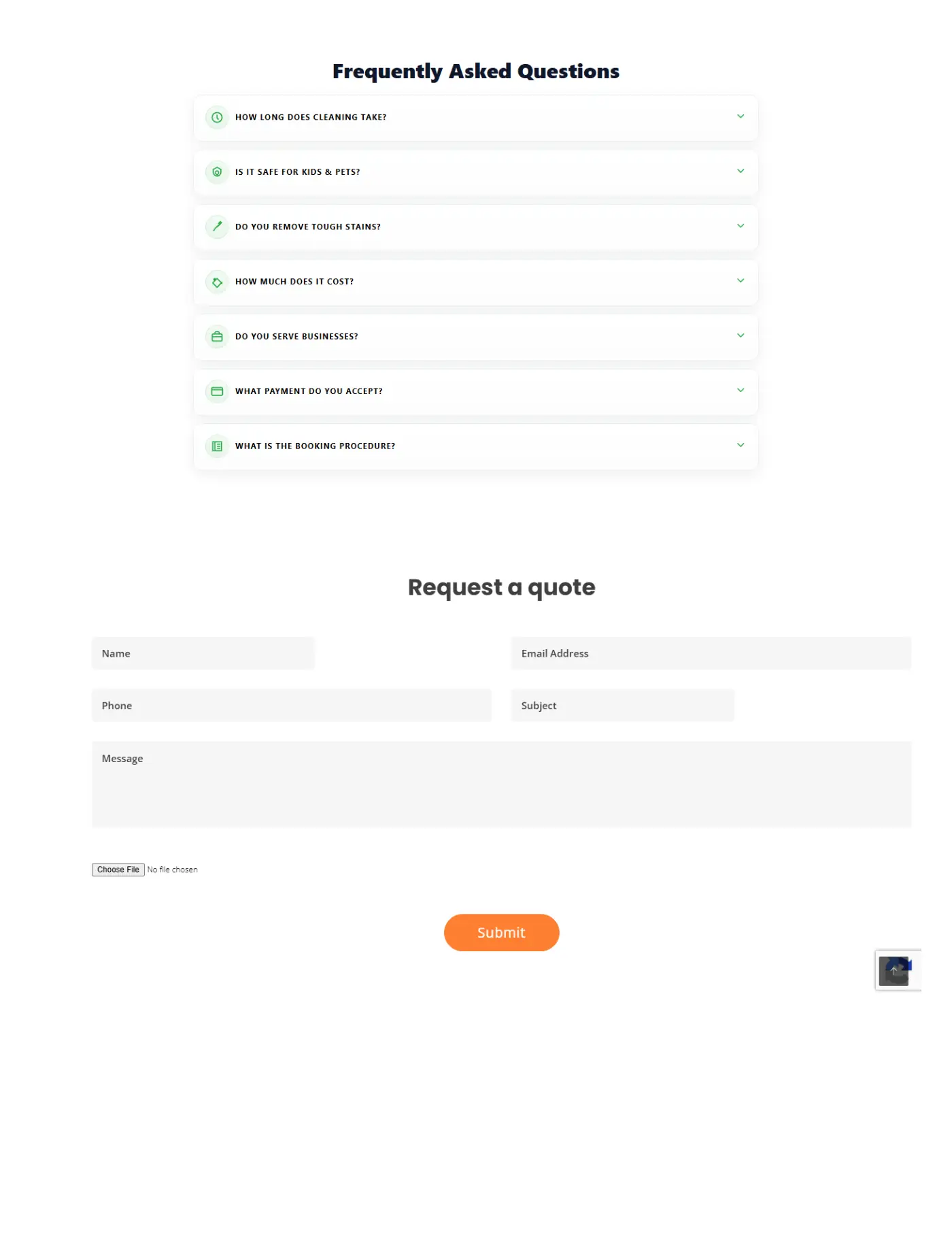
Home Services & Cleaning
Green Lion Carpet Cleaning
Let’s work together
Ready to build a similar website for your business?
Let’s create a clear, high-converting digital experience around your audience and goals.