Project Overview
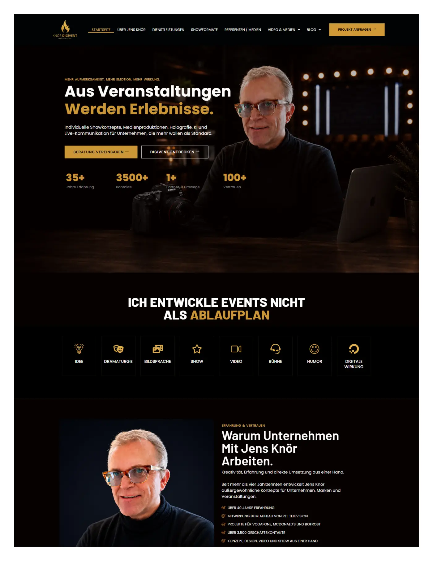
Jens Knör Digivent was developed as a portfolio website, website development engagement for the marketing & media market serving audiences in Germany. A cinematic personal-brand website combining event strategy, media production, AI, holography, show formats, and high-end visual storytelling. The objective was not simply to create an attractive page. The work needed to present the business clearly, support the visitor’s decision process, and create a dependable foundation for future marketing. Premium German portfolio website for events, media, and live communication Every visible section was therefore evaluated in terms of communication, usability, credibility, and the action it should encourage.
Understanding the Business Context
Before shaping the interface, the project required a clear understanding of the offer and the audience behind it. Visitors arriving at Jens Knör Digivent may have different levels of awareness: some already know the service they need, while others are still comparing options or trying to understand the problem. The content structure was designed to accommodate both groups. It introduces the core proposition early, explains the service in practical language, and provides enough supporting information for a more considered decision. The project also needed to respect the expectations common to the marketing & media sector, where trust, clarity, and an easy route to contact are central to conversion.

The Design Goals
The visual direction balanced brand personality with functional clarity. Typography, spacing, image scale, section rhythm, and call-to-action placement were used to create a page that feels intentional rather than assembled from unrelated blocks. The design gives important messages enough room to breathe while keeping the visitor moving through the experience. Contrast was used to distinguish primary actions from supporting information, and repeated visual patterns help the user recognize cards, proof points, services, and conversion sections. This approach supports consistency across desktop, tablet, and mobile layouts.
Information Architecture and User Journey
The information architecture was planned around the questions a qualified visitor is likely to ask: What does this business provide? Is the offer relevant to me? Why should I trust this company? What is included? What happens after I make contact? The page order answers those questions progressively instead of presenting every message at once. Because this was a conversion-focused website project, the page hierarchy was designed to move from attention to understanding, then from understanding to action. The opening section needed to communicate the offer immediately without overwhelming the visitor. Supporting sections then introduced the service, the reasons to trust the business, the practical process, and the next step. This sequencing is important because a strong call to action performs better when the page has already answered the questions that normally create hesitation. This makes the website easier to scan while still providing enough depth for visitors who want to read carefully.

Service and Offer Presentation
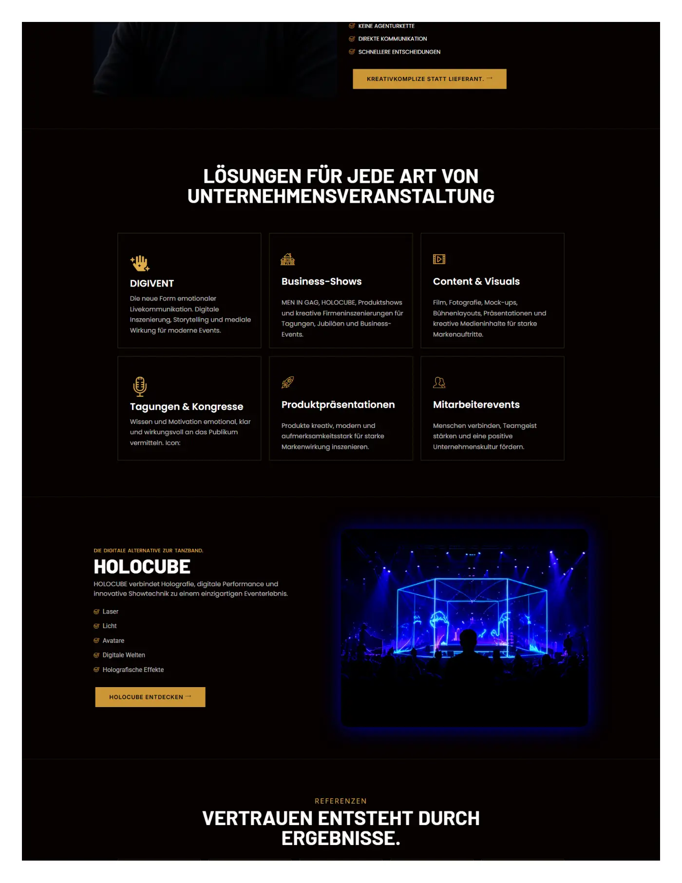
Service discovery was treated as a core user-experience requirement. Visitors needed to understand what the company provides, who the service is for, and how to begin without navigating through unnecessary layers. Service cards, supporting explanations, proof elements, and focused calls to action were used to reduce that friction. The services delivered for this engagement included Portfolio website design, personal brand positioning, media showcase, responsive development. Rather than listing those items as isolated features, the project connects them to the visitor’s practical needs. This gives each section a clear purpose and prevents the page from becoming a generic catalogue of capabilities. Where multiple services or options are shown, the layout creates enough distinction for comparison while maintaining a consistent visual system.
Trust, Proof, and Conversion Strategy
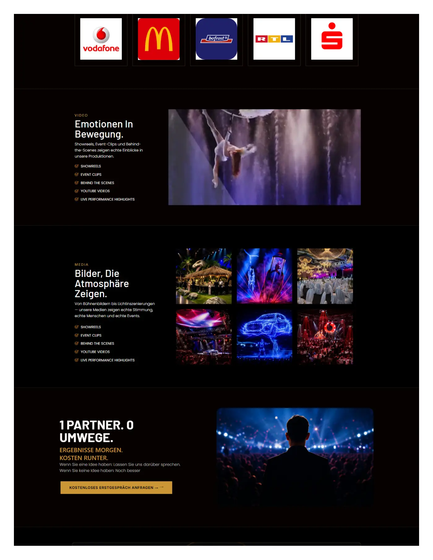
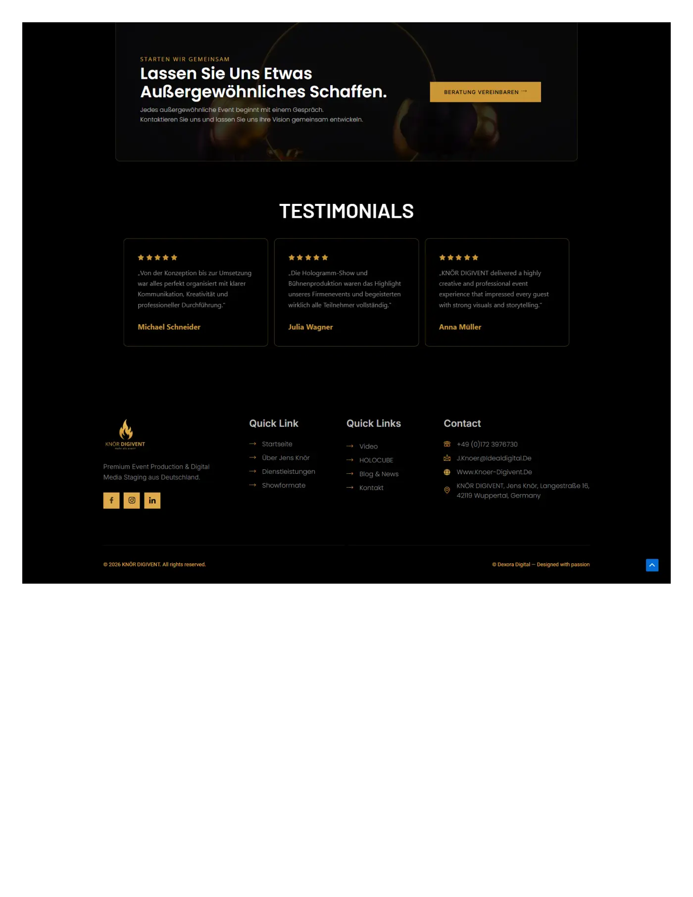
For a specialist or B2B audience, trust depends on specificity. The website therefore prioritizes clear service language, process explanations, technical capability, sector relevance, and evidence of professional delivery. The objective is to help a serious buyer understand the offer before starting a sales conversation. Calls to action were positioned at moments where the visitor has enough context to respond. The primary action remains visually consistent, while secondary actions support people who need a different route, such as calling, viewing services, requesting a quote, booking a consultation, or exploring more detail. This avoids the common problem of placing multiple competing buttons in every section. The page aims to guide rather than pressure, which produces a more credible experience.

Responsive Development and Interaction
Interactive elements such as menus, forms, buttons, sliders, tabs, and galleries were kept consistent so visitors could understand how the interface behaves. This reduces cognitive load and makes the website feel more professional, especially on mobile devices where space and attention are limited. Responsive behaviour was considered from the start rather than added after the desktop layout was complete. Content columns collapse in a logical order, buttons remain easy to tap, forms retain readable labels, images scale without losing their purpose, and section spacing is adjusted for smaller screens. This matters because many visitors will first encounter the project through mobile search, social media, an advertisement, or a direct message. A polished desktop design is not enough if the mobile journey becomes difficult.
SEO-Ready Structure and Performance Considerations
The project was structured with an SEO-ready foundation rather than treating optimization as a later add-on. That includes one clear page purpose, logical heading hierarchy, descriptive section labels, crawlable text, meaningful internal-link opportunities, optimized image context, and a focused conversion path. For Jens Knör Digivent, this foundation helps search engines understand the relationship between the brand, the marketing & media market, the services being presented, and the locations or audiences the website is intended to reach. Performance considerations also influenced the structure. Large visuals should be served in modern formats, below-the-fold imagery can be lazy loaded, unnecessary scripts should be limited, and layout dimensions should be reserved to reduce shifting as the page loads. The project content remains editable so metadata, internal links, service explanations, image alt text, and future sections can be improved without rebuilding the complete layout.

Quality Assurance and Launch Readiness
Quality assurance covers more than checking whether the page looks correct. The project should be reviewed across current desktop and mobile browsers, common viewport widths, form states, menu interactions, links, buttons, images, and content hierarchy. The final review also checks that contact details are consistent, the correct destination is used for each call to action, required fields are understandable, and no temporary staging references remain visible. Search readiness includes checking the page title, description, canonical URL, indexing settings, image attributes, heading order, and any relevant structured data.
Project Outcome
The completed Jens Knör Digivent experience provides a clearer digital presentation of the business and a more deliberate path from first impression to enquiry or action. The value of the work is visible in the page structure, visual consistency, responsive usability, and the way the offer is explained. No unverified traffic, revenue, ranking, or conversion claims are attached to this portfolio entry. Instead, the project demonstrates the actual design and development decisions that can be reviewed directly in the visual showcase. This keeps the presentation credible while still showing the depth of the work.
Website Showcase
The screenshots below present the design as a complete experience rather than a single isolated hero section. They allow visitors to review the page hierarchy, visual language, service presentation, proof elements, calls to action, and supporting content in context. The gallery can be reordered, replaced, or expanded from the WordPress project editor as new desktop or mobile captures become available. The featured screenshot is also used in the project hero and portfolio card so the visual identity remains consistent across the archive and individual page.
Why This Project Matters
Jens Knör Digivent shows how a website can combine brand presentation with practical business communication. Good design is not limited to colour, typography, or image choice. It also determines what information appears first, how confidently a visitor can understand the offer, and whether the next step feels obvious. By connecting strategy, content structure, interface design, responsive development, and an SEO-ready foundation, the project becomes more than a visual refresh. It becomes a usable digital asset that the business can continue improving as its services, campaigns, and audience develop.
Explore the complete project
Select any screen to view it at full size. Original source PDFs are never exposed or offered for download.