
Medical education / Project story
Victory Medical Courses: Ongoing website revisions
The footer needed a more useful structure for several distinct areas of the website.
The client and the brief
Victory Medical Courses's assignment centred on ongoing website revisions. Ongoing website revisions included a restructured footer covering courses, the digital logbook, simulation and institutional sections.
The intended audience was learners and institutional visitors exploring medical education. The website needed to help that audience find courses, the digital logbook, simulation or institutional information. This gives the project a practical starting point: the experience should connect the information a person needs with a next step the business can handle. The brief is specific about the requested work, so this account follows that scope rather than treating every part of the current website as a deliverable.
The project can be understood through the relationship between the business request and the visitor's task. The business focus was navigation between distinct medical-education resources. The visitor needed an understandable route through the relevant information. Those perspectives meet on the page, where the message, content and action have to make sense together. The resulting case study explains the documented intervention and the reasoning that makes that intervention useful.
The problem the work needed to address
The footer needed a more useful structure for several distinct areas of the website.
For this audience, a website is a step inside a larger decision. Someone may be comparing options, looking for a specific answer or deciding whether to contact the business. The page needs to respect that intention. When information is difficult to interpret or the route forward is unclear, the visitor has to do more work before reaching a useful decision. In this engagement, that concern was tied to navigation between distinct medical-education resources.
The scope matters when describing the starting problem. The supplied record identifies the particular task and any stated constraints. It does not provide a complete historical archive of every page or a baseline for every business measure. This case therefore keeps the problem connected to the documented assignment and treats the current public site as present-day context. That gives the reader a clearer picture of what the engagement was intended to change.
What Avenzo delivered
The supplied scope describes ongoing revisions, including restructuring the footer for course, logbook, simulation and institutional sections.
The deliverables below describe the actual assignment. Their purpose was to help visitors find courses, the digital logbook, simulation or institutional information. Each item belongs to the stated engagement, while surrounding services, platforms and business activities remain separate unless they are named in the brief. This distinction is useful when comparing the work with another project that may have a similar appearance but a different technical or operational scope.
- Website revisions
- Course navigation
- Digital-logbook navigation
- Simulation and institutional footer sections
Giving the information a clear reading order
A website can contain useful information and still make it difficult to find. The structure should follow the task the visitor is trying to complete. Here, that task was to find courses, the digital logbook, simulation or institutional information. The opening needs to connect with the supporting detail that makes this choice reasonable. A visitor should be able to move from an overview to a more specific question without losing the main subject of the page.
Different kinds of content have different roles. A service explanation helps someone understand the offer. A process section explains what working together may involve. A contact route provides the next step. Giving those roles recognisable places helps the reader use the site at their own level of readiness. For Victory Medical Courses, this is connected to navigation between distinct medical-education resources, which is the practical concern behind the engagement.
The available scope determines how much of that structure can be changed. A new website offers room to establish the sequence from the beginning. An additional page or revised section has to fit into an existing sequence. Both can be useful when the new information has a clear purpose. The important distinction is between the part of the journey delivered in this engagement and the wider website in which it appears.
Working within the website's existing relationships
An established site contains paths that people may already use. A published URL may be linked from search, an advert, an email or another page. A form may connect to a follow-up process. Familiar wording or a brand pattern may help the visitor recognise that they are still dealing with the same business. A change enters this environment, even when the visible assignment is small.
For Victory Medical Courses, the relevant handoff was the existing course and institutional destinations. The surrounding site still influences how a person reaches it. This is why a contained page update, a corrected destination or a refreshed section needs to be described in context. The delivered change should be credited for the part of the experience it affects, while other pages and systems retain their own responsibilities.
This approach also makes later maintenance more understandable. A future editor can distinguish a completed assignment from a possible follow-up improvement. A redesigned page can preserve a useful route, and a targeted fix can repair a break without replacing the entire site. The case study keeps that boundary visible. It gives a prospective client a concrete account of the intervention and avoids attaching wider ownership or performance claims to work that was never included.
Connecting the page with a meaningful next step
The intended next step was to find courses, the digital logbook, simulation or institutional information. An action should describe a choice the visitor can understand before selecting it. That includes whether it opens more information, begins an enquiry or continues into a separate booking or registration process. The expectation created by the page is part of the experience, even when another platform handles the following step.
For Victory Medical Courses, the handoff involved the existing course and institutional destinations. The page should give the visitor enough context to make that transition sensibly. A visible action can remove a navigation obstacle, while an explanation can reduce uncertainty about what the action means. These are different contributions to the journey, and a case study is more useful when it keeps them specific.
A button click, a completed form and a confirmed booking are separate events. The business needs to know which event a performance report represents. The website can support an appropriate handoff, but the response and decision after that point can depend on a separate team or system. The value of the page should therefore be assessed through the stage it actually changes, using evidence that matches the original scope rather than a broad assumption about every later outcome.
Considering the process after the page
A website action usually leads to work somewhere else. An enquiry needs a response, a location choice needs relevant information and a registration may continue on a separate platform. For this engagement, that connection involved the existing course and institutional destinations. Understanding the next responsible party helps explain why a visible action and a completed business outcome are related but distinct.
A useful handoff gives the visitor a recognisable route and gives the business an event it can interpret. The project record identifies any tools, integrations or operational setup included in the delivery. Hosting, a domain, SSL, analytics and an embedded form each perform a different role. Their presence should be described accurately rather than expanded into a general claim about everything that happens around the website.
The practical goal is continuity between what a person reads and what they are expected to do next. That can support a clearer conversation, a more relevant enquiry or a consistent route to another platform. Maintaining the information and following up appropriately remain part of the wider operation. The case study explains the website's contribution while leaving later business outcomes to evidence from the relevant process.
Keeping the experience understandable across devices
A wide screen and a phone place different constraints around the same information. A desktop layout can position related elements beside one another. A narrow screen usually needs a more deliberate sequence. The person using either view still needs to understand the offer and find courses, the digital logbook, simulation or institutional information. The hierarchy should stay recognisable when columns stack, images change proportion or a heading wraps onto several lines.
For Victory Medical Courses, the connection between responsive presentation and the business task is navigation between distinct medical-education resources. A smaller-screen view should preserve the relationship between the message, the explanation and the action. Text needs room to remain readable, and the relevant controls should be identifiable without depending on a precise pointer position. These considerations help distinguish a useful mobile sequence from a compressed desktop composition.
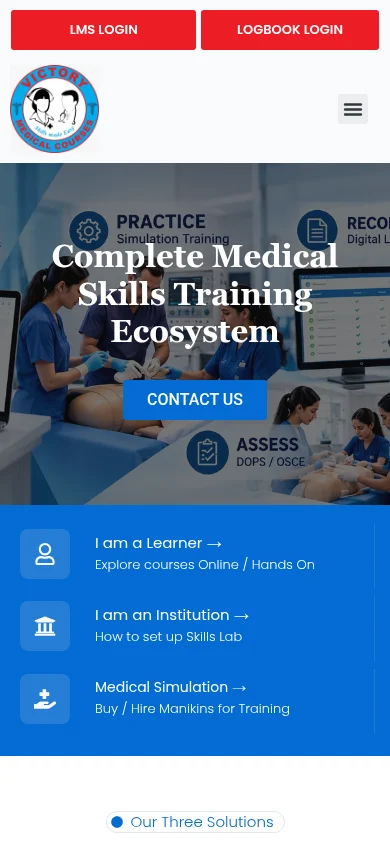
The current desktop and mobile captures show the visible public page at a particular time. They can document layout, text size, navigation and action placement. They cannot establish that every form submission, booking or external system works. Any device testing recorded in the brief is described as delivered work. The visual record is additional evidence of the present page, with its capture date kept visible so it is not confused with an undocumented historical before-and-after comparison.
Matching the evidence to the claim
The evidence for a website change should match the claim being made about it. A visible layout change can be supported by a capture of that layout. A current destination can be checked by following the relevant link. A completed form, an accepted referral and a confirmed booking require different checks. For Victory Medical Courses, the relevant business task was to find courses, the digital logbook, simulation or institutional information, so the review needs to stay connected to that task.
Desktop and mobile screenshots are useful records of a public page. They show what a browser displayed at the time of capture, including the available information and visible actions. They are not a substitute for a project archive, a historical baseline or a private system test. The capture date and page URL therefore remain part of the visual evidence, particularly where the website may have changed since the engagement.
The supplied project record establishes which testing and release steps can be credited as completed work. Any further review points in this story explain how the business can assess the delivered experience. Keeping that distinction clear helps a reader understand both the actual scope and the evidence needed for a wider outcome. It also creates a more reliable basis for future changes, because a later team can ask a specific question instead of assuming that every surrounding system was covered.
A current look at the public website
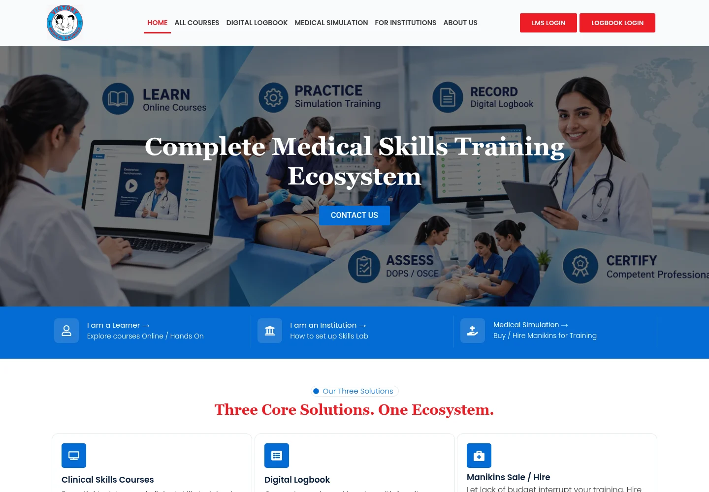
The current public page supplied for this engagement was captured on 2026-11-19. The browser page title was “Welcome”. Desktop and mobile views were captured separately so the visible layout could be reviewed at each screen width. The images show the site as it appeared during that capture, including any changes that may have been made after the original assignment.
The captured page includes these visible headings: “Complete Medical Skills Training Ecosystem”; “[I am a Learner →](https://victorymedicalcourses.edmingle.com/)”; “[Explore courses Online / Hands On](https://victorymedicalcourses.edmingle.com/)”. They provide context for the information a visitor encounters today. Their inclusion documents the present page; it does not expand the historical project scope or attribute later site changes to the original engagement.
The source URL is retained beside the visual record so a reader can distinguish the page that was captured from the general description of the engagement.


The delivered change and its practical purpose
The documented delivery gives Victory Medical Courses a more specific website capability: Website revisions; Course navigation; Digital-logbook navigation; Simulation and institutional footer sections. These items are the supported outcome of the assignment. Their practical purpose was to improve the part of the experience concerned with navigation between distinct medical-education resources, so learners and institutional visitors exploring medical education could follow an understandable route toward the intended next step.
The business outcome still depends on what happens beyond the visible page. The relevant handoff was the existing course and institutional destinations. How that process is maintained, how enquiries are handled and how the visitor's underlying needs develop can all affect the eventual result. The website's contribution is best explained through the delivered change, then assessed using evidence from the stage it actually influences.
No verified before-and-after performance figures were included in the supplied project notes. This case study therefore does not claim a percentage increase in leads, a reduction in acquisition cost, a ranking improvement or a specific time saving. Functional delivery and measured business performance are kept separate so that the story remains useful without implying a result that has not been documented.
How the business can assess impact
A useful measurement plan starts with the action the page is intended to support: to find courses, the digital logbook, simulation or institutional information. The business should define what counts as a completed event at that stage. Opening a destination, making an enquiry and completing the later business process may be related, but they answer different questions. A report becomes more useful when its event definition is clear enough for another person to understand and reproduce.
A comparison also needs an appropriate period and context. Changes in the audience, advertising activity, seasonality or the service offer can affect results alongside a website change. The purpose of comparison is to understand what happened under those conditions. A result should identify the period, the event measured and the source of the data, so it can be read as evidence rather than as an isolated promotional number.
For Victory Medical Courses, a later update to this case study can add verified figures once the relevant records are available. The original brief, delivery scope and dated captures already provide a useful foundation. Adding a clearly defined measure would extend that foundation with evidence of actual use. Until then, the impact statement stays focused on the delivered capability and the visitor journey it was designed to support.
What a similar project should establish early
A similar engagement should begin with the intended audience and the specific task the website needs to support. In this case, those were learners and institutional visitors exploring medical education and the decision to find courses, the digital logbook, simulation or institutional information. Making that relationship explicit helps the business explain what the page needs to achieve before individual layout or platform choices take over the conversation.
The next useful detail is the project boundary. The business should identify which pages, content, tools or integrations are included and which existing elements need to stay available. The constraint recorded here was straightforward: The footer needed a more useful structure for several distinct areas of the website. That kind of detail helps a team make proportionate decisions and creates a more reliable basis for checking whether the delivered work matches the original request.
The business should also identify who owns the next step after the page. A working enquiry route needs someone to respond, and a booking or registration destination needs its own responsible process. Knowing that handoff early makes the conversation more concrete. It helps connect the visible interface with a useful operational outcome while keeping responsibilities clear.
The lesson from Victory Medical Courses is to judge the work through the actual task and documented scope. A full redesign, an advertising page, a responsive repair and an audit can each be useful in different circumstances. The appropriate choice depends on what is getting in the visitor's way and what the business needs to manage afterward. The project record gives that discussion a specific starting point: navigation between distinct medical-education resources.
Your next project
Start with what your website needs to do.
Share your audience, your current website and the next step you want visitors to take.
Discuss your project