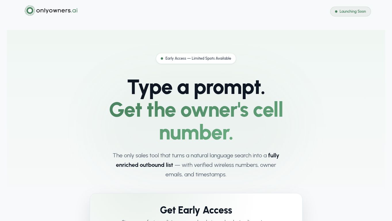
A detailed look at the decisions, systems, visual evidence, and delivery process behind this project.
Executive Summary
This case study is about the decisions behind the interface: what needed to be clear, what needed to feel credible, and what needed to happen next. OnlyOwners.ai was delivered as a web application, saas platform project for the technology & saas market. A live AI platform prepared for functional review, visual capture, and portfolio publication. The engagement brought together AI platform design, development so the website could work as one coherent system rather than a collection of unrelated screens.
The case study below documents the reasoning behind the information hierarchy, visual language, responsive behavior, conversion paths, and technical delivery. It does not attach invented traffic, ranking, revenue, or conversion statistics to the project. Where verified delivery evidence exists, it is identified separately. Technology websites must explain value quickly while still supporting deeper evaluation, so the experience was built around reducing uncertainty at each important step.
Business Context and Digital Opportunity
The primary audience includes technical evaluators, founders, operators, and prospective customers. That audience does not arrive with identical intent. Some visitors know exactly what they want, some are comparing providers or products, and others are still trying to understand the problem. The structure therefore needed to work at several levels of awareness. Early sections introduce the proposition and the reason to keep reading; deeper sections give detail, proof, service or product context, and a clear next action.
Within technology & saas, the experience needed to prioritize product clarity, workflow explanation, proof, scalable information architecture, and strong demo or enquiry paths. The design system was therefore evaluated against practical questions: Can a first-time visitor identify what the business offers? Can someone scan the page without losing the meaning? Do proof points appear before the request for commitment? Does mobile preserve the same hierarchy? Can future pages be added without creating a new visual language every time?

The Challenge We Needed to Solve
The challenge was not simply to make OnlyOwners.ai look more modern. The website had to make the offer easier to evaluate. For technology & saas audiences, a weak page hierarchy can create friction even when the underlying service is strong. Important information can be buried, calls to action can compete with each other, and visual sections can feel attractive without helping the visitor decide.
Our design criteria focused on four areas: message clarity, so the value proposition is understood quickly; decision support, so the page answers the questions that normally create hesitation; trust architecture, so proof and professional signals appear in the right context; and conversion continuity, so the next action stays visible without turning the interface into a wall of buttons. These criteria shaped both the content structure and the interface system.
Strategy: From Business Requirements to Page Architecture
Avenzo began by translating the project requirements into a hierarchy of user questions. Instead of starting with visual blocks, we mapped the information a qualified visitor needs before taking action. That meant distinguishing core proposition content from supporting detail, separating proof from promotion, and deciding where deeper explanation was valuable. The resulting architecture supports both quick scanning and deliberate reading.
The project aligns closely with our Web Application Development approach: structure the website around the commercial objective, then use design and development to reinforce that structure. Where the interface required clearer interaction patterns, the principles behind our UI/UX Design work informed component hierarchy, spacing, forms, navigation, and responsive states. The goal was consistency without sameness—reusable patterns that still allow important sections to feel distinct.
The Avenzo Delivery System Used on This Project
Every engagement needs a process that is structured enough to prevent omissions but flexible enough to respect the project. For OnlyOwners.ai, the delivery system followed six connected stages. Each stage had a specific output, and each output became the input for the next stage so design decisions did not become disconnected from strategy or implementation.
- 01
Product Mapping
Translate product capabilities, user roles, and business goals into understandable journeys and page priorities.
- 02
Flow Architecture
Map discovery, sign-up, enquiry, account, marketplace, or application flows before interface styling.
- 03
Interface System
Create reusable components, states, patterns, and hierarchy so the experience remains consistent as it grows.
- 04
Development
Implement responsive interfaces, content systems, forms, integrations, and application-specific functionality.
- 05
Trust & Adoption
Explain the product, security, process, proof, and next steps so users can evaluate the platform with confidence.
- 06
QA & Release
Validate flows, responsive states, errors, links, forms, performance, accessibility considerations, and release readiness.
This sequence matters because late-stage fixes are usually more expensive than early clarity. Architecture decisions influence design; design influences development; development decisions affect performance, accessibility, search readiness, and maintainability. Treating those disciplines as one system reduces rework and produces a cleaner handover.
Visual Direction and User Experience
The interface was designed around hierarchy rather than decoration. Typography establishes a clear difference between the primary promise, section-level explanation, supporting detail, and utility copy. Spacing creates rhythm between information-dense sections and visual proof. Buttons are treated as actions rather than ornaments, with primary and secondary states that communicate priority. Cards, tabs, forms, pricing elements, galleries, or service modules use repeatable rules so visitors learn the interface as they move through it.
Because this project sits in technology & saas, the visual system also needed to feel appropriate to the buying context. The objective was not to force a generic Avenzo aesthetic onto the client brand. Instead, the design uses the project’s own imagery, color language, content density, and tone while applying consistent UX principles underneath. That is why the screens can feel distinct from other Avenzo projects while still demonstrating the same design discipline.
Service, Product, or Offer Presentation
The website needed to make the commercial offer legible before asking the visitor to convert. For this engagement, delivered capabilities included AI platform design, development. Those capabilities were translated into user-facing sections that explain what is available, who it is relevant to, and what the visitor should do next. Where several services or products appear together, visual grouping and consistent labels reduce comparison effort.
For a web application, saas platform project, the sequencing of the offer is especially important. The page cannot rely on a single headline to do all the work. Supporting sections build context progressively: benefits answer “why,” service or product detail answers “what,” proof answers “why trust this,” process answers “what happens next,” and conversion elements answer “how do I start.” This gives the user enough information without treating every section as equally important.
Development System and Maintainability
The approved experience was implemented on the platform selected for the project requirements with an emphasis on responsive behavior, maintainable content structures, predictable components, and clean user interactions. The development objective was not just visual similarity to a mockup; it was to preserve the logic of the design across viewport sizes, content changes, and real user interactions.
Reusable patterns were favored where they reduce maintenance cost: consistent button states, shared card logic, repeatable service or content modules, predictable form behavior, and responsive spacing rules. At the same time, visually important sections were allowed to break the grid where that improved storytelling. This balance gives the site a distinctive presentation without creating a fragile collection of one-off sections that are difficult to edit later.
SEO, Semantic Structure, and Internal Linking
Search readiness was treated as part of the build. The case study does not assume that design alone creates organic visibility. A search-ready foundation depends on a clear page purpose, one logical H1, descriptive H2/H3 hierarchy, crawlable copy, meaningful link relationships, image context, accessible navigation, sensible canonical handling, and metadata that accurately represents the page.
Projects that are intended to support organic acquisition can be extended through Avenzo’s Custom Website Design service, while conversion-heavy pages benefit from connecting SEO with the page experience rather than optimizing traffic in isolation. Internal linking is used here the same way: not as a quota of exact-match anchors, but as a way to connect this case study to the Avenzo capability that actually relates to the work being discussed.
Trust, Conversion, and the Decision Journey
Trust elements were positioned where they help answer a real concern. Depending on the project, that can include reviews, credentials, guarantees, portfolio imagery, product documentation, experience, service coverage, process detail, named clients, pricing context, or an explanation of what happens after enquiry. The objective is to make proof part of the narrative instead of isolating it in a logo strip that visitors may ignore.
Conversion actions were also treated as a hierarchy. A primary CTA should represent the most valuable next step, while secondary actions should help visitors who are not ready for the same level of commitment. Repeating a consistent action after meaningful information creates continuity; repeating five competing actions in every section creates noise. That distinction informed the CTA placement throughout the design.
Responsive QA, Performance, and Launch Readiness
The final experience was evaluated beyond the desktop screenshot. Responsive QA considers content order, navigation behavior, tap targets, form labels, button width, image cropping, card stacking, heading wraps, fixed elements, and the way long sections compress on smaller screens. This is particularly important because high-intent visitors frequently arrive from mobile search, social media, advertisements, maps, or shared links.
Performance considerations include serving appropriately sized modern images, lazy-loading below-the-fold visuals, reserving image dimensions to reduce layout shift, limiting unnecessary scripts, and avoiding decorative effects that block interaction. Launch readiness also includes checking internal and external links, forms, required fields, metadata, indexing settings, canonical behavior, and any staging references. The objective is a page that remains reliable after the visual review is finished.
Project Outcome and What Can Be Verified
The most defensible outcome is visible in the delivered experience itself: a structured hierarchy, consistent interface language, responsive content flow, clearer calls to action, and a visual system built around the project rather than around a generic template. The portfolio record does not include verified analytics or revenue data for this engagement, so this case study deliberately avoids inventing performance percentages.
That evidence-first approach matters. A portfolio should distinguish between what was built, how it was built, and what can be measured. For OnlyOwners.ai, the screenshots and project record support the design and delivery story. If verified performance data is added later, the case study can be expanded without changing the underlying structure.
What Makes This Case Study Distinctive
OnlyOwners.ai demonstrates how the same Avenzo delivery principles can produce a different visual outcome when the audience, brand, offer, and sector change. The project is not valuable because it resembles another website in the portfolio. It is valuable because the hierarchy, proof, imagery, interactions, and conversion path were organized around this specific business context.
The finished system demonstrates how deliberate architecture can make a website easier to trust, easier to use, and easier to grow. The screenshots throughout the page are connected directly to the project media system, so refreshed captures can replace older visuals without rewriting the narrative. This creates a case study that is both a sales asset and a maintainable record of the work.
Explore the services behind this kind of work
Planning a Similar Project?
If your business needs a scalable digital product experience, Avenzo can map the strategy, structure the content, design the interface, and build the experience through launch. Start with the Avenzo consultation and share the current website, required functionality, audience, and commercial goal. The recommendation will be based on the project requirements rather than a generic package.