
Design case study · Food, Beverage & Consumer Brand
Product personality with a clear route through the range.
A website experience for people discovering an energy-drink brand and its flavours.
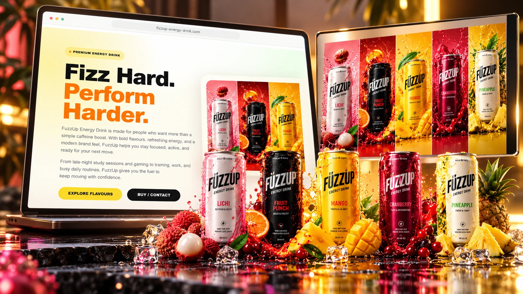
- Client
- FizzUp Energy Drink
- Industry
- Food, Beverage & Consumer Brand
- Scope
- Brand Website Design
The challenge
Give the right information a clear place.
A consumer-brand website needs to express personality while keeping the product range understandable. Flavour discovery, product storytelling and the wider brand presentation should reinforce each other rather than compete for attention.
Our design focus was product storytelling, flavours & high-impact brand presentation. The project brings the opening message, supporting content and next-step actions into a connected website presentation.
Project goals
What the website needed to do.
Make the product identity memorable
Give flavours a clear browsing structure
Connect product and brand storytelling
Visitor journey
From a question to a clear next step.
The content sequence follows the decisions a visitor needs to make while exploring FizzUp Energy Drink.
- 1
Meet the brand
→ - 2
Explore the flavours
→ - 3
Read the product story
→ - 4
Follow the next product action
Design decisions
The decisions behind the design.
Let the product own the opening
Use the hero presentation to make the product and brand identity immediately recognizable.
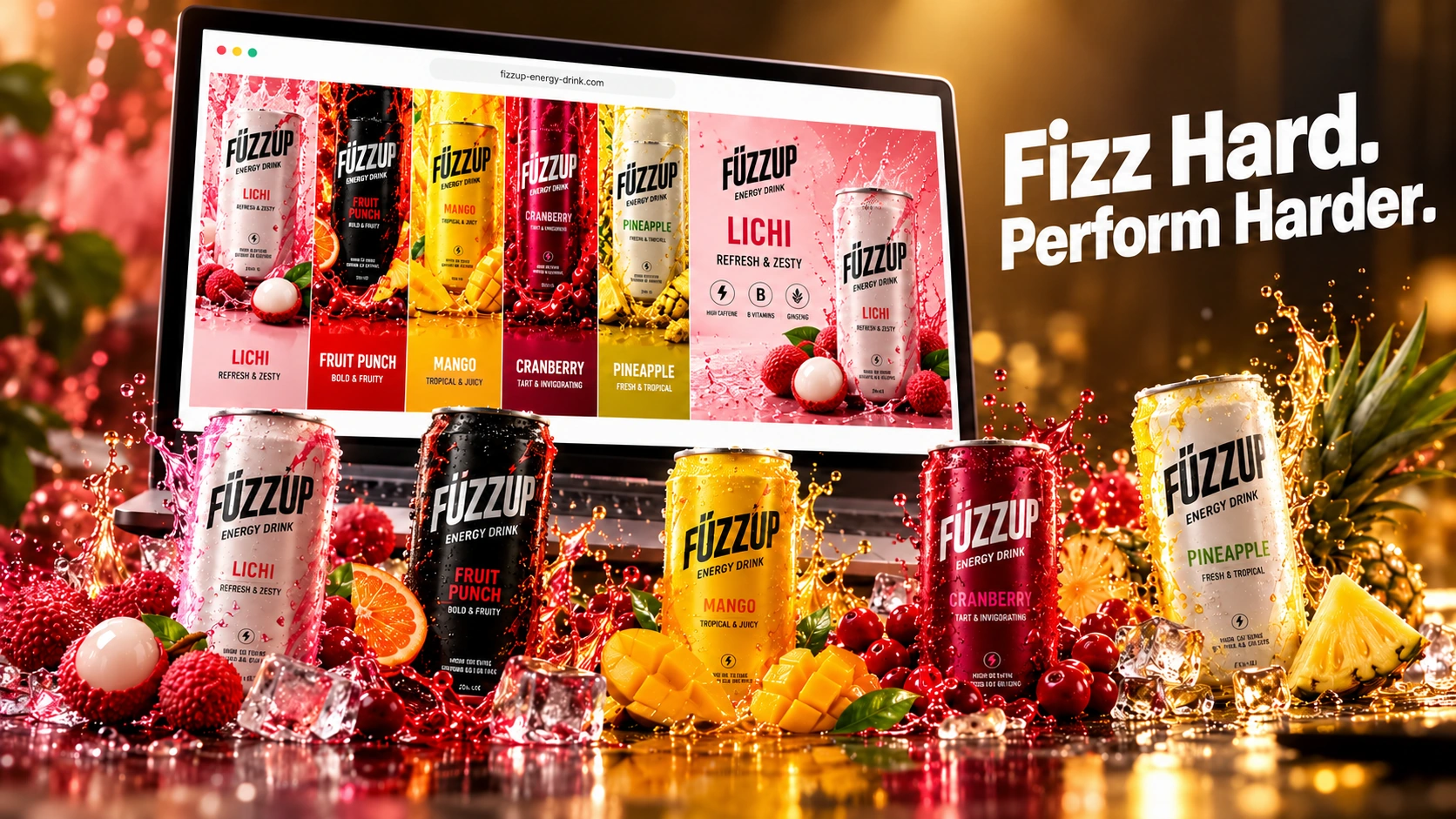
Structure the flavour range
Give the collection view a repeatable visual pattern so people can explore the range.
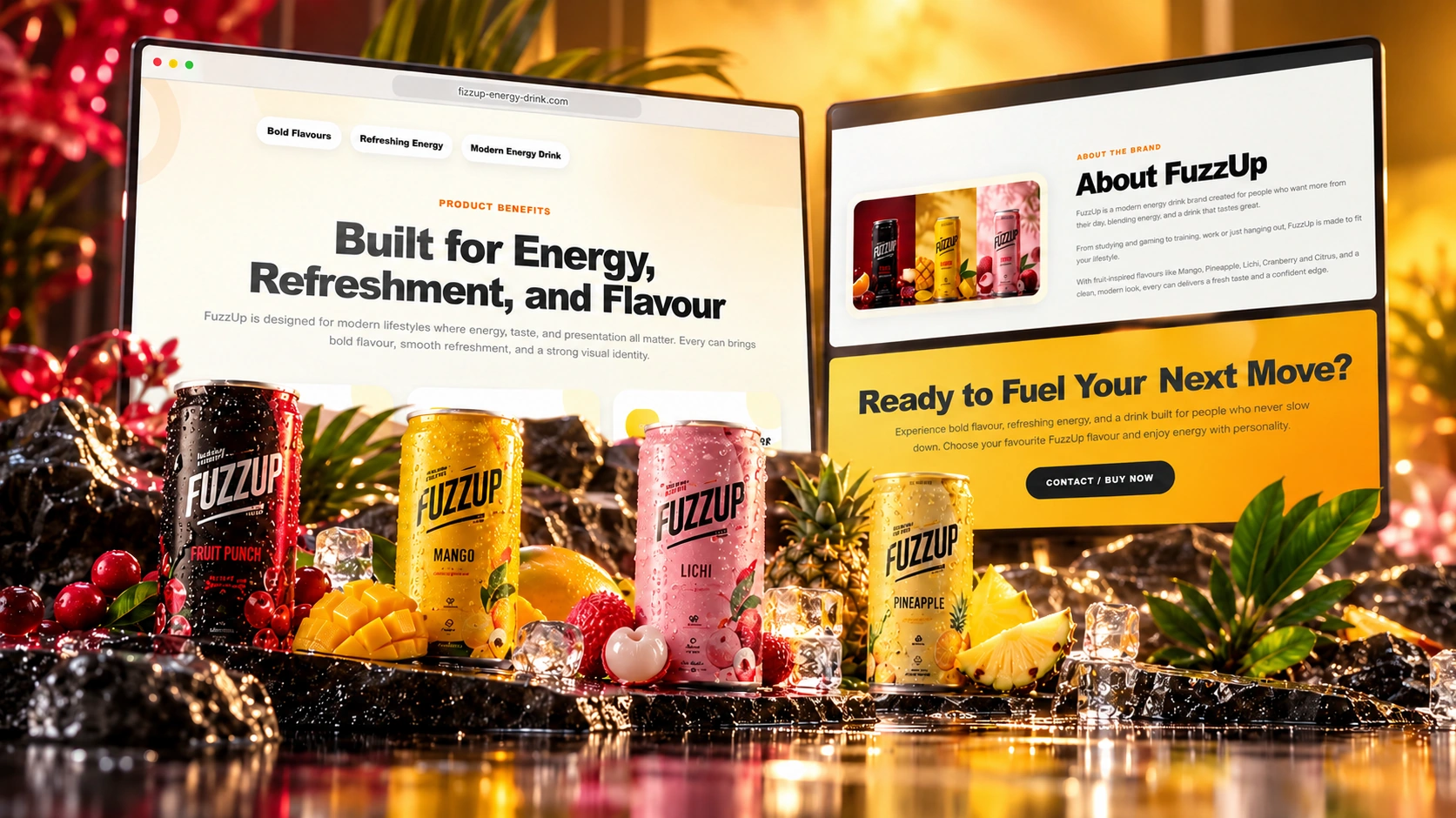
Carry the story across sections
Connect the product narrative with the supporting and complete-site compositions.
Design system
One visual language across the experience.
Supporting detail in readable sections.
Follow the next product actionHeadings · content · next stepA clear reading order
The opening establishes the subject; the following sections build the detail.
Repeatable content patterns
Related information uses familiar headings, spacing and section structures.
A distinct primary action
The visual hierarchy keeps “follow the next product action” recognizable as the next step.
Website in motion
Explore the website in motion.
A closer look at the FizzUp Energy Drink page experience through the available scrolling films.
The page experience
A closer look at the finished presentation.
Explore the project imagery alongside the full portfolio presentation.
Responsive presentation
Clarity on a smaller screen.
The device imagery presents the visual direction. The priorities for smaller screens are simple navigation, readable information and a recognizable next step.
Simple navigation
Keep the route to relevant information short and understandable.
Readable content
Preserve the order of headings and supporting detail.
Clear contact paths
Give the primary next step a visible, consistent place.
What we delivered
A connected website experience.
The documented project brings together the following design work and presentation assets.
- Brand Website UX/UI
- Product Storytelling
- Responsive Design
- Visual Direction
- Portfolio imagery
- Scrolling website showcase
Design outcomes
What the design brings together.
A connected page story
Make the product identity memorable.
A repeatable content system
Give flavours a clear browsing structure.
A recognizable next step
Connect product and brand storytelling.
These are qualitative design outcomes. Business performance, conversion changes and client results are not quantified in this case study.
More project stories
Explore more case studies.
Your next project
Could your website make the next step clearer?
Let’s create a focused website experience around your audience and goals.