Figma to WordPress development
that matches your design.
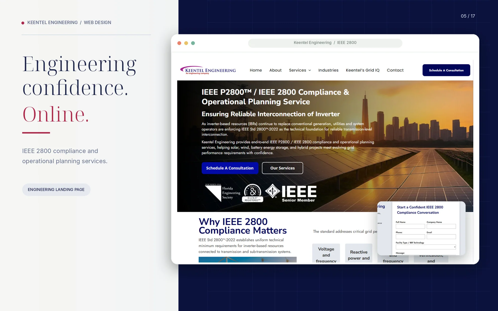
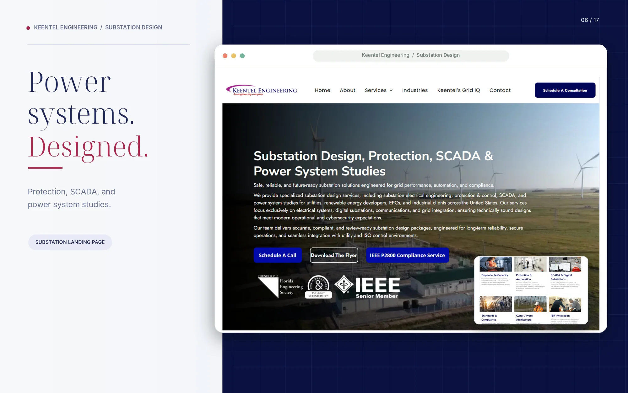
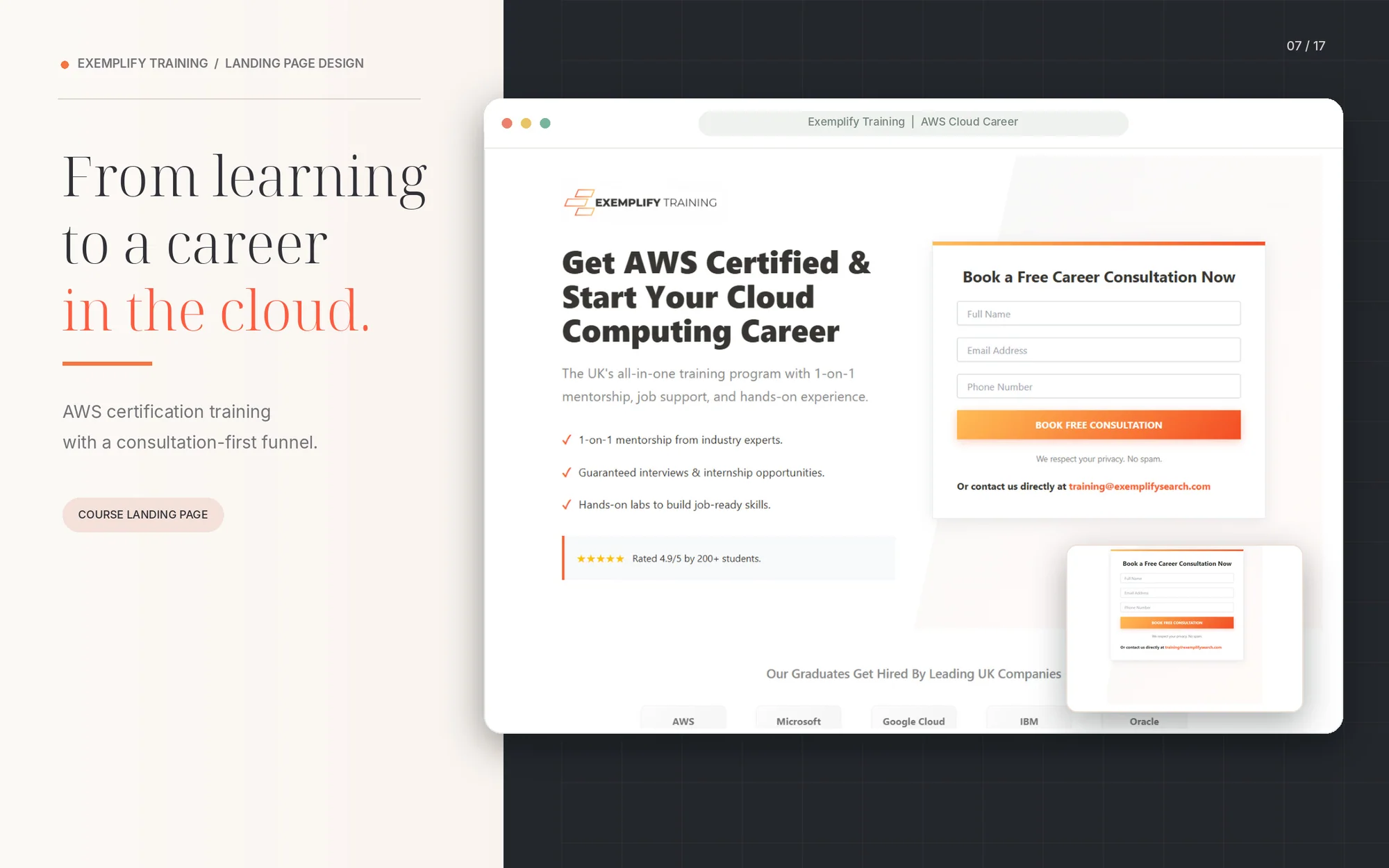
We convert Figma files into fully responsive, editable WordPress websites — with layouts, spacing, type, and states built to match the file frame-for-frame, not “close enough.” Every section is rebuilt as a reusable, client-editable component, not a static image slice.
Figma files that become real, working WordPress sites.
Not every Figma file is the same kind of project, and the build approach changes depending on what you’re handing off.
WHAT WE BUILD
Marketing & corporate websites
Multi-page brand and business sites where every section, spacing rule, and hover state in the file needs to survive the handoff — built so the live site reads exactly like the design, not an approximation of it.
01
SaaS & product marketing pages
Feature grids, pricing tables, and interactive UI patterns translated into WordPress without flattening the interactions the design was built around.
02
eCommerce storefronts
Product, category, and cart flows rebuilt on WooCommerce (or your platform of choice) so merchandising and checkout logic sit underneath a pixel-accurate front end.
03
Landing pages & campaign sites
Conversion-focused single pages built fast, with the exact spacing and hierarchy the design was tested for — no generic page-builder defaults creeping in.
04
Design systems & component libraries
Figma component libraries (buttons, cards, forms, states) mapped one-to-one to reusable WordPress blocks or Elementor components, so future pages get built from the same system instead of drifting from it.
05
Need something built from scratch instead?
If there's no Figma file yet and you need the design work done first, see UI/UX Design or Website Prototyping & Wireframing. If your WordPress site needs custom functionality beyond front-end conversion, see Custom WordPress Development.
06
What "pixel-perfect" actually. means on our builds.
“Looks close” isn’t a standard — it’s how sites end up with drifted margins and mismatched type by page three. Every build is checked against these six things before it ships.
HOW WE MEASURE ACCURACY
01
Spacing & grid accuracy
Margins, padding, and column widths pulled directly from Figma's measurements, not eyeballed.
Layout
02
Typography fidelity
Font weights, line heights, letter spacing, and responsive type scale matched exactly, including custom web fonts.
Type
03
Color & style tokens
Colors, gradients, shadows, and border radii built as reusable style values, not one-off hex codes per section.
Style
04
Interactive states
Hover, focus, active, and disabled states included even when they're only implied in the static file.
Interaction
05
Component consistency
Repeated elements (cards, buttons, nav items) built once and reused, so a style update in one place updates everywhere.
Structure
06
Editable, not locked
locked Every section is editable in WordPress after launch — text, images, and repeatable content blocks — not a coded page your team can't touch.
Editing
The decision that determines how editable your site is
How we implement the design matters as much as how it looks — this is the part that gets skipped when a build is rushed straight from Figma to code, and it’s usually the difference between a site your team can maintain and one they can’t.
BUILD APPROACH
Page Builder
Elementor / page-builder build
Full drag-and-drop editing after launch, so your team can add and update pages themselves without touching code.
BEST FOR: Marketing sites, landing pages
Custom Code
Custom theme development
Clean, minimal-bloat code tied to the design system, for larger sites where performance and long-term maintainability matter most.
BEST FOR: Larger, structured sites
Native Blocks
Gutenberg / native block build
Native WordPress editing without a third-party page-builder dependency, for teams already standardized on the block editor.
Content-heavy, block-native sites
Breakpoints the design didn't show — solved before launch, not after.
Most Figma files show desktop and maybe one mobile frame. Everything in between is a decision someone has to make, and we make it based on how the design’s grid and type scale actually behave, not by shrinking the desktop layout until it fits.
RESPONSIVE BUILD
Breakpoint mapping
Tablet, small laptop, and mobile breakpoints planned against your content, not just standard device widths.
Type & spacing scaling
Font sizes and spacing scale proportionally across breakpoints instead of jumping between fixed sizes.
Component reflow
Multi-column layouts, cards, and navigation rebuilt for how they should behave on smaller screens, matching the design's intent even where no mobile frame exists.
Touch-target sizing
Buttons, form fields, and nav items sized correctly for touch on mobile, even when the design was built desktop-first.
A generic template setup vs. a page built for the goal.
The gap isn’t visual polish — it’s whether the code was structured around a specific performance and design outcome from the start.
WHY PURPOSE-BUILT WINS
Performance Metrics Comparison
Select a benchmark to view live interactive score differences.
Generic Conversion
Built by Avenzo
+185%
Faster Page Load
93% Less
Unused JavaScript
100/100
SEO Audit Score
A proven process for accurate conversions.
Five stages keep the project organized and focused on the metric that matters — visitors taking the action you designed the page for.
HOW WE WORK
File review
We audit your Figma file for completeness — missing states, unlabeled components, and inconsistent spacing get flagged before development starts, not discovered mid-build.
01
Build plan & platform decision
We recommend the implementation approach (Elementor, custom theme, Gutenberg, or hybrid) based on your team's editing needs and the file's complexity.
02
Development
Sections are built and reviewed against the Figma frames in stages, not delivered as one unreviewed block at the end.
03
QA & responsive testing
Cross-browser, cross-device, and design-comparison testing before anything goes live.
04
Handoff & launch
Supervised go-live, admin walkthrough, and a defined post-launch support window so your team isn't on their own the day after launch.
Common questions about Figma to WordPress development
FAQs
How closely will the WordPress site match my Figma file?
We build to match spacing, typography, color, and interactive states directly from your file’s measurements and layers, not a visual approximation. Anything ambiguous or missing from the file, like an undefined mobile breakpoint, is flagged and confirmed with you before we build it, so there are no surprises at handoff.
Will I be able to edit the site myself after launch?
Yes. Every build is delivered as an editable WordPress site through Elementor, native Gutenberg blocks, or custom fields, depending on which approach fits your team. We’ll walk you through exactly what’s editable during handoff.
Do you use Elementor, a custom theme, or something else?
It depends on your file and how your team plans to manage content going forward. We recommend the right approach after reviewing your Figma file — see our implementation Options above for how we decide.
What if my Figma file doesn't have a mobile design?
We build responsive breakpoints based on your desktop layout’s grid, type scale, and content hierarchy, matching the design’s intent even where no mobile frame exists.
Can you also build backend functionality, not just the front end?
Yes. If your project needs custom functionality beyond front-end conversion, like booking systems, membership areas, or custom post types, see our Custom wordpress development services.
Packages built around your scope.
Every project is scoped individually — these tiers give you a starting point for the conversation.