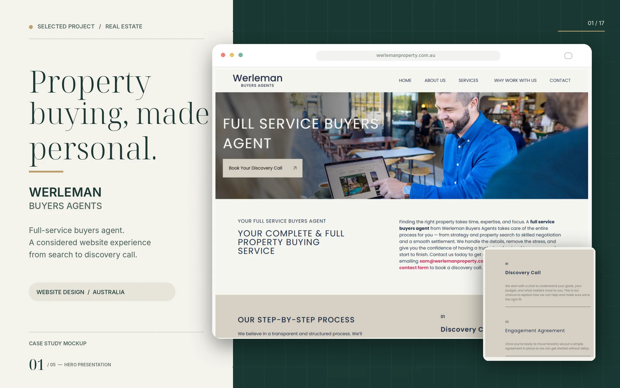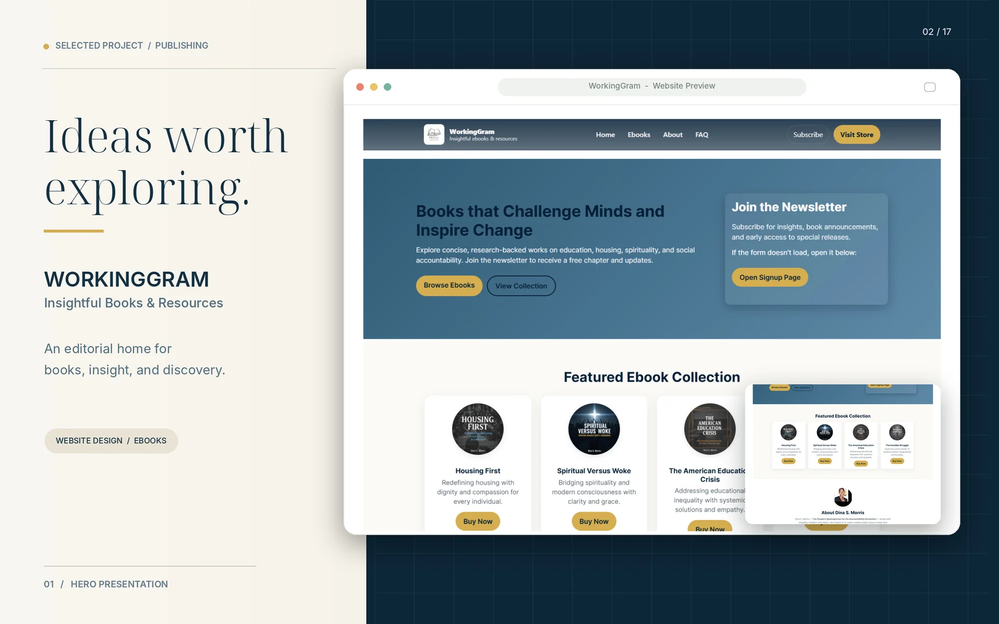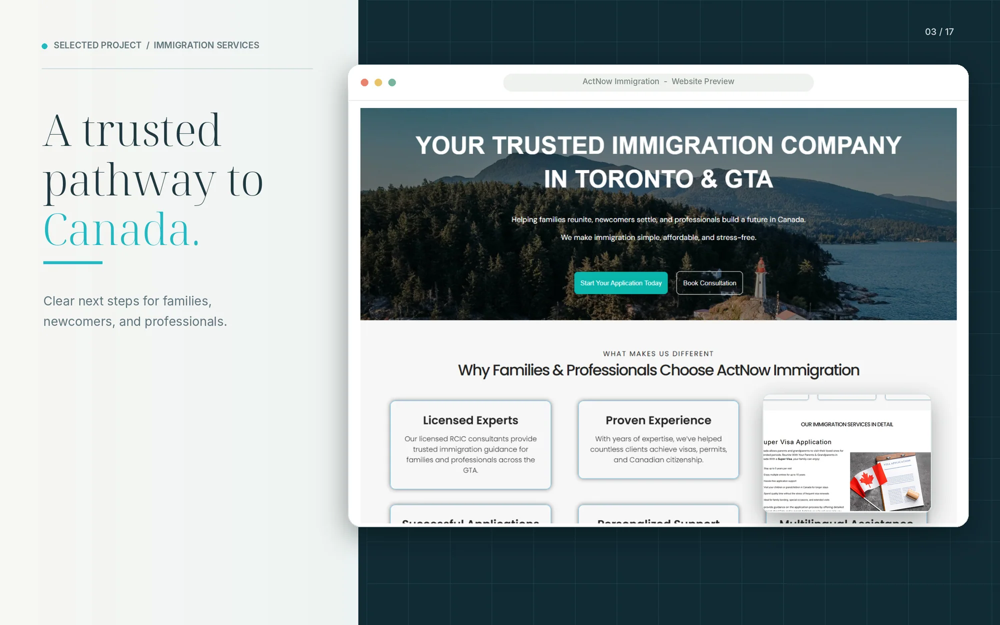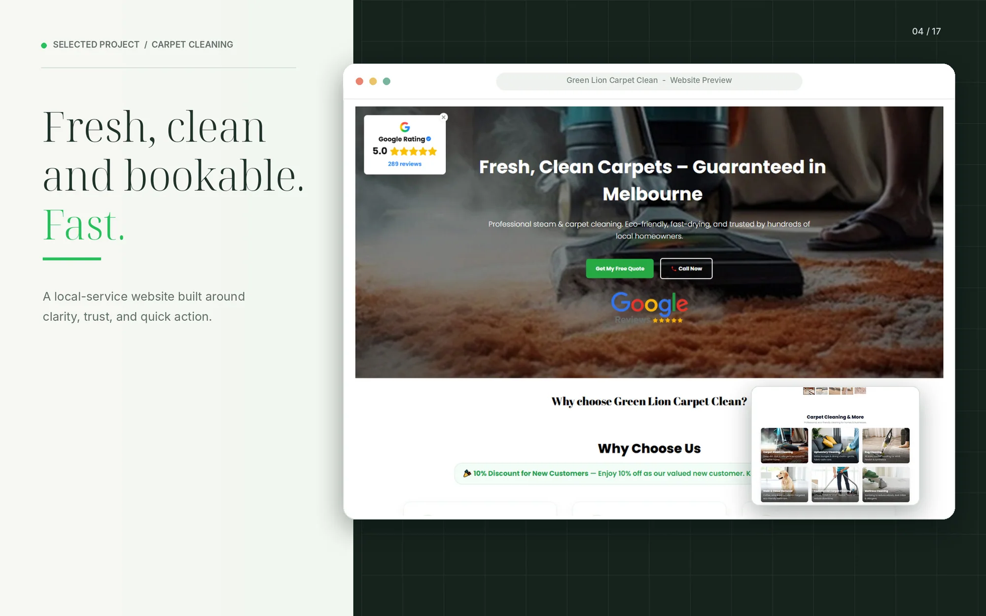

✨ Website Design & Development for Growing Businesses — Start your project →

Responsive Website Design

We design and build websites that work perfectly on every screen — phone, tablet, and desktop — combining fluid layouts, hand-tested breakpoints, fast load times, and navigation that adapts to how people actually browse.

Featured Service · Web Development

Responsive Sites Delivered
0
Device & Browser Tested
0
Mobile-First Builds
0 %

Everything a responsive website
needs to work on any screen

No layout that just “shrinks” on mobile. Every project is built mobile-first from the ground up, then hand-tested across real devices — so your site works properly no matter where someone lands on it.


What's Included

Fluid, adaptive layouts

Page structures designed to reflow naturally across screen sizes — not a fixed desktop layout squeezed into a smaller frame.

Mobile-first development

Built starting from the smallest screen up, so mobile visitors — often the majority of your traffic — get a fast, fully-featured experience.

Touch-friendly navigation

Menus, buttons, and forms sized and spaced for tapping, not just clicking, so nothing is fiddly or hard to reach on a phone.

Cross-device, cross-browser testing

Hand-tested on real phones, tablets, and desktops across major browsers — not just previewed in a resizable window.

Performance-optimized images & assets

Images and media served at the right size for each device, keeping pages fast even on slower mobile connections.

Consistent experience at every breakpoint

Content, calls-to-action, and functionality stay clear and usable at every screen width — nothing gets cut off or hidden by accident.

A website that works,
everywhere your customers are

Most visitors will meet your business on a phone before anything else. Here’s what changes when a site is properly built for every screen, not just retrofitted for mobile.

Why Responsive Over Fixed

Designed for every screen

Layouts built to adapt, not just shrink

We design with fluid grids and flexible breakpoints from the start, so your site rearranges intelligently on any device instead of just scaling down.

Built to perform on mobile

Speed matters more on a phone

Every project is optimized for mobile load times and Core Web Vitals, since slow-loading pages lose visitors fast — especially on mobile networks.

Tested on real devices

Not just a browser resize

We test on actual phones and tablets across iOS and Android, plus every major browser, so what you see in review is what your customers actually get.

A proven responsive design
and development process

Five phases keep your project organized, transparent, and focused on a site that performs well on every device.

How We Work

Discovery

We learn your business, your audience’s devices and browsing habits, and audit anything you already have online.

Responsive, hand-coded build tested continuously across screen sizes, with clean, structured markup.

Development

Post-launch maintenance and updates so the site stays fast and fully responsive as new devices and browsers roll out.

Support

Mobile-first layouts and page structure, mapped to your content and reviewed with you across breakpoints before build.

Design

Cross-device testing on real phones and tablets, speed checks, and a supervised go-live so nothing breaks on launch day.

QA & Launch

The right platform for your business,
not ours

We choose the platform based on your goals and budget — not a one-size-fits-all stack.


Platforms We Build On

WordPress

Elementor

WooCommerce

Shopify

Webflow

HubSpot CMS

React

Next.js

Figma

Custom PHP

Headless CMS

API Integrations

Responsive website packages
built around your scope

Every project is scoped individually — these tiers give you a starting point for the conversation.


Engagement Options

Starter Site

A focused responsive site for a small business or single service line.

From $2,500

Growth Website

For businesses that need a scalable, cross-device presence.

From $5,900

Most Popular

Enterprise Build

For multi-location, e-commerce, or highly custom responsive.

Custom Quote

Tell Us About the Website You Want to Build

Share your goals, current challenges, and required functionality. Our team will review your requirements and recommend a suitable development approach.

[dexora_contact_form]

No pressure and no generic package. We will review your requirements before recommending a solution.